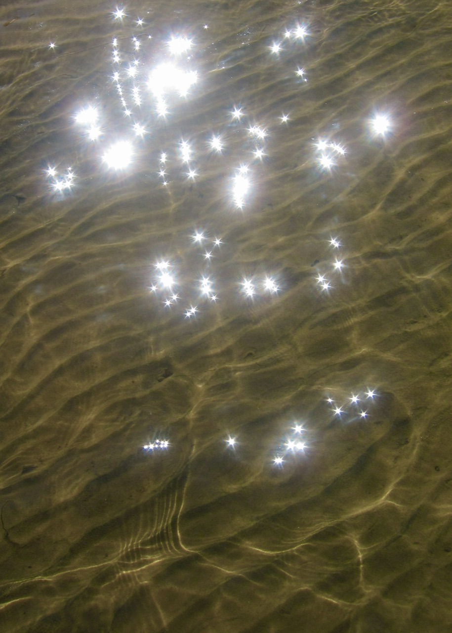


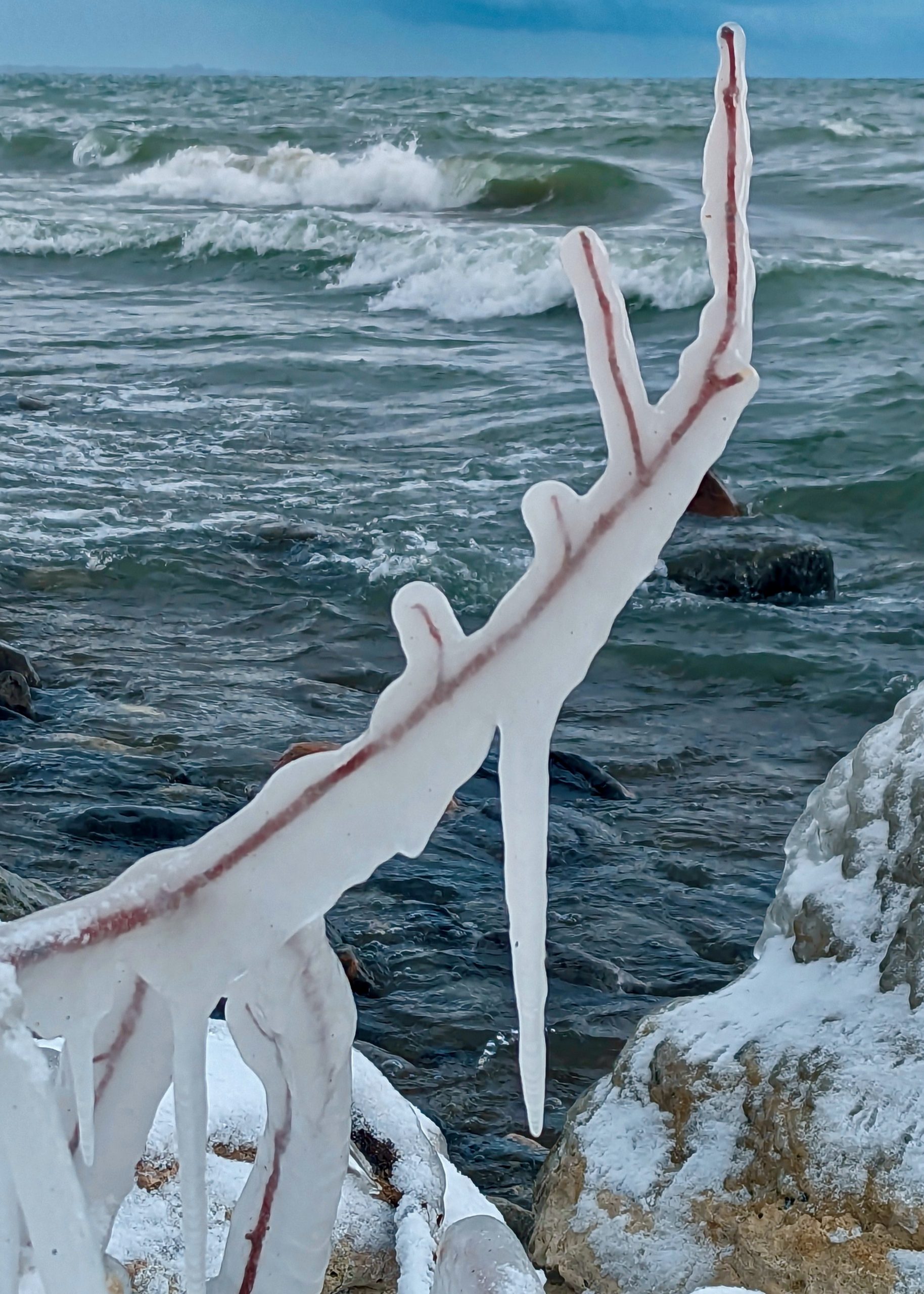


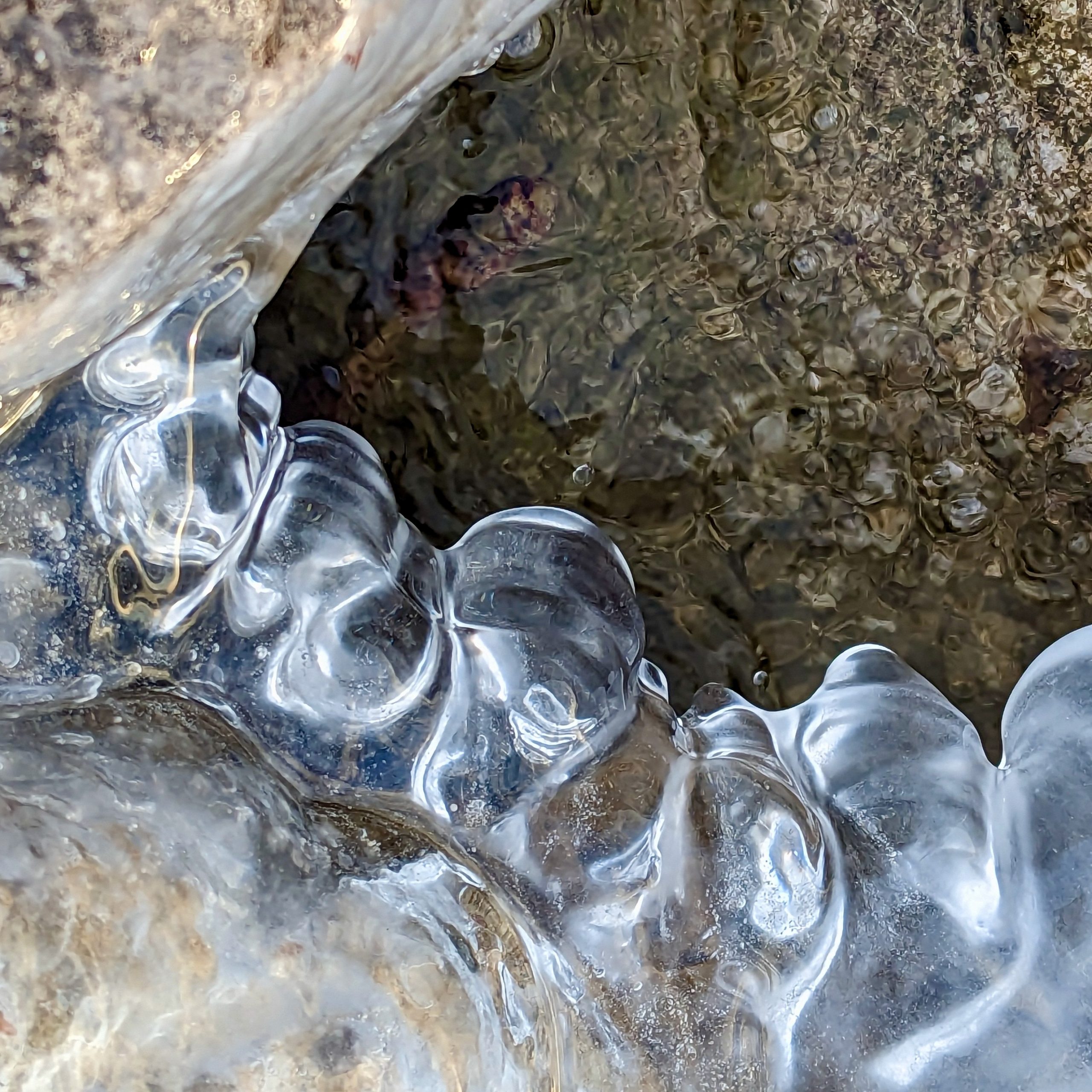
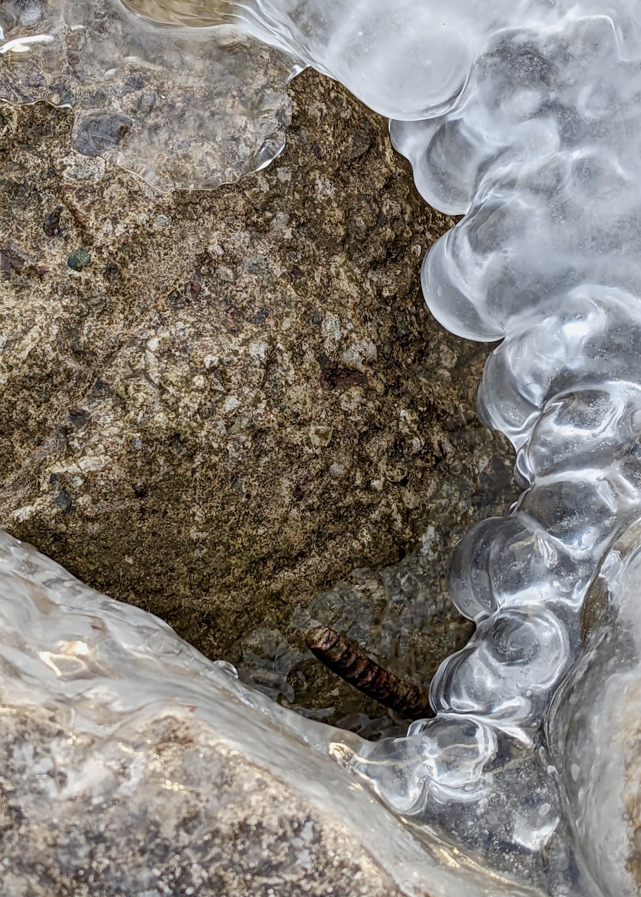


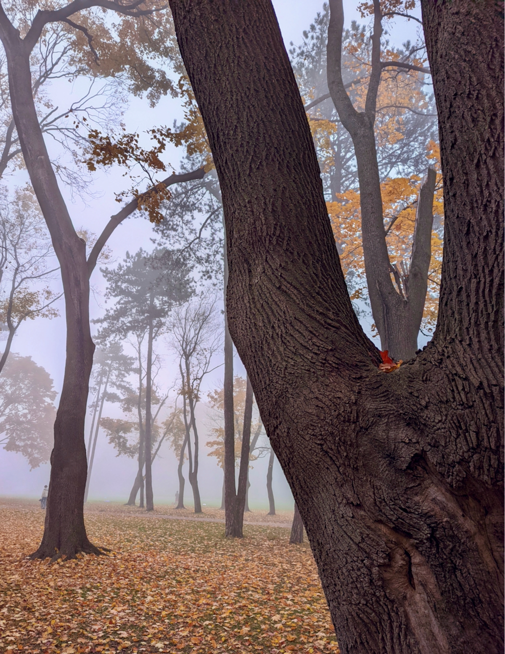
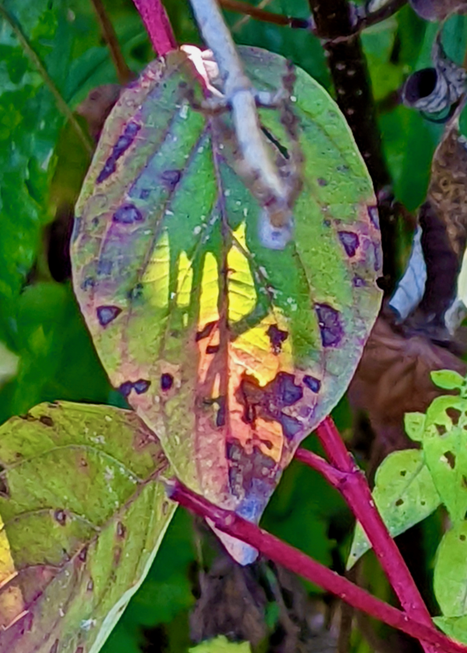
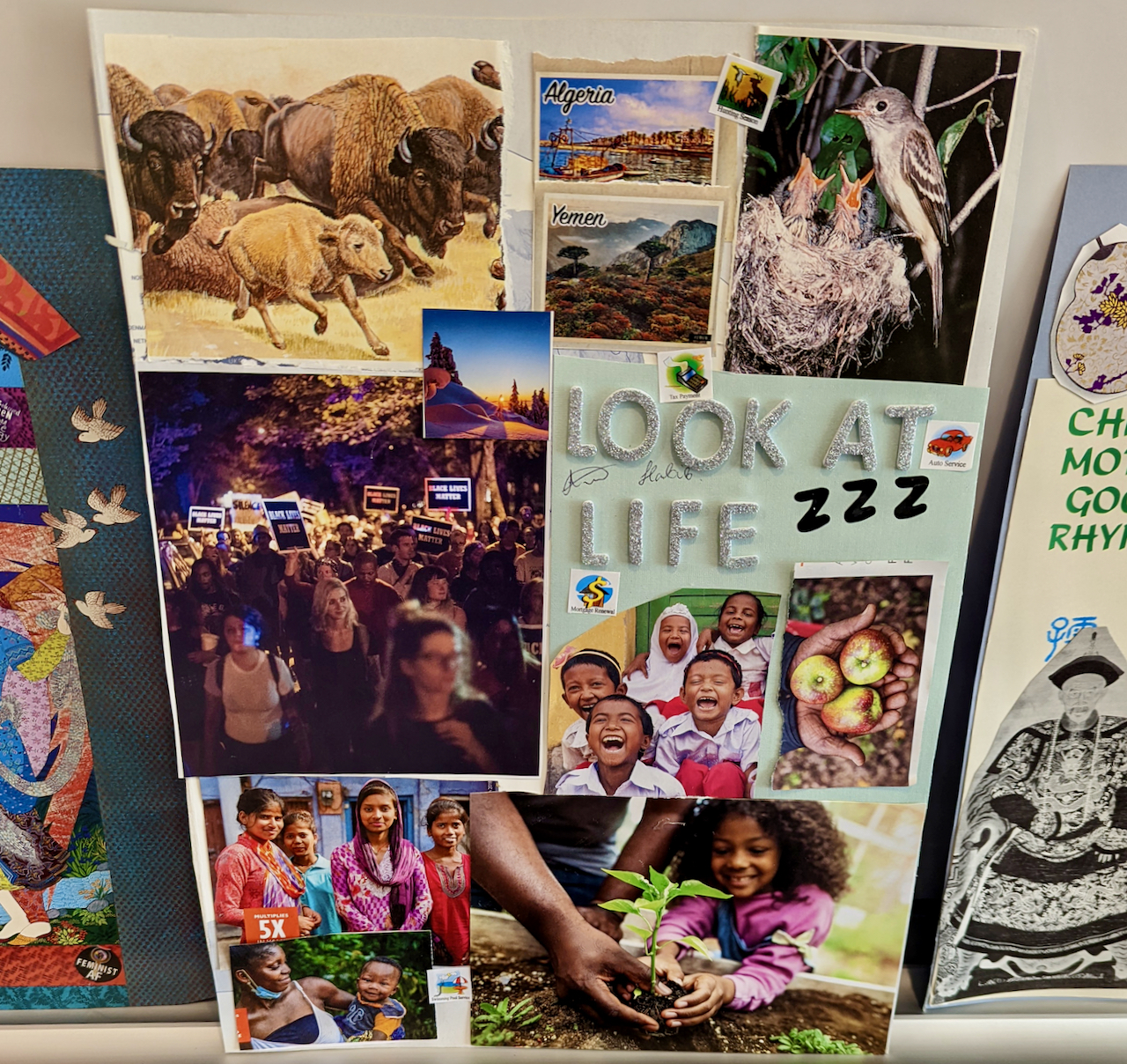
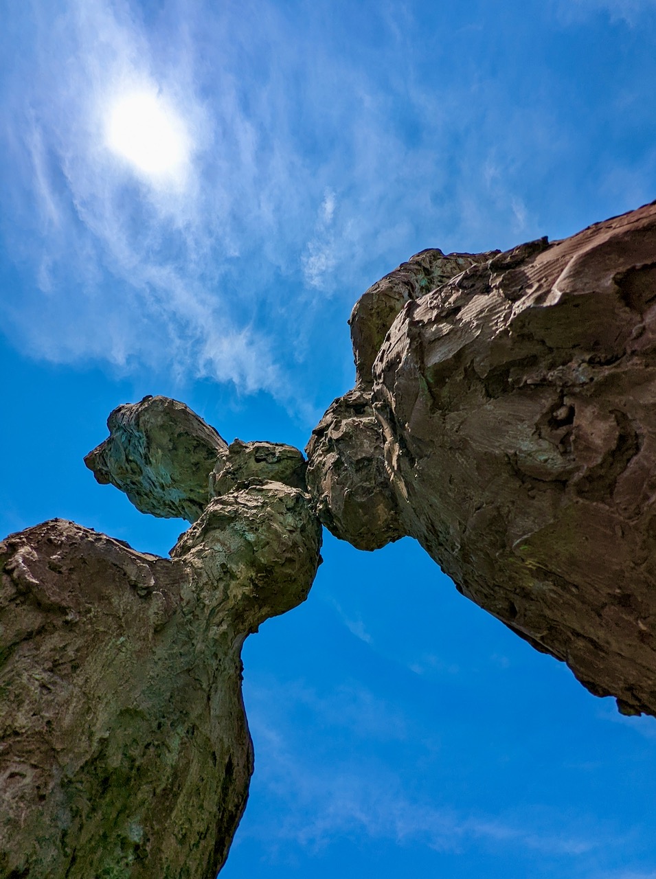
One fall day,
a logical gully
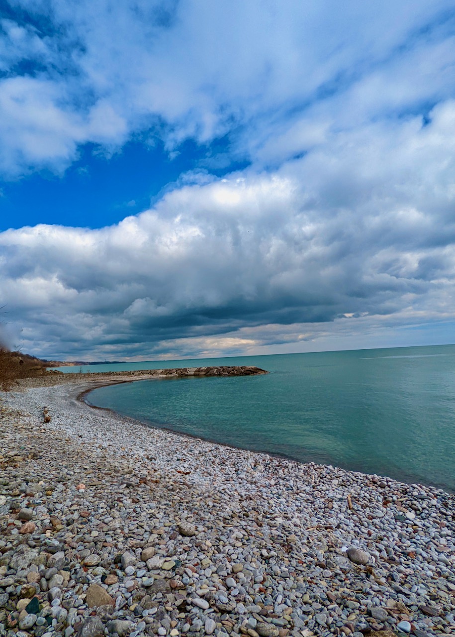
guides me down the slope to Highland Creek.
My steps disturb a creature
who escapes under the cover of leaves,
defining a ribbon of movement
that lifts the rustling shelter as it flees.
With anonymous grace,
the animal testifies to life unseen but more real than this poem,
fusing threads of instinct without pause.
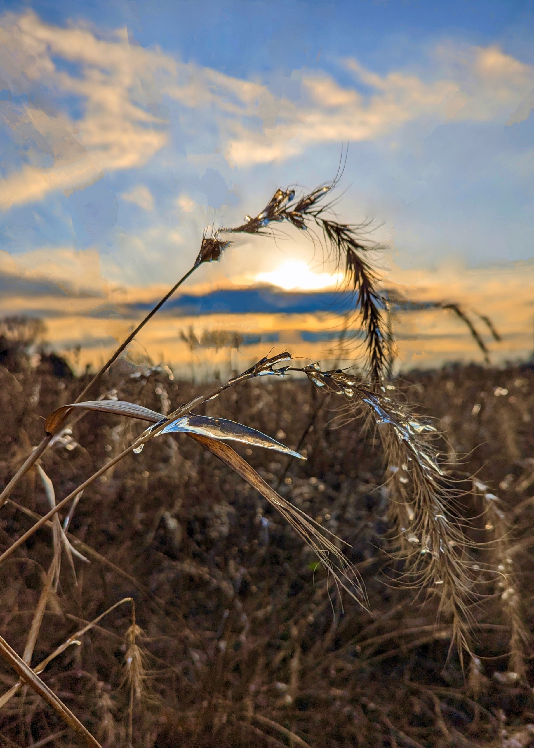
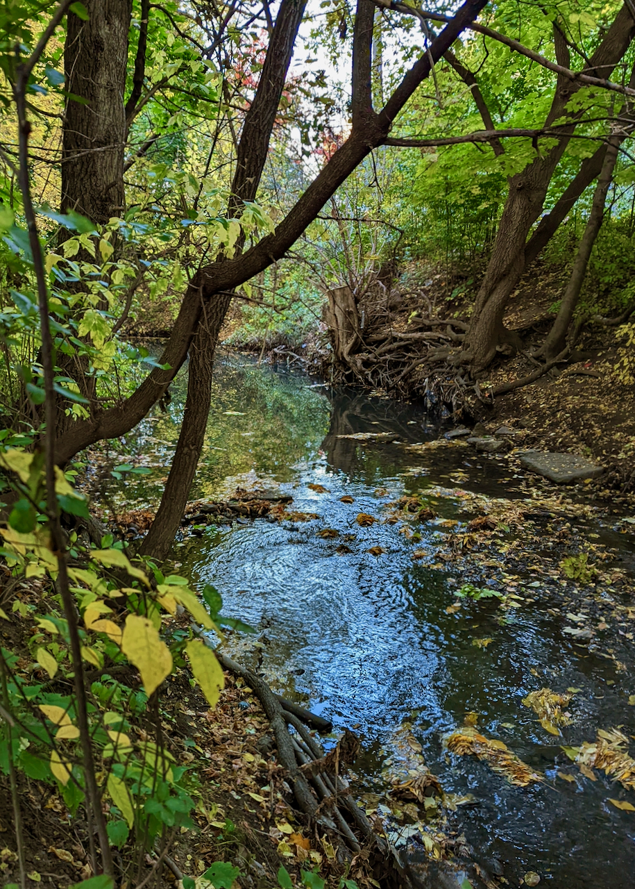
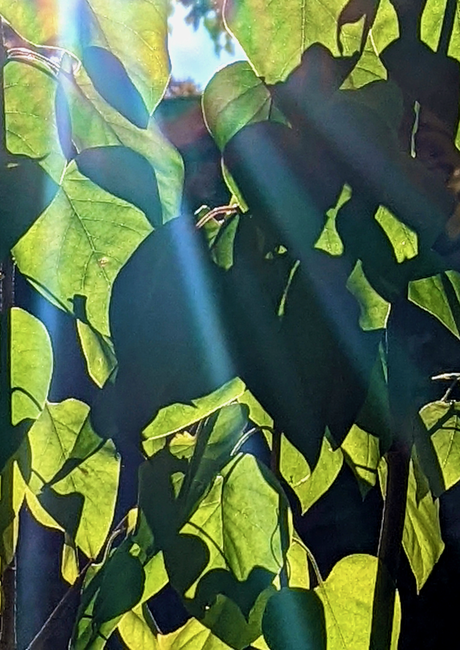
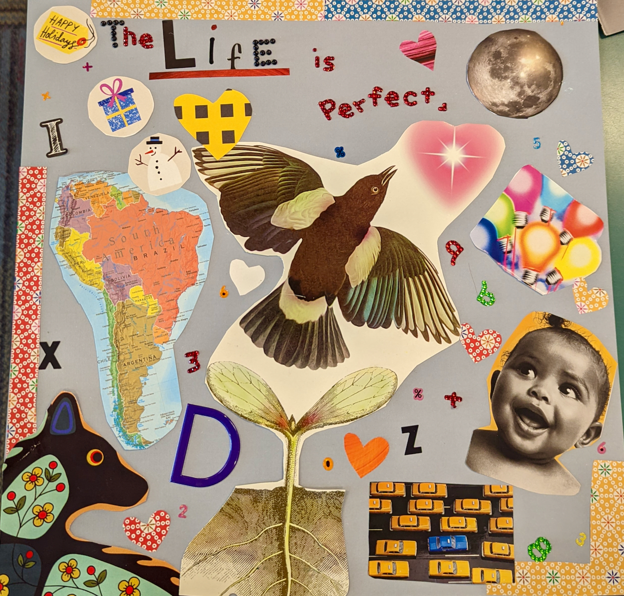
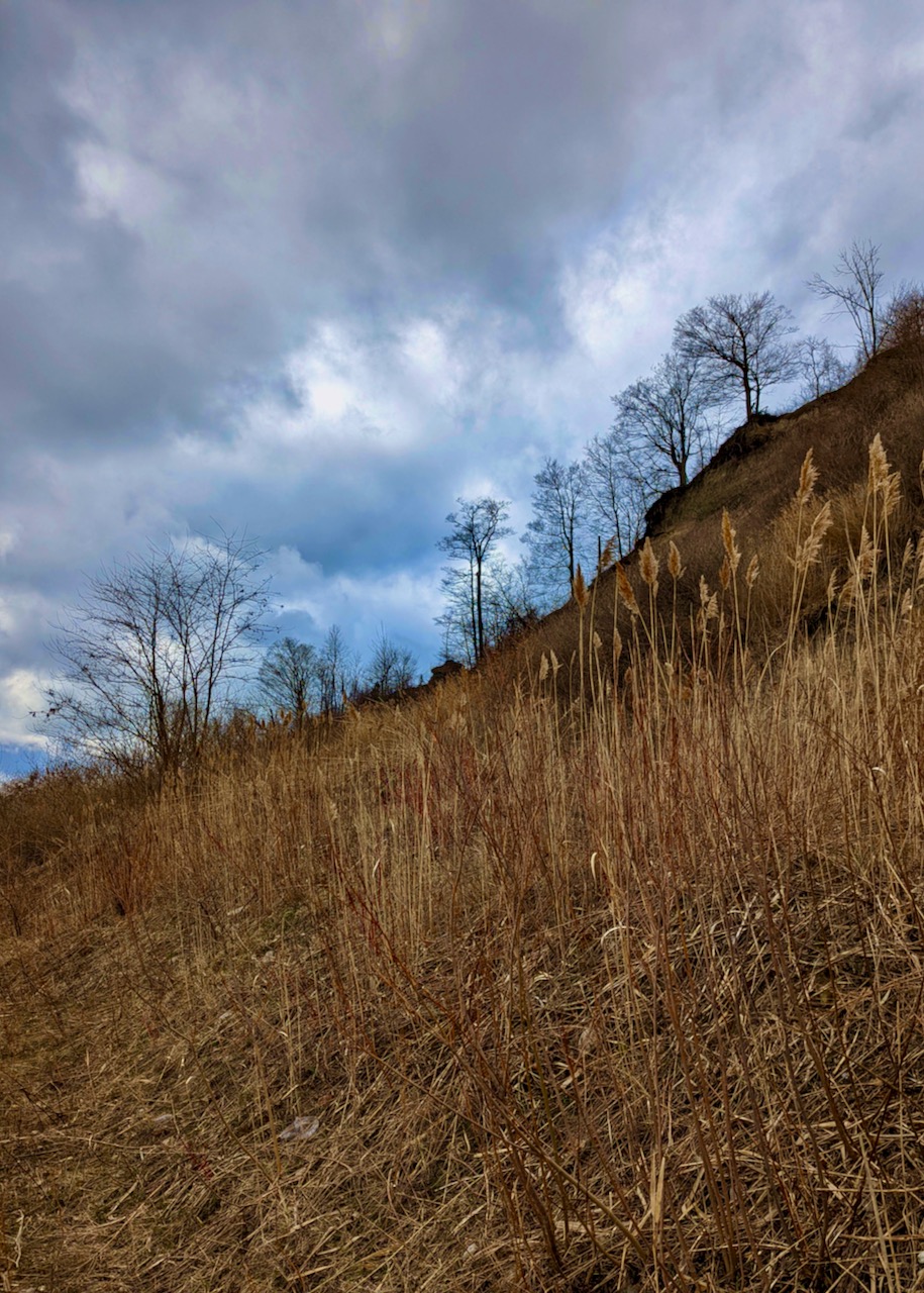
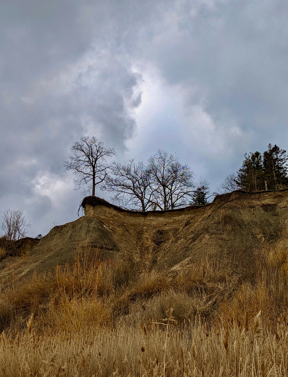
One summer day,
I cycle home from the college on Ashtonbee Road,
thoughts distracted from the simple path
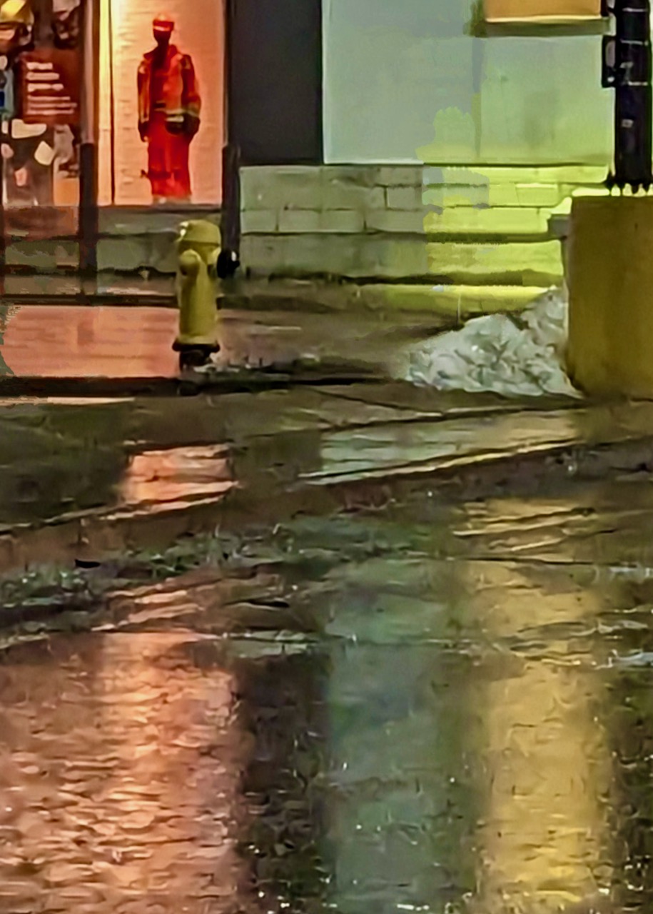
that curves by the banks of Taylor Massey Creek.
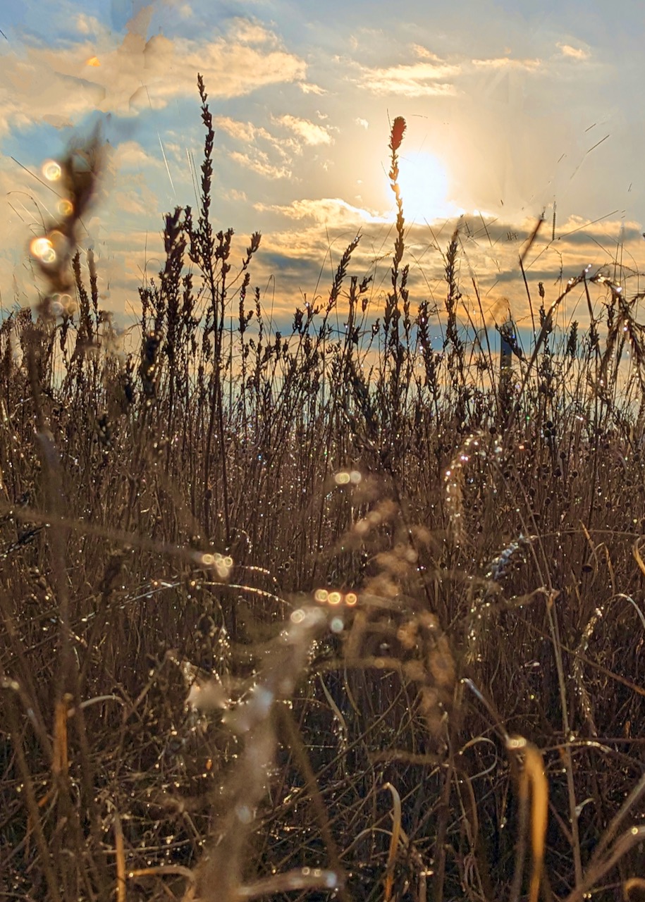
I pass a tall gathering of yellow grasses
that erupts with red winged blackbirds.
They fly straight up from the reeds,
rising in a startled mass of flapping.
Like verses that nest unknown within us,
it takes a sudden whoosh of wheels or wings
to show life at its roots, a wild relentless freshness
that we cage with fear.
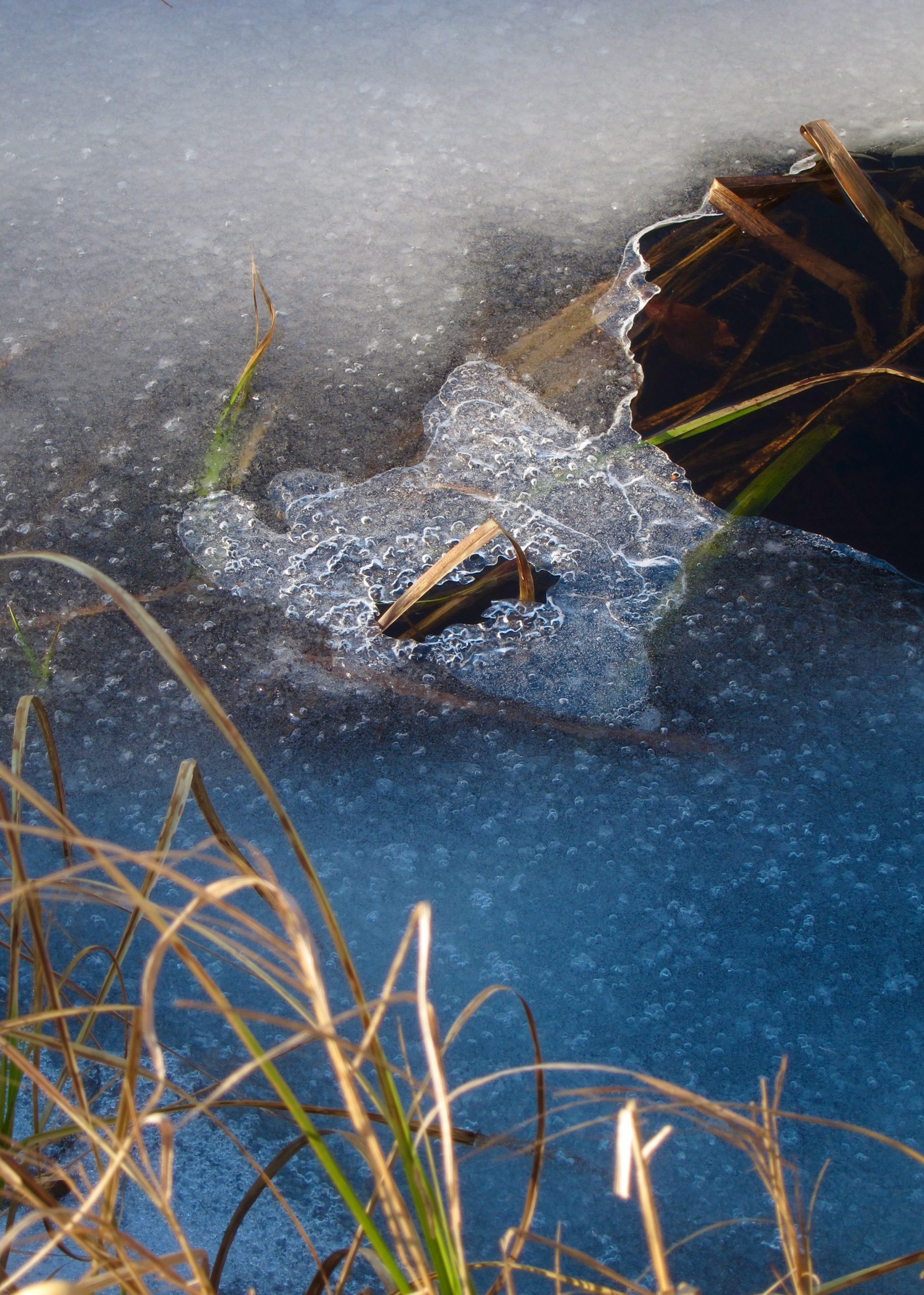
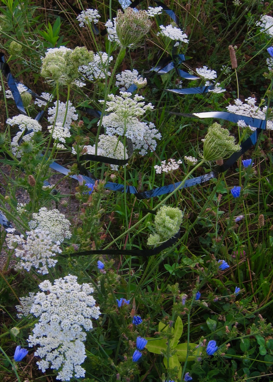
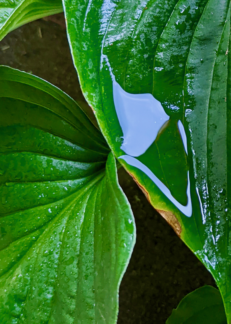
One spring morning,
dark green shoots
grow from my breasts, pushing up, pushing out.
Cautiously, I tug a shoot from my left aureole
and a curly leaf unfurls in my hand.
I tug more leaves and yet more leaves,
shocked by the secret depth of my roots.
Raw soil spills over my fingers,
and one last strong yank
yields a golden onion.
My vegetable offering
hints at the body’s food, the push of streams,
breath of reeds, and the resilient moss veiled by fallen leaves.
I believe in succulent roots
that answer winter prayers of the famished
who trace patterns of desire on the waiting Earth.


Your anguish is a force, a separate soul that cries out for solace and remedy. A thousand words of comfort rise from the ache in my throat, but they cannot restore the beloved person who abandoned you. Into this void, my voice may drop like a stone.
It hurts to see you cry, face in your hands, unable to sleep, eat, or even feel real. Dizzy from the shock of sudden desertion, each second refuses to pass, remains incomplete. Your injured heart has lost its rhythm and your movements seem leaden, as if masses of melted tar are dragging your arms down every time you lift a glass.
While your body slows to glacial time, the brain accelerates as it struggles to comprehend this alien reality that cannot be happening but is happening anyway. Like a never-ending game of tether ball, your thoughts spin faster and faster into smaller and tighter circles, shackled by panic to the iron fact of loss.
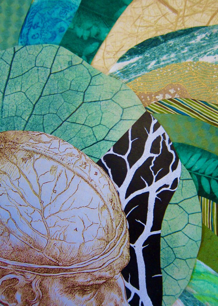
If I had the power to heal you, I would gather the softest banana leaves in creation and soak them thoroughly in shea butter. Then I’d wrap them round your head to cool and cradle your brain, drawing out the poison of self-punishing thoughts, soothing the pain, and smoothing the wrinkled loops of endless tormenting questions.
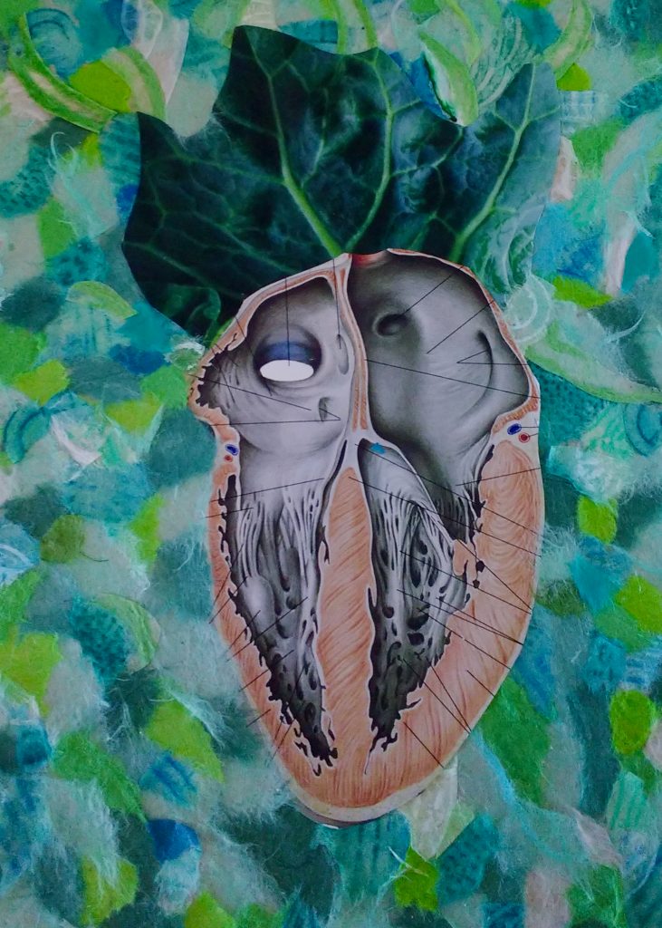
For your heart-wounds, I offer a poultice composed of clay, feathers, and ferns to press against your chest as if in prayer. The heart-poultice cannot mend the cracks, but it honors them with love. When the minerals and soft coverings touch your skin, they ease the hurt, giving you precious minutes of relief.
And for your whole body, a pool has been sunk into the cursèd room that most haunts you with memories. The pool is not very wide — the width of three ordinary bathtubs — but it is fathoms deep. The sides and bottom of the pool are made of peat-black marble, turning the water so dark that it gathers you into oblivion. When you sink into this personal well, the only things you experience are the present sensations of cool healing water, your steady breath, and the kind red beating of your heart.
(Thank you Sean McDermott for making the recording! For a physical or digital copy of Visualizations for Heartbreak, please contact Catherine Raine at cafrinie@yahoo.ca).
On a winter evening in 2011, I attended “Calling All Artists!” at Northern District Library. The massive turnout filled a huge meeting room and had staff scrambling to add rows of chairs to accommodate all the Toronto artists eager to learn more about exhibiting their work at the Toronto Public Library.
Four speakers talked us through the application process. The person in charge of TPL’s Art Exhibits went over the application form in detail. Greg Astill promoted the services of the popular Digital Design Studio at the Toronto Reference Library. Then we learned more about displaying our art to its best advantage from Carol Barbour, TPL Gallery and Exhibits Curator. Finally, Susan Cohen discussed the business and marketing aspects of the art profession. She generously gave us the benefit of her experience as Program Director for Cultural Careers Council Ontario.
I took away many helpful ideas from the information session, but two of them stand out the most.
First, Ms. Cohen emphasized the crucial importance of a clear and concise artist’s statement: “You need to know exactly what you are doing and why you are doing it.” If our marketing vision is not clear to ourselves, how can it be clear to our viewers and potential customers?
Second, Ms. Barbour advised us to demonstrate strong artistic commitment not only in the careful planning of exhibit details but also in researching the galleries and walls of the thirteen libraries to which we can apply. Our applications will be even stronger if we can make a case for why our work belongs in a particular space. To emphasize this point, one of the speakers said, “For example, large abstract works would not be appropriate for a small, intimate gallery like the one at Yorkville. They would be perfect for Northern District’s Skylight Gallery, though.”
As I was reflecting on the curator’s advice, it occurred to me that my library blog could facilitate the research element of the application process. (For new readers to Breakfast in Scarborough, I have visited, written about, and photographed all 100 branches). The thirteen posts listed below offer glimpses of each library’s unique atmosphere and should give TPL exhibit applicants a sense of which one might best showcase their work.
To check out the specific branches that host community exhibits, please click on the hyperlinks below:
Albion (photos in this branch were taken before the 2017 rebuild)
Oakwood Village Library and Arts Centre
Richview’s gallery was site of my first library art exhibit!
Three cheers for art in the libraries!!!


Once the reality of betrayal shatters the numbness, your rage awakens molten creativity and revives the blacksmiths and glassblowers of old. Your curses blast the forge and explode in the fire, where they transform into a glowing orb with fierce swirls of crimson, orange, and yellow.

The fiery globe is too hot for human hands to touch, and curious viewers must back away from its dangerous fragility. But when the orb cools, when it settles into itself, thousands will flock to this glass masterpiece, magnetized by its primal beauty.
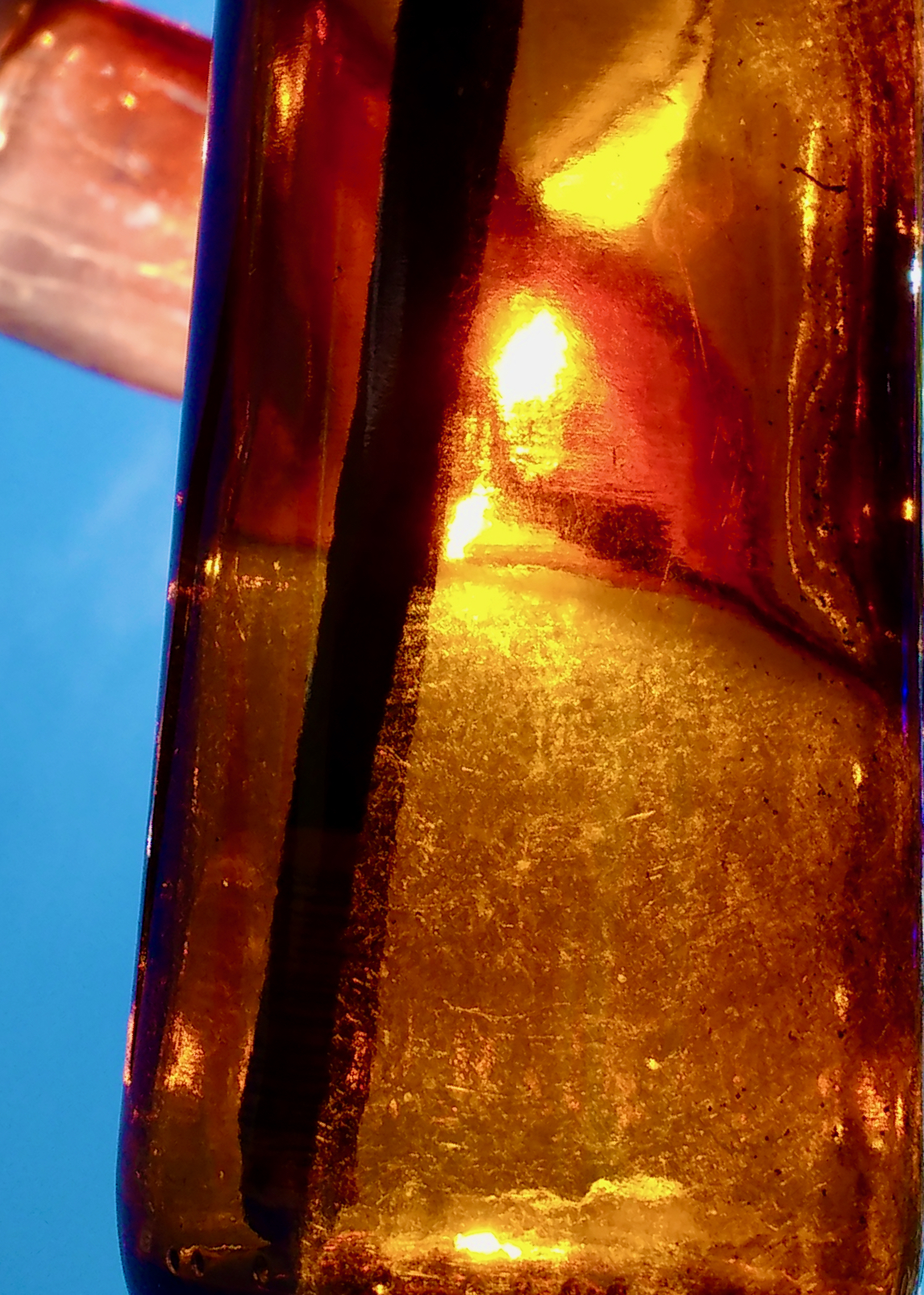
The rage orb electrifies viewers and powerfully connects them to the anger of our hurting world, for this beautiful object has been forged and burned and spun from the rawest materials on earth: the fury of the wronged and the anguish of the betrayed.
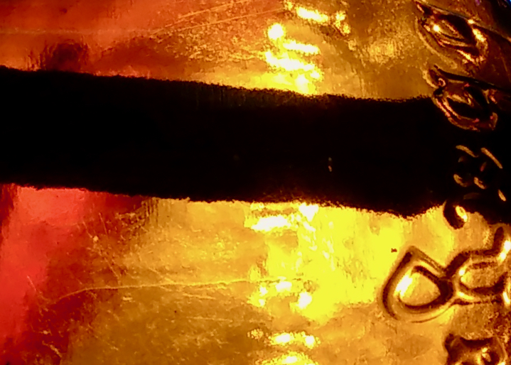
When the orb is tilted at different angles, flashes of violence appear, open wounds that seethe beneath the fragments of a shattered heart. Critics may find your art disturbing or claim it contains glints and flints of revenge, but I say, “No, not traditional revenge or actual violence. Only the satisfaction that comes from refusing to bury pain inside. It takes courage to harness anger’s explosive energy and hurl it into a new form, sowing seeds of fire into grief’s deep furrows.”
Although the orb’s creation has not exorcised anger for good, it has given you some peace. Its presence is a testament to the value of authentic feelings, no matter how uncomfortable, sharp, or bitter. As you navigate this strange land of loss, you bring rage with you, for it is a righteous guide that divines underground springs of truth.

(Thank you Sean McDermott for making the recording! For a physical or digital copy of Visualizations for Heartbreak, please contact Catherine Raine at cafrinie@yahoo.ca).

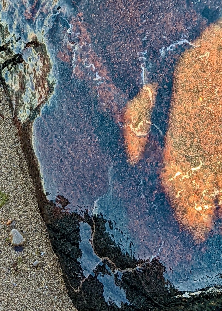


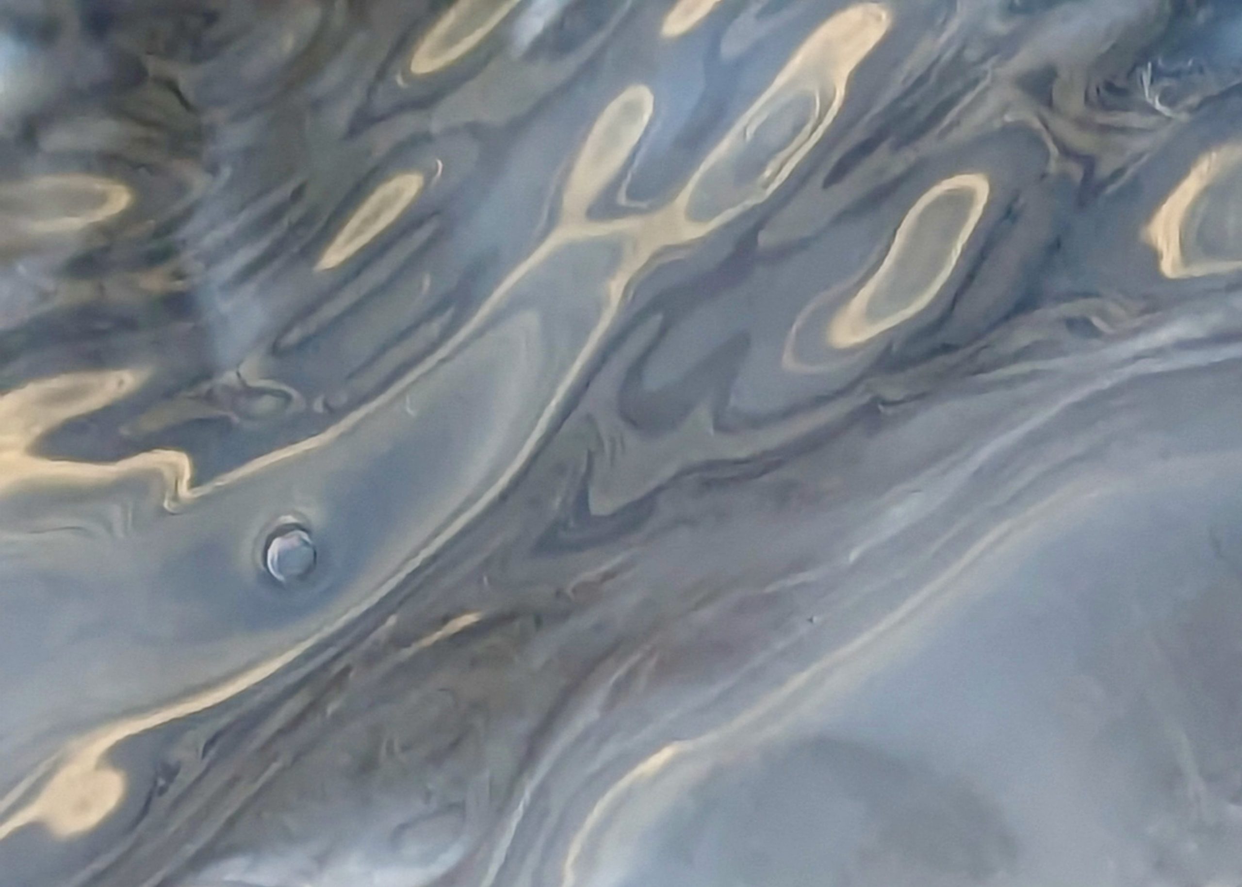
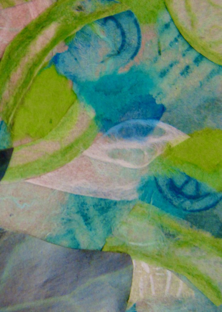
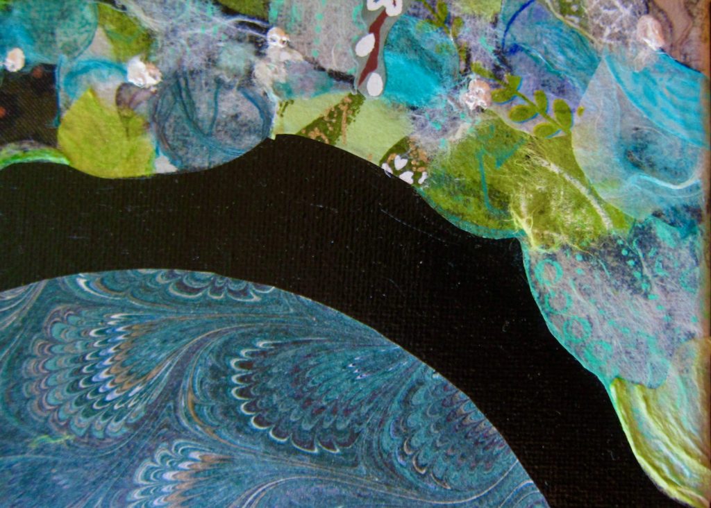
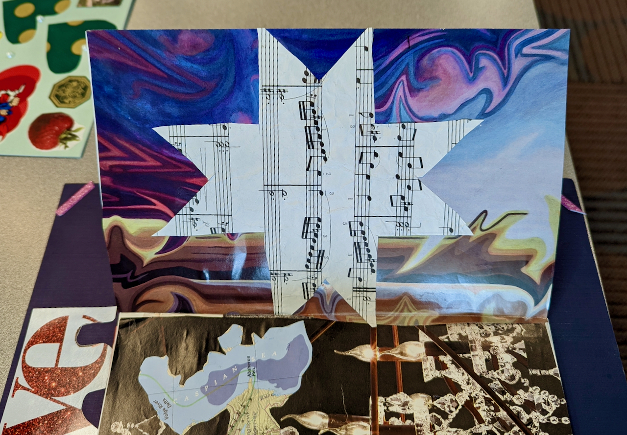
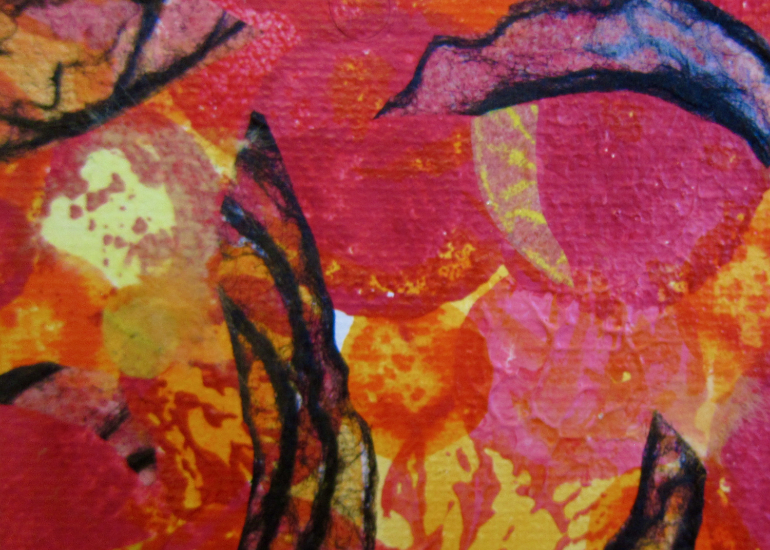
Last December I bought a painted wooden canvas that someone had donated to Value Village. After gazing at my purchase, I decided to follow some of the patterns of the paint swirls, adding tissue paper, thread, dots of acrylic paint, and handmade papers to the canvas.
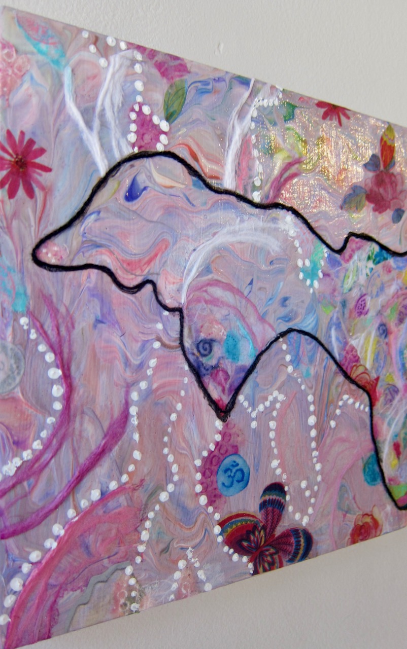
For example, the dark purple shape in the top left quadrant of the substrate seemed open to becoming the eye of an aquatic creature swimming through waving pink fronds and flowery fragments. Black thread was added to outline the imagined form of the creature, now called Colourfish, and make it more discernible.
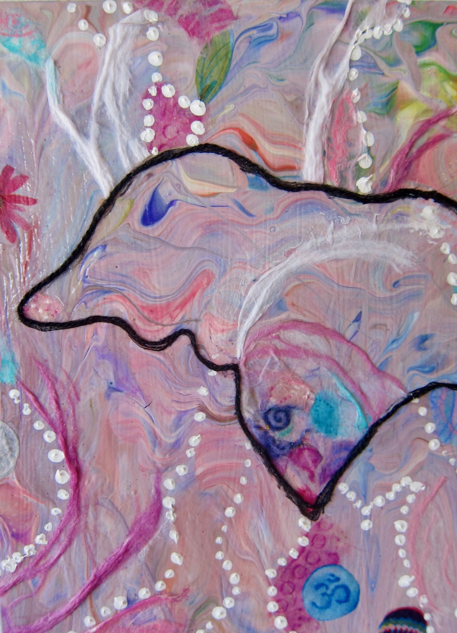
To the artist who gave their canvas to Value Village, thank you very much! If you had not lavished the board with violet, lavender, pink, green, and apricot paint, the Colourfish would not have found a habitat so well-suited to its playful temperament.
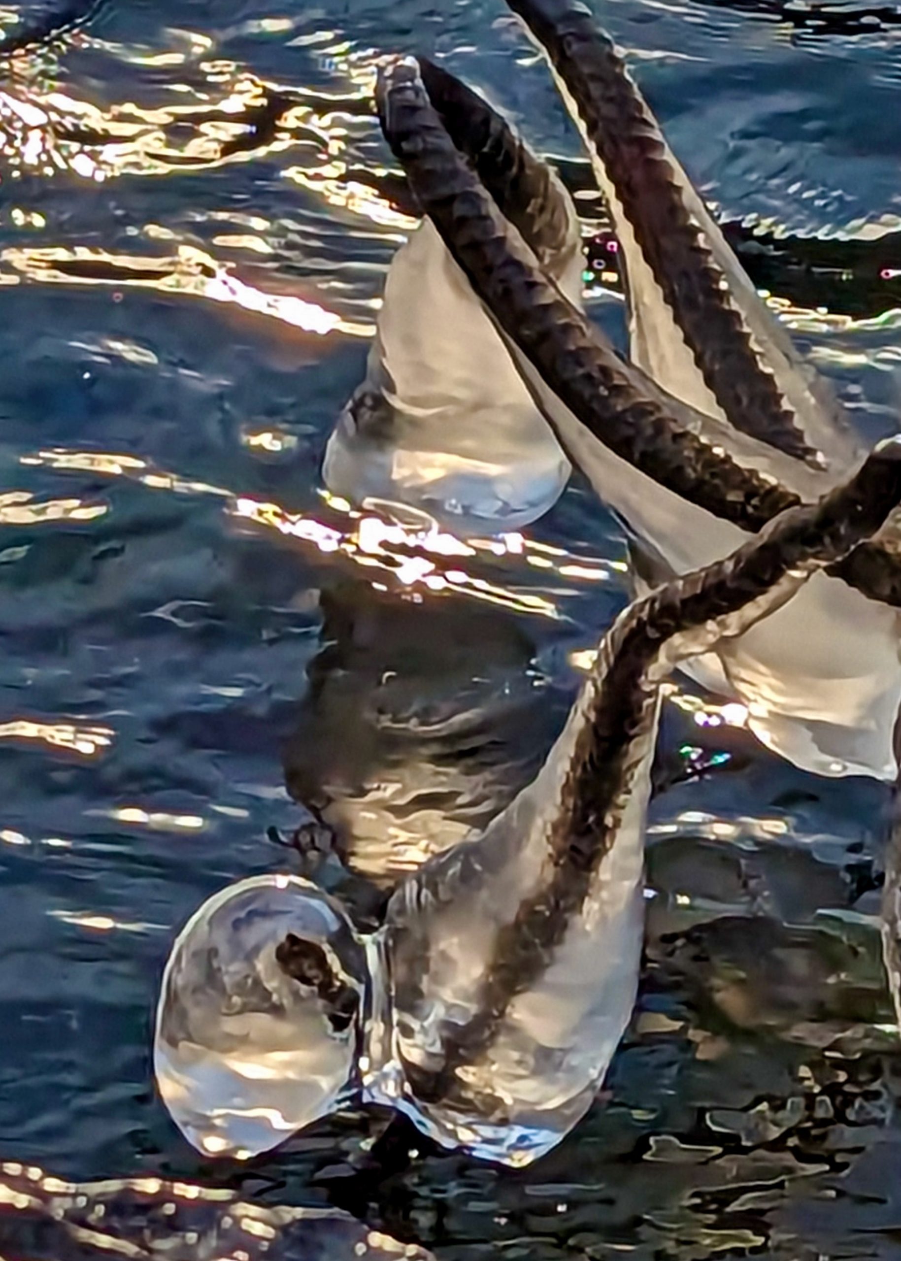
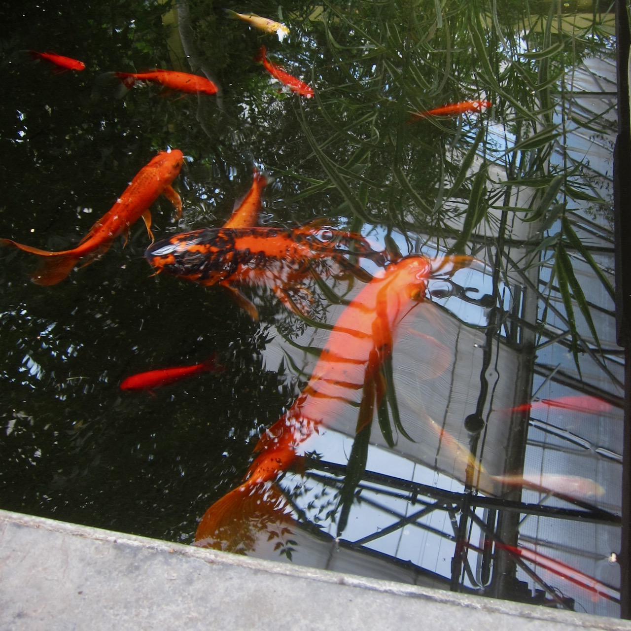
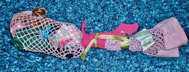
My friend Ellen made this cloth creature in the Art Gallery of Ontario’s cafeteria one day in 2010. As we talked, she sewed the sweet green eyes and fashioned eclectic ear-gills that poke through the pink mesh.
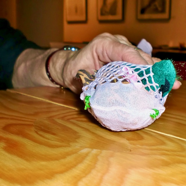
Thread, needles, fabric, ribbons, and socks spilled from two bags I had brought from home, and our heads bent over our work as we talked.
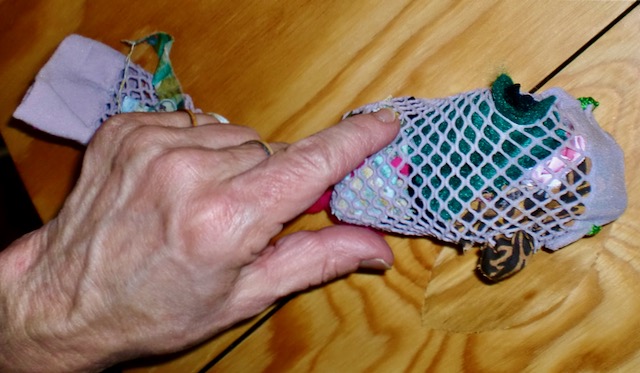
Before we left the gallery, I took some photos of Ellen’s creation. I love how her hand both protects and presents the sockfish. Animated by playful colours and textures, its energy is bright.
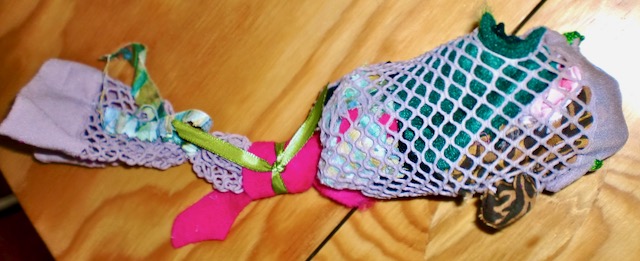
Expressing movement, personality, openness — it seems eager to be on its way, tail swishing in the current.
I treasure the memory of that artistic afternoon with Ellen and all the times we met to write, make collages, or exchange ideas. With character, originality, and grace, she practiced friendship as an art form. I’ll never forget Ellen’s creative and loving heart that continues to bless. I miss my dear friend.