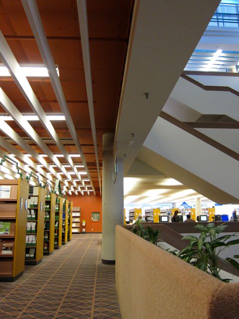
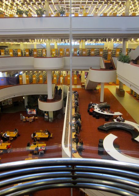
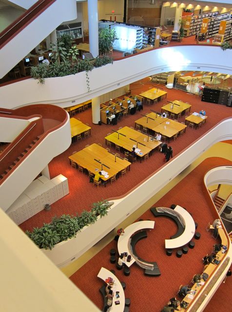
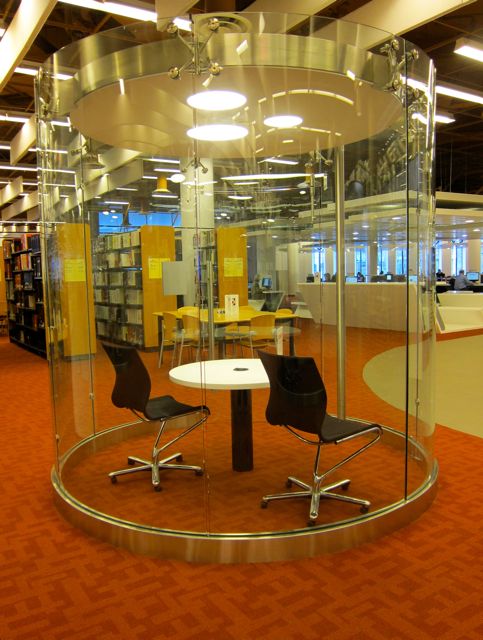
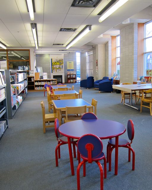
A popular floor at North York Central, Business and Urban Affairs was crowded with goal-oriented readers during my 2010 visit. All five private study booths were occupied and each available table was taken.
One group of three patrons was making a day of it in the library. Camped out around a low table in the northwest corner, their writing surface was obscured by water bottles, fruit, croissants, papers, and cell-phones.
2013
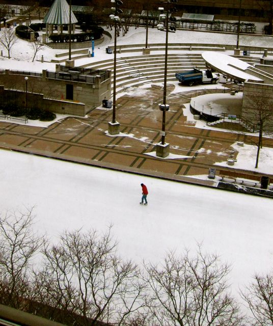
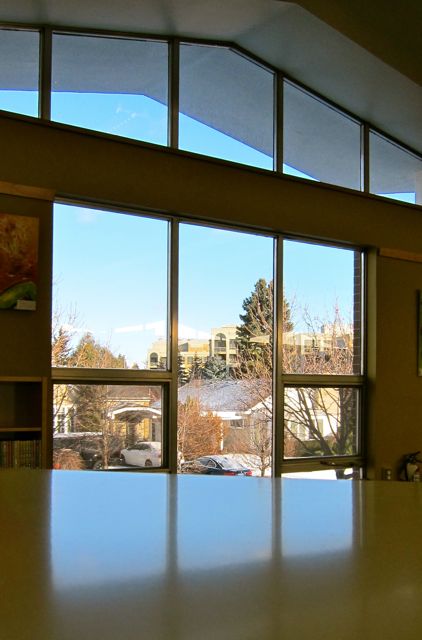
None of the window seats at the large tables along the south wall were available, for readers are solar, warmth-seeking creatures like cats and sunflowers. The view of Mel Lastman Square and its skating rink provided additional motivation to secure chairs by the windows.
2013
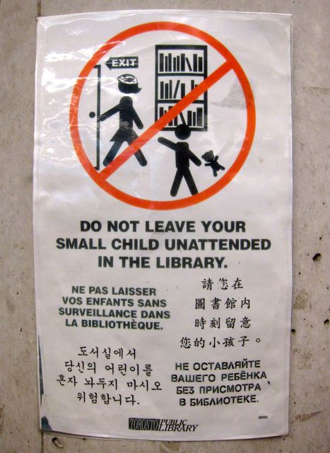
Notices in both English and Mandarin warned us to “watch our belongings.” The warning wasn’t unnecessarily alarmist; one time I actually heard an intercom announce that a wallet had just been reported stolen.
Focusing on the acquisition of wealth in more legitimate ways, a display on debt management suggested the following books: Tame the Debt Monster, Release from Debtor’s Prison, and Green with Envy: Why Keeping Up with the Joneses is Keeping Us in Debt. I also noticed a catchy title that stood out among other recommended books: How Come THAT Idiot’s Rich and I’m Not?
Wondering if the thief had been caught and then sent home with moral fables to study, I walked to down to the third floor, Society and Recreation.
When I arrived on the third floor, I was immediately drawn to the artwork on the walls near the large Native People’s collection. I especially liked a print by Jamasie near the first study booth on the north wall. My favourite detail of “Camp at Kangiak” was a face peering from the entrance to a tent.
“Camp at Kangiak” by Jamasie (Print of stone-cut)
As I walked beside the study cells, booth #5 suddenly became free, and I lit inside without thinking. Primal scholarly instincts had kicked into high gear, for I didn’t want to miss this rare chance to occupy one of the most coveted study spaces in the library.
Settling in more deeply, I placed my backpack and canvas bag on a high wooden shelf. Then I breathed in the pleasure of briefly owning this quiet, private room designed for concentration and productivity.
I reflected that the very name “Study Booth” was an ideal to live up to. If I played games on my phone or painted my nails, it would disrespect a cell devoted to cramming, brainstorming, or crafting compositions. And with the door and its wall made of glass, my study behaviour was also on display as an example to passersby.
After I reluctantly emerged from my booth, I headed over to the large newspaper collection. Over the racks was a prominent sign that showed a pair of scissors imprisoned by a thick red circle and a diagonal slash mark. Brazen article-clippers, Be Ye Warned!
2013
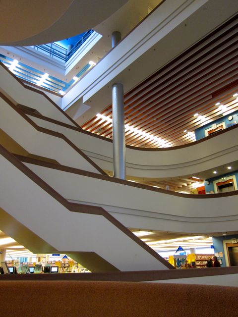
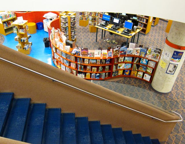
On the alert for naughty scissor-wielders, I descended to the second level, Language and Literature, taking some time to admire the overhead and underfoot views of the library.
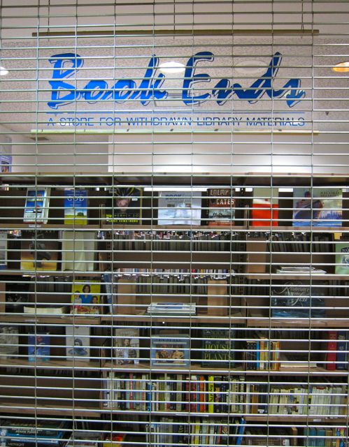
When I landed on the second floor, I gravitated towards a display cabinet filled with altered books. Located near the elevators, the exhibit had been created by OCAD students who had taken withdrawn library books (for sale at Book Ends on the Concourse level) and transformed them into art. The display’s centerpiece was a shredded-paper nest from which sprang some colourful paper birds.
2013
My other favourite altered book was “Flipping War” by Christopher Wong. He had chosen a battered paperback copy of The Boat and painted the pages in swashes of blue. Then he had drawn a series of pictures to create an animated story. As I flipped through the pages, I saw a ship and a shark with a saucy smile, a lurking submarine, and a small fish getting chomped by a bigger fish. Some rising jellyfish provided the final act before the words “The End” appeared on the last pages.
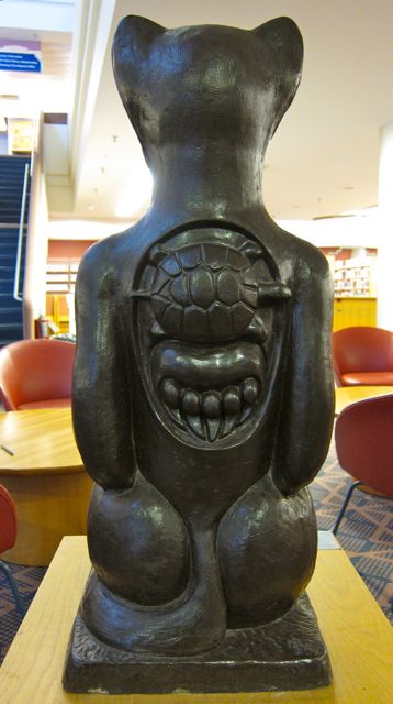
“Totemic Tribute to Pauline Johnson” by Karen Stoskopf Harding
In addition to the creatively recycled books, I was also intrigued by two Karen Stoskopf Harding sculptures with their backs to the elevator doors. One was called “Totemic Tribute to Pauline Johnson” (also known as Tekahionwake) and the other “Totemic Tribute to Emily Carr” (or Klee Wyck, “One Who Laughs).
Refreshed by art, I began orbiting the second floor’s outer parameters. In my travels. I came across a language learning lab and a piano practice room ($1 per half hour). The music lesson in progress added a textured dimension of sound that made the space come even more alive.
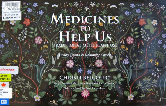
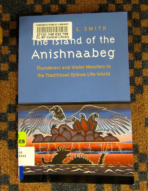
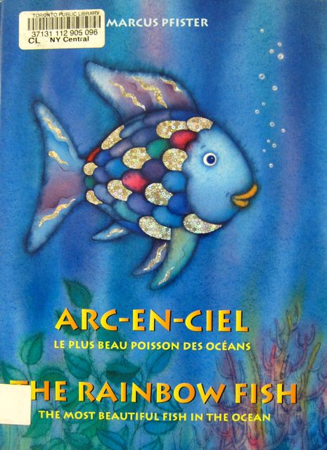
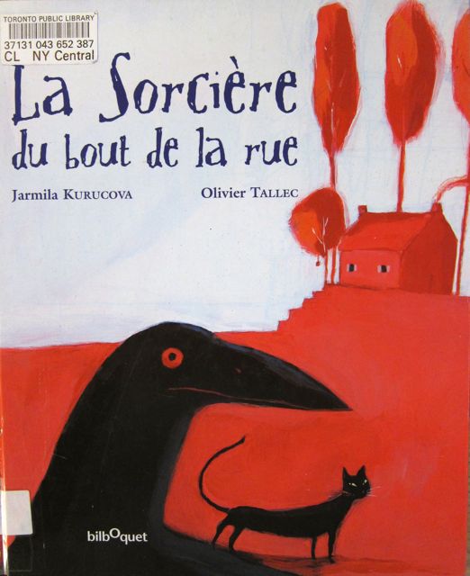
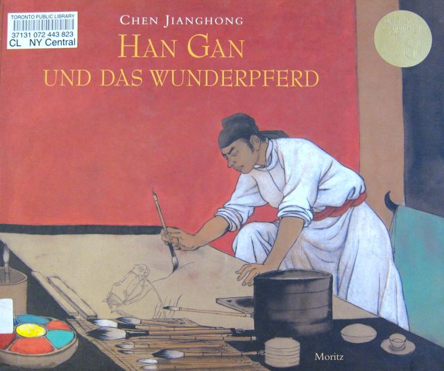
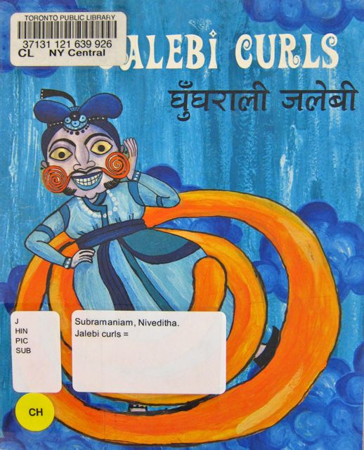
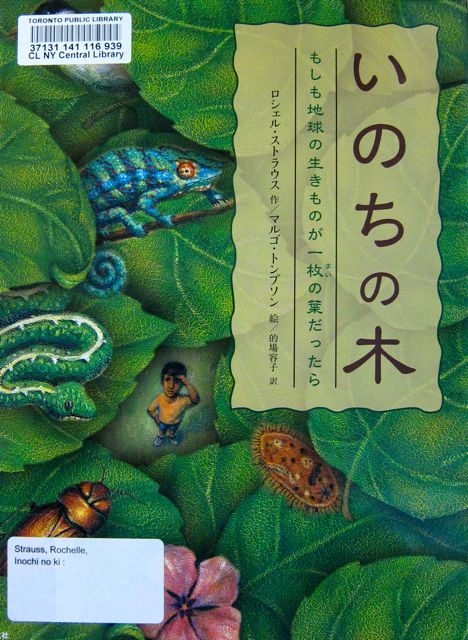
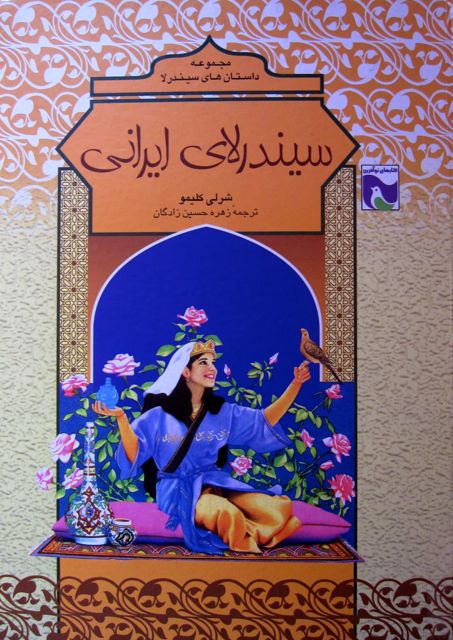
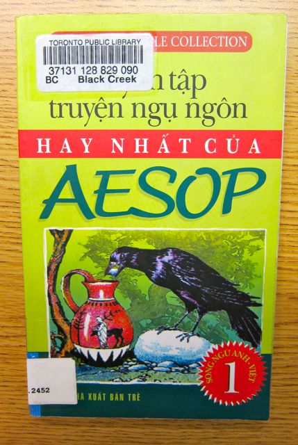
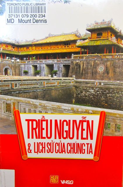
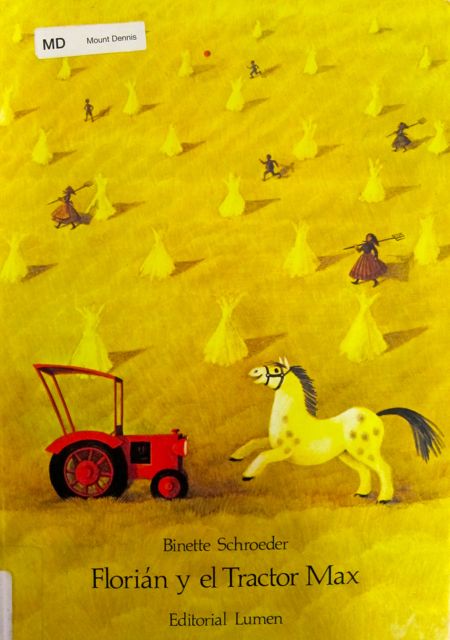
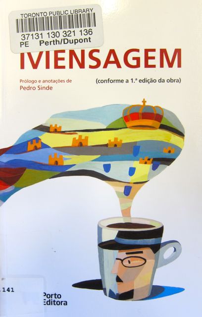
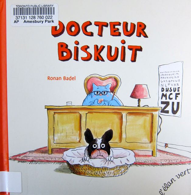
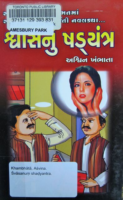
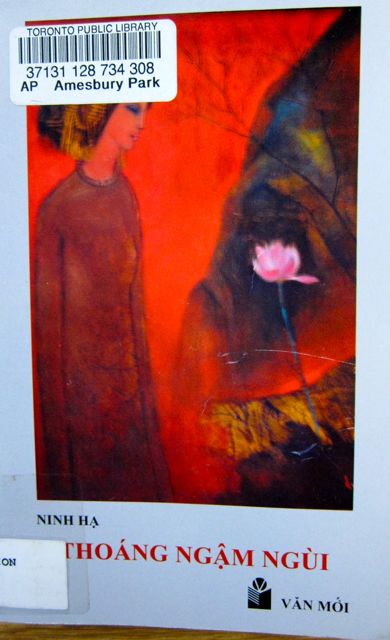
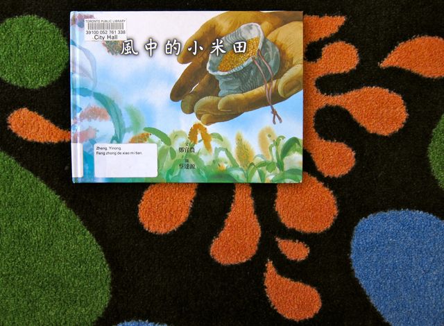
Note: This book and the examples of multilingual books which follow are actually from the first floor of North York Central (Children’s Section). I find that the children’s books usually have more interesting covers.
With piano scales galloping in the background, I investigated the central shelves and their astonishing range and quantity of multilingual materials. For example, the French collection, which included a great number of Livres de Poche, was vast.
North York Central also provided large collections in German, Hindi, Chinese, Korean, Russian, Serbian, Polish, and Persian. Languages with more modest representation included Japanese, Urdu, Vietnamese, Spanish, and Romanian. However, they had been at least been spared the fate of collections transferred to other TPL branches (Arabic, Tamil, Bengali, Greek, Gujurati, Hebrew, and Italian).
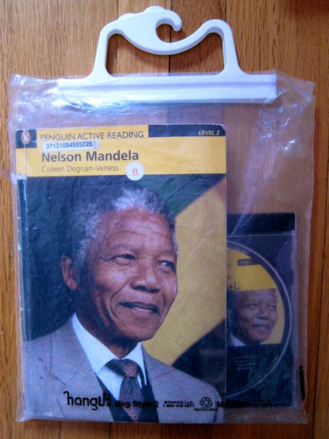
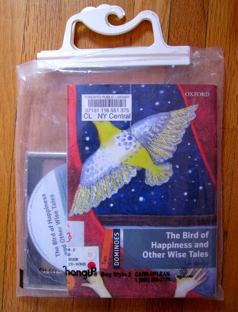
Despite sharing a floor with so many glamorous scripts and characters, practical ESL materials had not been neglected. A generous section of the west wall contained plenty of grammar, reading, and test-preparation resources. And a large cabinet was entirely filled with abridged ESL readers, graded by difficulty-level.
Enlivened by art, music, and languages, I let gravity draw me to level one, Circulation, Browsery, and Children’s.
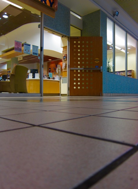
Intense movement and activity characterized North York Central Library’s circulation area when I visited in 2010. Long lines of borrowers resembled busy supermarket queues, and library staff were doing their best to hustle them through the check-out process. At least there were no price checks! (Self-service stations have since reduced the crowding in the entryway).
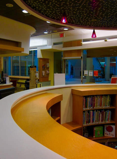
The restless pace of book borrowing was rendered more frenetic by the overstimulating decor. Bright colours and geometric shapes competed with the press of people and objects, leaving the eye with few places to rest. However, one structure provided a clear visual boundary in a disorienting space. It was a waist-high wall with red tiles.
2013
Shaped like a letter “s” that just kept on curving at the top and bottom, the red wall demarcated where the browsery ended and the Children’s Section began. Continuing the curve where the wall stopped was a red bookcase that also managed to undulate.
2013
Behind the red wall was a yellow castle tower with green eaves and a semi-open roof made of green boards arranged in a radial pattern. A gold ball capped the centre of the castle roof, which was approximately eight feet high.
On the floor near the entrance to the story-castle was a stone sculpture titled “Mother Bear and Cub” by E. B. Cox. This small but solid art object had inspired many young expressive artists, judging by the wild streaks of green, red, burgundy, pink, and turquoise crayon that decorated the stone bears. In my view, the colourful dialogue between sculptor and viewers validated the sculpture and further enhanced its appeal.
2013
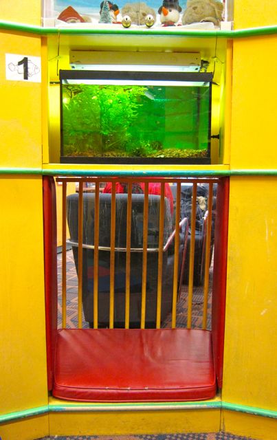
When I went to look inside the castle, I was delighted to discover four aquariums on the shelves. These fish tanks had been placed at mid-level on the castle wall, and underneath the shelves were two reading cupboards without doors. With cushions at floor level, the cubby-holes were the perfect size for a parent and child to crawl into and share a story. At the back of the reading nooks were wooden bars that created a non-threatening dungeon effect.
2013
The fanciful tower wasn’t the only story venue at North York Central’s Children’s Section; it also boasted a separate story-room. On the day I visited in 2010, the room was packed with youngsters and their caregivers listening to an animated educator. After she finished her story, she led the audience in a rousing rendition of “I’m a Little Teapot.” Nearby shelves contained more serious fare, such as The House that Crack Built.
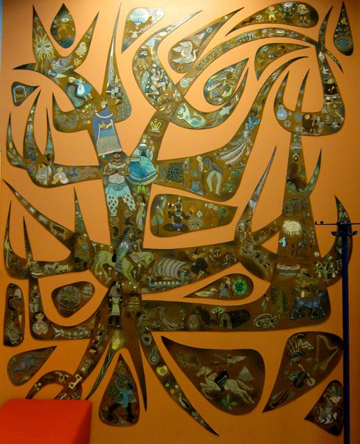
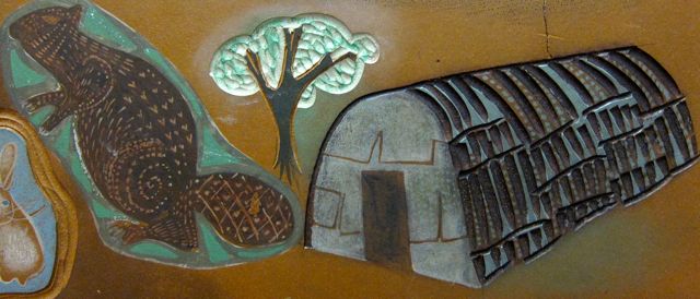
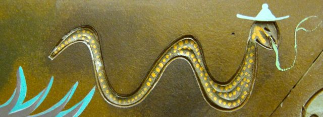
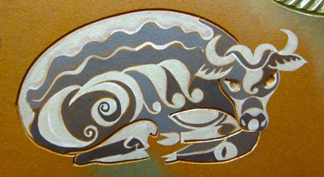
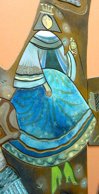
On the east wall near the story-room was a striking piece of art carved in the shape of an abstract tree with branches that arched up and out. Created by K. and L. Rix, the sculpture’s branches and leaves contained a vast range of figures from the animal kingdom, fairy-tales, myths, and First Nations and Inuit culture.
2013
It took me at least ten minutes to absorb the riot of images, for they were packed together in such close proximity that they competed for attention. Inhabiting the tree were the following entities: a winged mouse, a dinosaur, a jester, Pegasus, a giant beaver next to a longhouse, a Viking ship, Pan, a snake wearing a hat, a fairy godmother, a canoe, a peacock, a frog, a woodcutter, a yam-child, a warrior, a goddess, some bulls, a cat, and a queen (among others).
If I needed to learn more about frog kings or jesters, I could step right over to the large Children’s Literature Reference Section on the west wall, a category which I hadn’t seen at any other TPL branch (although Lillian H. Smith branch has a Children’s Literature Resource Collection). Equally impressive was a large collection of children’s books in French, German, Hindi, Chinese, Korean, and Russian. A smaller number of materials was also available in Arabic, Persian, Serbian, Japanese, and Spanish.
2013
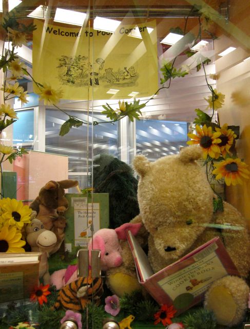
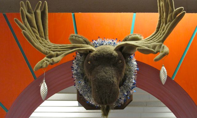
The final interesting feature on the first floor was a Kid’s Help Desk that combined whimsicality with informativeness. The curved desk was framed by claw-shaped side columns topped by teddy bears. A moose head loomed over the librarians’ heads, a creature with so much natural authority that no patron would ever venture to comment on his dangle antler-rings or sparkly wreath.
2013
Bidding good-bye to the moose and a monkey clutching a library program guide, I directed my steps to the Concourse Level.
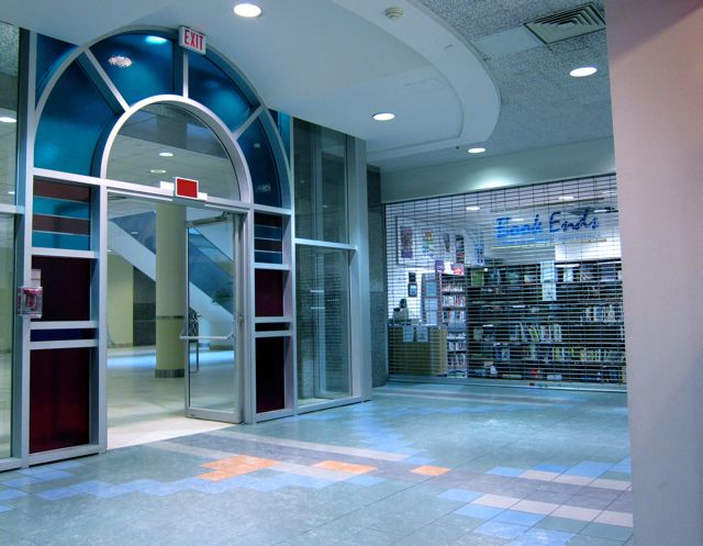
The two major attractions of North York Central’s basement level are Book Ends (a second-hand bookstore) and a spacious Study Hall with a view of Mel Lastman Square’s reflecting pool. The bookstore was closed on my first visit, so I focused my attention on the Study Hall.
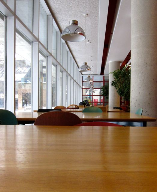
Five long tables worthy of feasting Vikings occupied the majority of the hall, and almost every chair was taken. It was fascinating how each student had created a miniature encampment to maintain personal space in a crowded area. For table-territory definition, the scholars had carefully piled up laptops, highlighter pens, bags of crisps, water bottles, dictionaries marked with fluttering sticky tabs, calculators, hefty textbooks, Starbucks cups, take-out boxes, and bottles of skin-cream. The study-forts proclaimed, “Breach these ramparts at your peril!”
2013
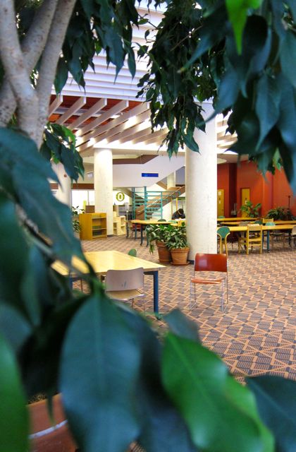
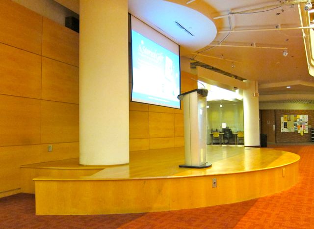
More tables lined the tall windows on the south side of the study hall. In addition, individual study carrels, a stage, and a few potted trees dotted the studyscape. One of the plants had been coaxed to sprout a post-it note.
2013
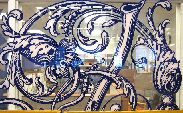
Capping off the room’s amenities, the Marget Canning and Jean Orpwood Adult Literacy Centre and the Talking Books Mobile Outreach Service beamed helpfully from the north wall and east walls respectively. I admired the calligraphy etched on the glass of the Literacy Centre’s windows so much that I was tempted to move some study carrels that were obstructing part of the artwork. However, I contented myself with photographing the visible lettering.
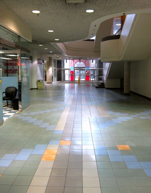
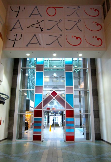
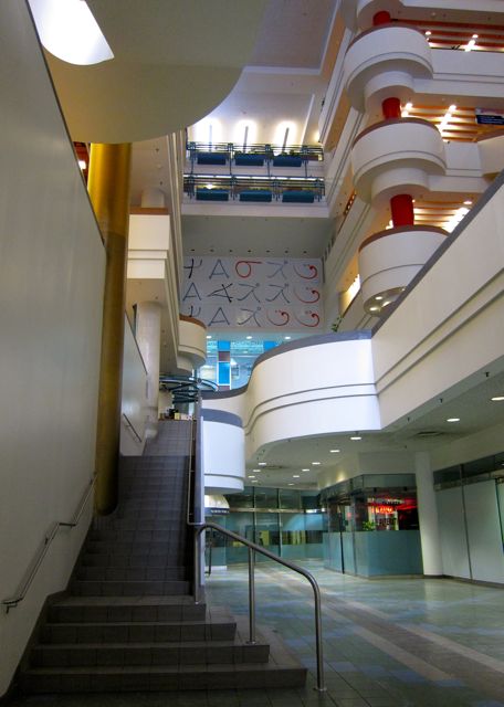
After exiting the east side of North York Central from the first level, I stood in the liminal space of the cavernous atrium. When I looked up, I saw a giant mural on the north wall over the main entrance from the mall. Three horizontal rows of five characters each repeated the letters and characters in different patterns. I recognized a couple of the scripts, but the meaning remained mysterious.
2013
Thanks to the library’s manager, Kim Huntley, I recently learned that calligraphy mural’s design was the work of a distinguished twentieth-century Canadian artist, Harold Town. According to a library information handout, Town “designed it for the exterior of the old Willowdale Library . . . (and) moved to the new Central library in 1987.” The frieze’s panels feature a Scandanavian rune, a Roman A, a Cree letter that resembles a plough, “the Chinese symbol for man, an L from the state of Assam in India, and a Semitic A turned on its side.”
2013
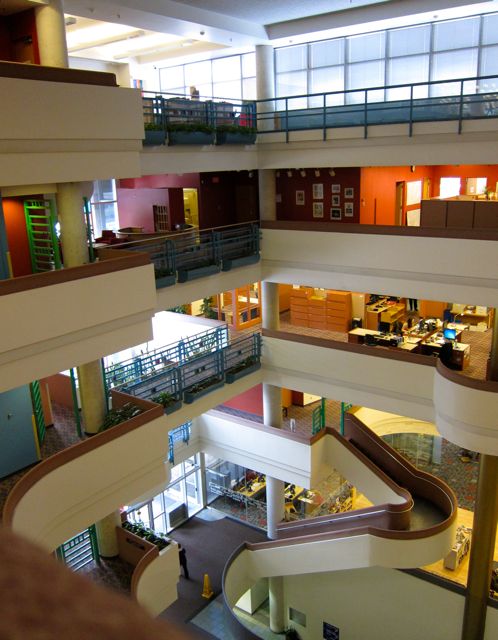
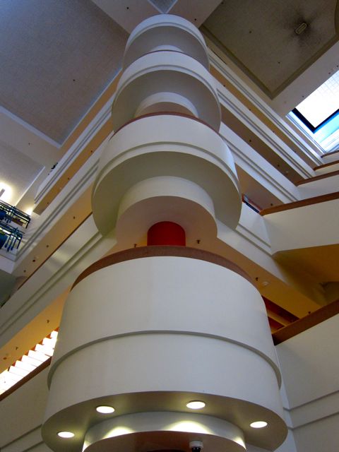
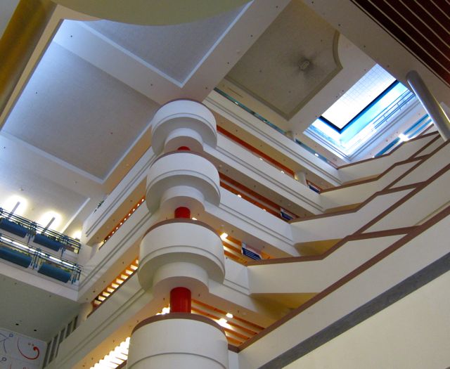
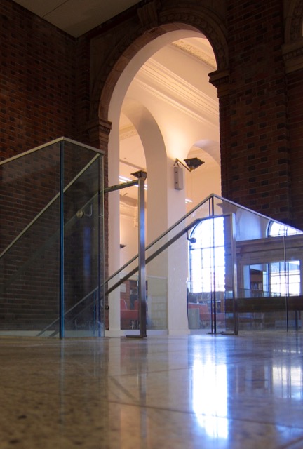
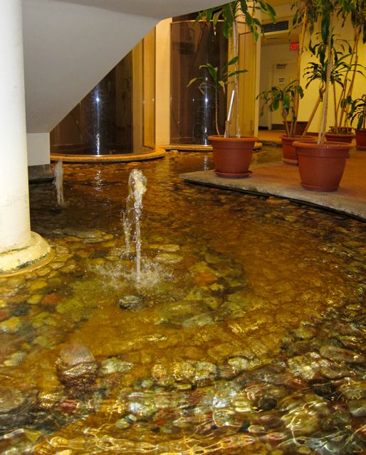
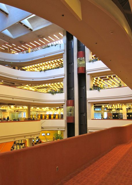
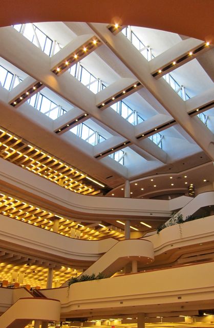
As I gazed at floors one to six in their entirety, I was struck by the layered complexity of the floors with their circular crow’s-nest nodules in the northwest corners, all stacked on top of each other and connected by a thick red column. From my vantage point, I could also see the carpeted sides of the many staircases, all in oatmeal pink. In contrast to the view from the sixth floor looking down, which reminded me of a pin-ball machine, the upward-from-the-concourse perspective felt seriously grand.
20132013
Pushing open the south doors that opened onto the square, I reflected that North York Central Library had just my secured my vote for one of the Seven Wonders of the Greater Toronto Area. I looked forward to returning again to explore the remaining six floors in more depth.
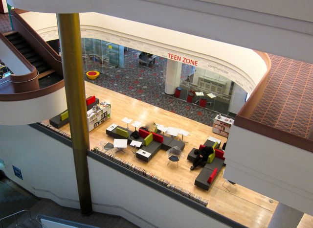
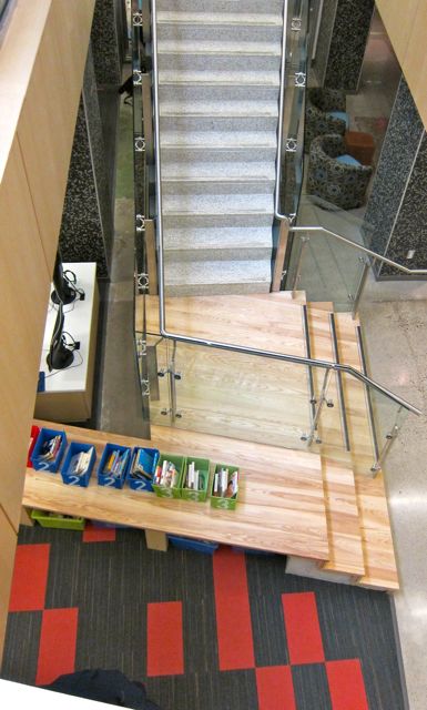
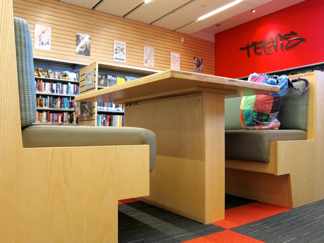
Due to a renovation in 2012, the Teen Zone looked radically different than it did on my 2010 visit. In fact, the difference was so striking that it called for a new blog post to describe it. Take, for example, the way the post-renovation zone resembled a cross-section of a luxury cruise ship when seen from above.
2013
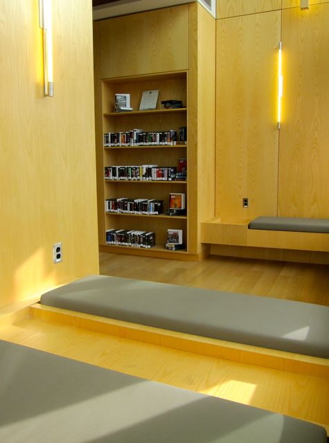
Nautical comparisons aside, the new Teen Zone has done North York Central proud, creating a sleeker and more modern space. I don’t miss the indoor gazebo, irritating mural in a fake graffiti font, or overall jukebox theme (a throwback to late 1970’s nostalgia of the 1950’s via Grease and Happy Days)
2013
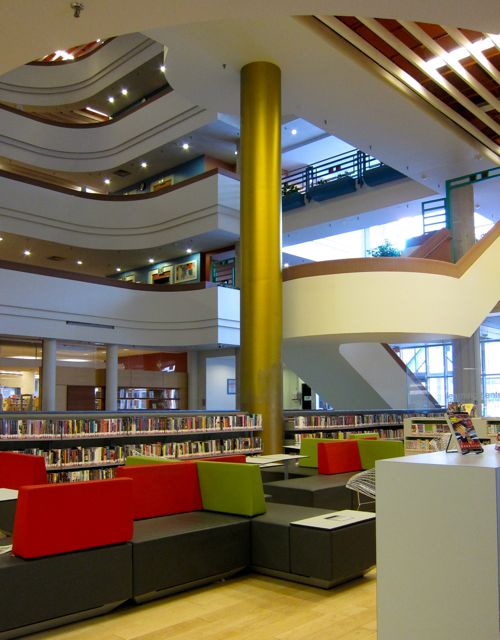
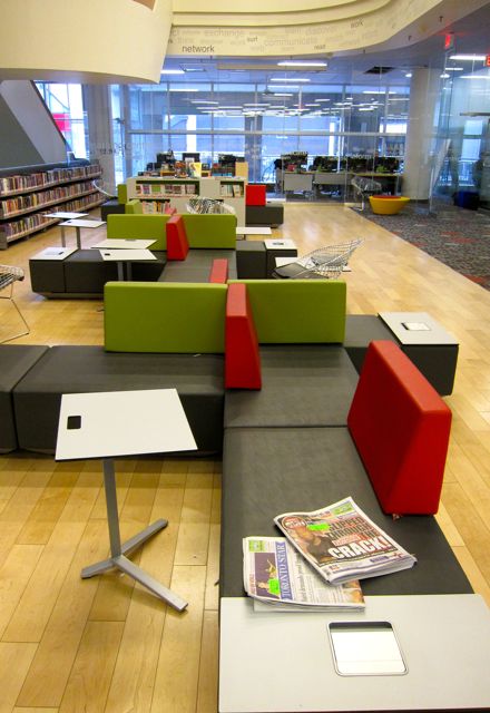
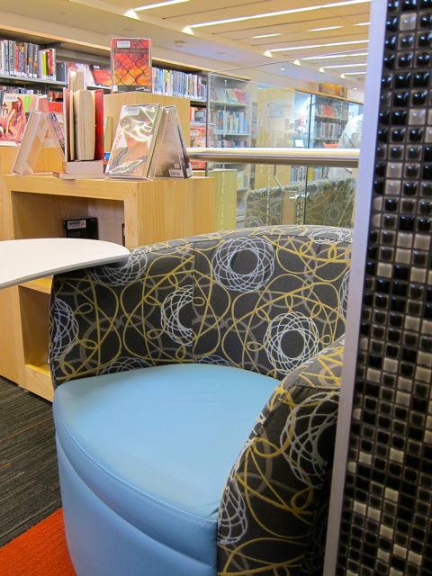
With the space less cluttered with jukeboxes and gazebos, it was soothing to see a long stretch of wooden flooring. I also appreciated the way the domino-like lounges invited the presence of both unstructured groups of sprawlers and quiet individual readers.
On my 2013 visit, I arrived just after nine on a Wednesday morning, but I had to photograph the area quickly because people were already pouring into the venue. (For privacy reasons, I avoid taking any photos of patrons). By 9:30, two out of three small study rooms were occupied, and the large study area and computer labs were filling up fast as well.
20132013
I wasn’t surprised by the Teen Zone’s popularity, for not a hint of stuffiness could be detected in the interior design. There was only a sense of spaciousness and freedom, a manifestation of limitless learning.
2013
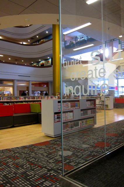
Indeed, it is a place where you can contemplate infinity while perching on a glowing custard-tart. And whether you are studying the techno-trippy carpet or gazing up at the pods above, the Teen Zone provides an imaginative setting for dreamers and scholars alike.
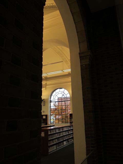
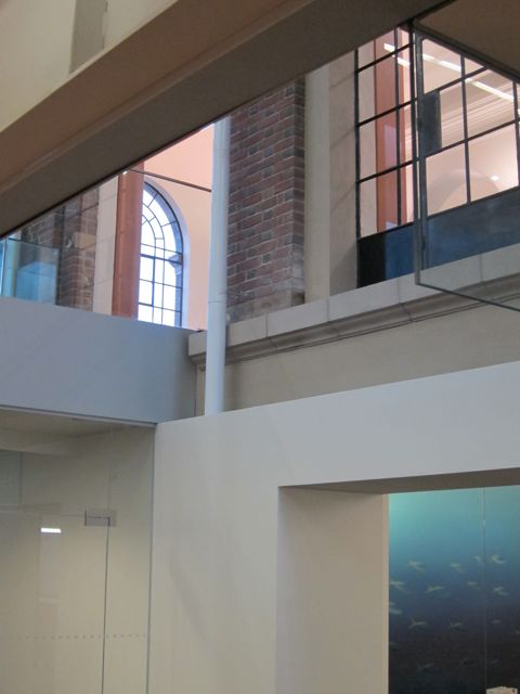
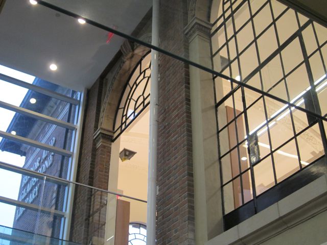
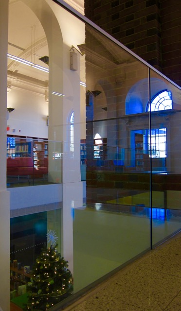
Debuting in 1913, dignified Bloor/Gladstone Library was the first Toronto library built without relying on fancy Carnegie grants. With $60,000 of city money, architects Robert Chapman and Alfred McGiffin didn’t hold back when it came to classical arches, cornices, and elegant mouldings. On my second visit in 2013, I entered Bloor/Gladstone with a sense of anticipation, adding my enthusiasm to that of a century of eager fellow patrons. I loved how the lobby was sparse and white, with nothing to distract me from the generous atrium and a host of large windows above and beyond.
20132013
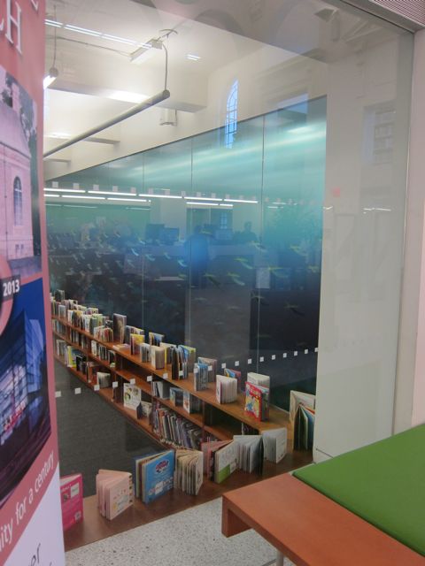
To my right was a Learning Centre with a south wall that reminded me of an aquarium-themed screensaver. The blue screen’s opposite side cooled the north wall of the Children’s section, which was half a level below the lobby.
2013
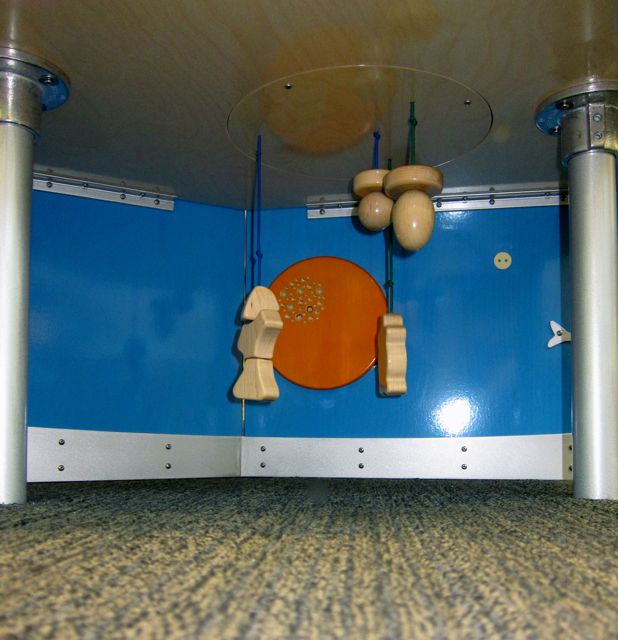
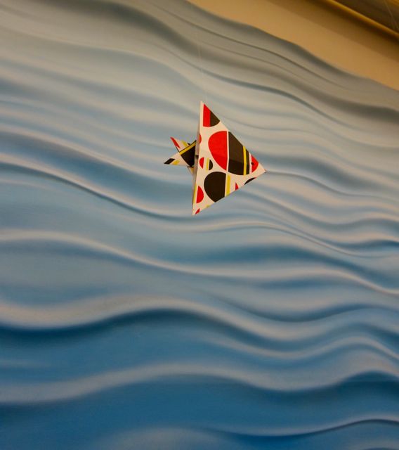
I liked how the designer of the kid’s zone had honored a reader’s need to perch and nestle. In a gap between two tall shelves was a long green cushion, perfect for sinking into a literary reverie or dialing a story. Another green cushion rested on the floor against a side wall near comprehensive windows overlooking an outdoor reading garden. Beside the cushion was a thoughtfully-placed table, so a reader could lean against the wall and place a stack of picture books or a silver thermos of hot chocolate on it.On my 2013 visit, I saw a new KidsStop wonder-wall which added considerable educational dynamism to the scene. When I sat on the floor to take some lower shots, I glanced under the table and discovered toggles that lower and raise a wooden turtle and a fish. With so many aquatic images in the lower level, flying origami fish adapted to the atmosphere with ease. I also appreciated the opportunity to see where the old and new sections of the building came together in a four-square of architectural fusion.
2013
Two flights of steps to the top level brought me to the east wing first, home of the Teens section. There, a historic stone hearth with protruding cherub heads shared a corner of the room with a big screen TV. I loved the tall arched mullioned windows whose sills were wide enough for teenagers to place their laptops on while resting their feet on a heater.
As I walked over to the middle section of the upper floor, I enjoyed looking over the atrium from above. Lining two sides of the ledge were rows of squat orange swivel chairs, decorous versions of spinning teacups at an amusement park. They even had clever side panels from which a desk could be pulled out like the trays airplane chairs provide for cups of soda and pretzel sticks.
Before I crossed over into the 2009 cube-shaped addition, I noticed a matching hearth to the one in the Teens area, complete with attendant cherubs. Many readers had gathered there, so I didn’t want to disturb them by taking a picture.
2013
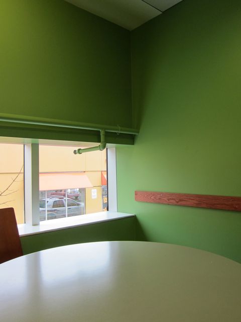
I found yet more readers in swivel chairs in the west wing, although this time they were green and placed in front of the north windows overlooking Bloor Street. The newest wing of Bloor/Gladstone also contained an impressive variety of language materials, including French, Chinese, Vietnamese, Portuguese, and Spanish. Finally, along the west wall were three engaging study rooms with green interiors and round air ducts (also painted green). I made a vow to reserve Room B one day and revel in the studious atmosphere, alive with creative possibilities.
2013
Until we meet again, Bloor/Gladstone, please stay as elegant, dignified, and self-sufficient as you have for a solid hundred years. Thank you for representing the best of the last century and embodying the promise of the current one.
To enrich your Sheridan Mall shopping experience, check out Black Creek Library on the lower level between a denture clinic and a dry cleaners. A resident of the mall since 2002, Black Creek branch shares its architect, G. Bruce Stratton, with fellow mall-libraries Woodside Square and Bayview.
2016
When I visited Black Creek for the first time, I found its cream and brown colours very inviting, drawing me into a comfortable mall-cave. Stratton’s website had not been exaggerating when it described the library’s design concept as “bright and warm with flowing lines.”
2016
Responding to the coziness, the patrons looked at home in the newspaper lounge and the branch as a whole. Every computer was taken, including one screen that was surrounded by a spirited group of kids hooting at You-tube videos.
2016
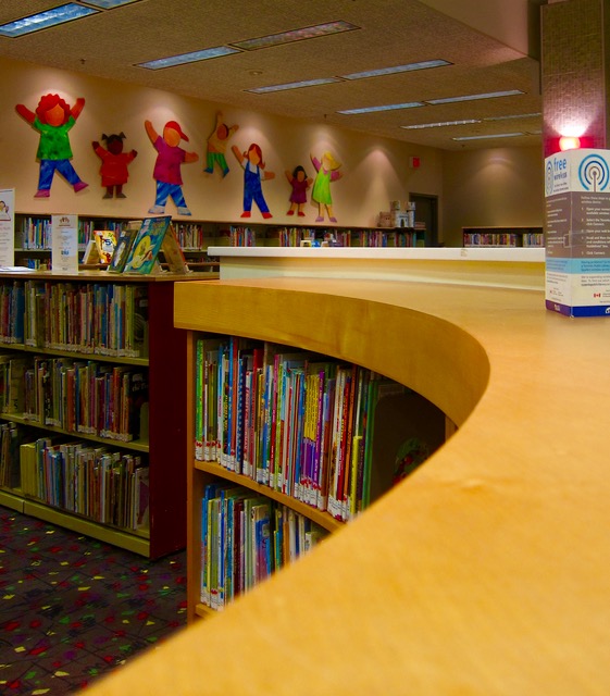
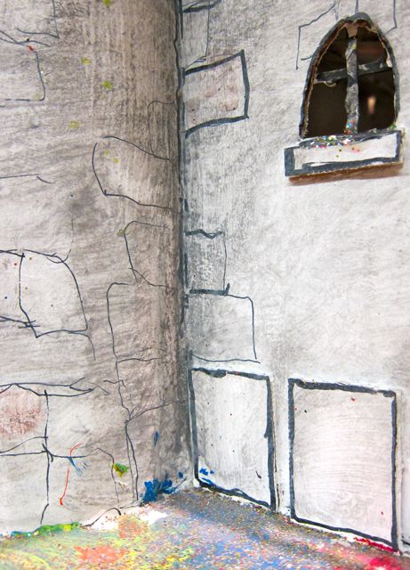
Liveliness was further supported by a dragon with flame-shaped eyebrows, a nearby pink rocket, and a series of wooden cutouts on the north wall that depicted happy kids with their arms up in the air. Two grey cardboard castles provided slightly more subdued decoration, but a closer look revealed a courtyard that sparkled with glitter.
2013
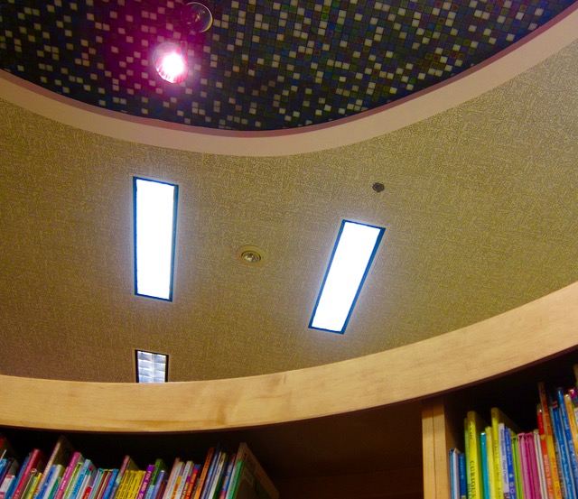
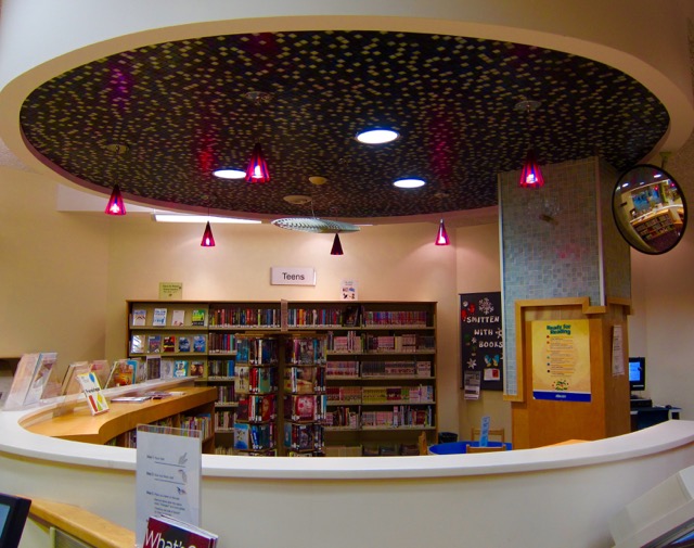
The most distinctive feature of Black Creek was a magical reading zone whose borders were defined by a semi-circular wall about four feet high and a tiled pillar. This shiny pillar supported a round structure overhead that resembled a tiled shower-head. Hanging from the structure were delicate lights enclosed in purple and dark-red glass. Shelves built into the inside curve of the wall completed the stylish nook.
201620162016
My husband was getting library-weary after visiting three in one afternoon, so before leaving I just took a quick glance at the ESL collection (meaty) and the multilingual shelves (diverse). Languages on offer were Spanish, Italian, Chinese, French, and Vietnamese.
As we left Black Creek, I reflected on how its presence at North York Sheridan Mall influences the overall atmosphere. When I saw my first mall library in Canada eight years ago, I considered the idea somewhat odd. Borrowing books seemed out of place in a zone where everything else was for sale.
However, I’ve come to appreciate the fact that mall branches like Black Creek, Bridlewood, Eglinton Square, Bayview, Woodside Square, and Maryvale provide welcome patches of public space in a larger establishment devoted to private profit. In this way, a library “redeems” a mall instead of becoming compromised by its commercialism. In my view, we need these literary reminders of the immaterial — ideas, imagination, poetry — in a world obsessed with the material.
Finding a parking space on Bloor Street West near Royal York Road was challenging, but my luck changed for the better when I walked into Brentwood Library for the first time. By coincidence, that particular Saturday in 2009 just happened to be Christmas Open House day!
With an angel-topped tree, carols playing in the background, and a festive cinnamon aroma heralding the presence of hot apple cider, Brentwood created a joyful holiday welcome for its patrons. Transcending a tired attempt to go through the motions, the Open House struck me as genuinely hospitable, especially when one of the librarians stationed herself behind the cookie table to serve the cider personally. Complementing the classic Christmas scene was the 1950’s atmosphere of the branch, which the clock above the hearth exemplified.
2009
Lest this solid 1955 building seem too stodgy at first description, its sunny attic was anything but heavy or repressive. A very calming, open space, it was the perfect home for the children’s collection. I spent a few minutes enjoying the attic’s high ceiling before I walked back downstairs and then descended one more flight.
As I approached the basement level, several murals painted on the stairway walls caught my eye. The bright colours provided a visual transition into the cozy room that housed the teen section as well as the Polish and French offerings. Selecting a French film and a quilt book, I returned to the cinnamon cheer of the main level for check-out.
2009
Four years and one massive renovation later, I encountered Brentwood branch for the second time. Its astonishing transformation had me asking, “Brentwood, is it really you?” However, the welcoming atmosphere and uplifting attic provided reassuring links to the Brentwood of old.
2013
A helpful staff member told me that the former attic ceiling had been salvaged and reconstructed to shelter the east side of the upper floor, further emphasizing the continuity between Brentwood’s “before and after” profile.
2013
As an enthusiastic fan of stained glass, I found much to appreciate in the windows of the large central space upstairs. The green and blue panes overlaid the morning’s study sessions with a blanket of peace.
20132013
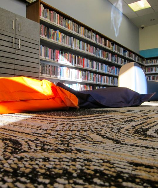
Post-renovation, the teen area had been promoted from the basement to a corner attic room that was perfect for communal study or private daydreaming. The purple and orange cushions lying in a patch of sunlight validated a reader’s need to flop on the floor with a book.
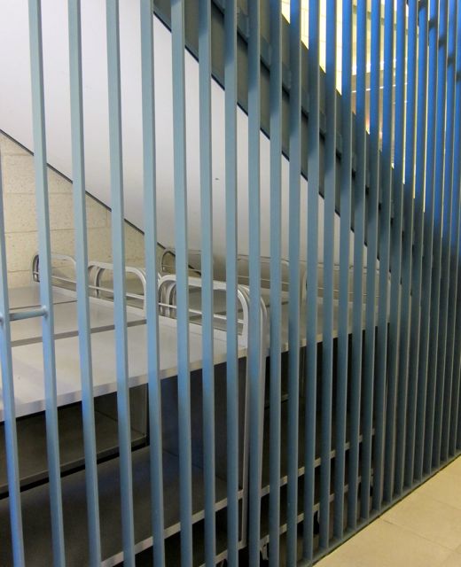
Walking down the stairs to the lower level afforded an opportunity to contemplate a majestic tree from the landing’s window and the rehabilitation of the library’s naughtiest carts (stored under the stairs near the ground level emergency exit).
2013
Arriving on the lower level, I found the south wing to be a classy place to browse for music, read the newspaper, or marvel at an original Group of Seven painting above the hearth.
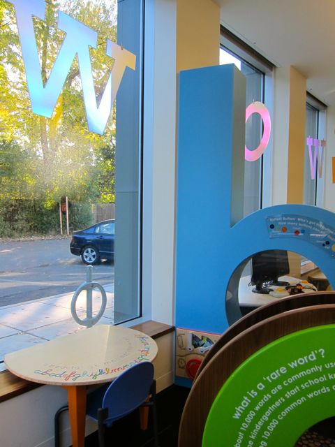
On my previous visit, the children’s section had been in the attic, but now it cheerfully inhabited the north wing of the ground level. Large letters glowed with light from tall windows and supported a phonics-inspired playground under the KidsStop logo.
2013
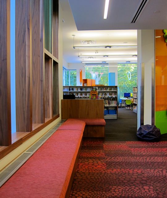
Providing continuity with the upstairs decor, stained glass on the north windows promised a colorful sunbath for patrons who chose to rest on a window bench. Situated slightly below sill-level, it was an inviting location to read in English, Polish, or French.
2013
When I left Brentwood after my 2013 visit, I felt thankful for its reader-friendly furniture, gorgeous windows, soaring ceilings, and hospitable staff. This branch is a veritable civic treasure .
When I was a tourist and potential immigrant to Toronto back in 2001, I spent several hours at the Toronto Reference Library marveling at its astonishing size and the range of its collections.
2013
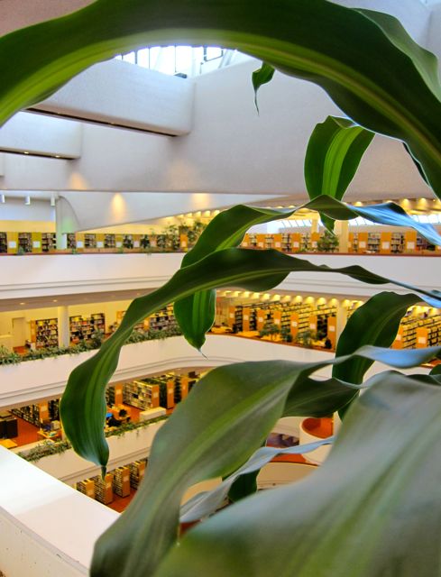
I remember riding the glass elevator facing the curved glass, watching the inner canyon expand to reveal the silent opera-stage of readers as I rose to the top floor. I have visited Toronto Reference Library many times since 2001, and I never tire of this elevator ride.
2013
From the upper ramparts, the library seems like a dollhouse for miniature patrons. However, many riches can be discovered close to the ground, such as the main floor itself, the steps leading to the podium, and calming pools encircling the feet of two staircases.
The main floor is also home to an extensive computer bay, BookEnds South and the TD Gallery. Photo taken in 2013.2013
On the second floor, Humanities and Social Sciences shelves reside next to the classy Bram and Bluma Appel Salon. Additionally, this floor offers a breathing green wall, space-age study pods, and plenty of globes in the maps section.
2013
Currently, a major renovation is in process at Toronto Reference Library, which lends an exciting feeling of flux and change to the third floor. With cabinets temporarily uprooted and wide stretches of floor space cleared, new opportunities to see the library’s fundamental lines and shapes reveal themselves.
2013
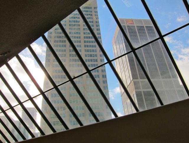
Not only does the third floor contain materials related to Business, Science, and Technology, it also provides scope for gazing at the massive cosmic waffle of the skylight ceiling (symbolizing the creative tension between pragmatism and idealism).
2013
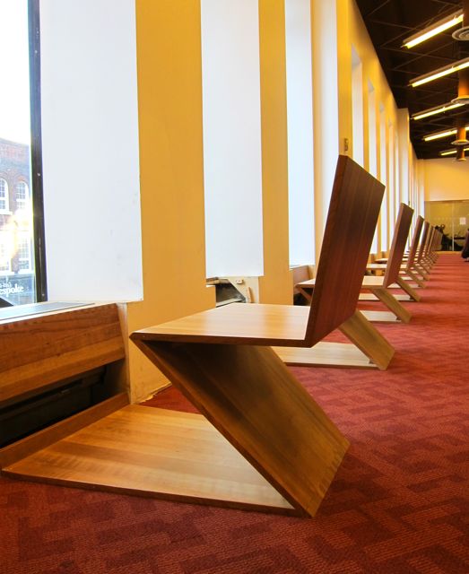
Wooden seats shaped like reverse Z’s on the third level appear appropriately businesslike, but they also offer front row tickets to the perpetual theatre of Yonge Street.
2013
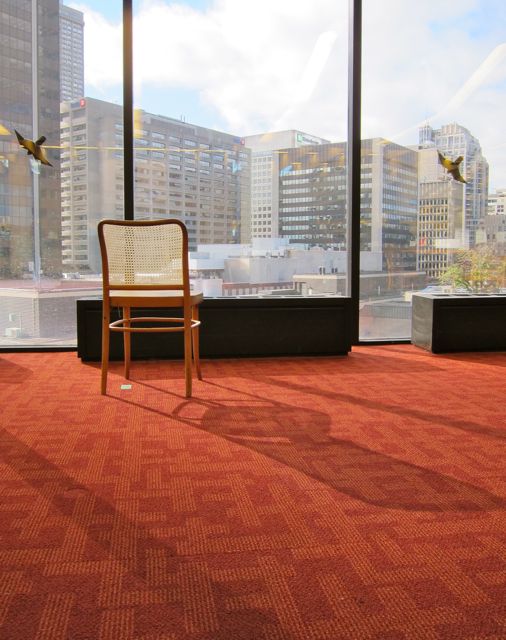
The windows of the fourth floor link scholars of Languages and Literature to the world of skyscrapers in a dramatic way. Further inspiration can be found in the amazing diversity of languages available for study on this floor. The following is only a sample of the breadth of the multilingual collection at Toronto Reference Library: Arabic, Czech, Danish, Hungarian, Latvian, Bengali, Croatian, Finnish, Marathi, Romanian, Slovak, Afrikaans, Albanian, Amharic, Armenian, Basque, Esperanto, Frisian, Irish, Malayalam, Maltese, Somali, Swahili, Telugu, Welsh, and Yiddish.
Once again, I bless the renovation for creating islands of expansive floor space upon which light can play. Photo taken in 2013.
The fifth and highest floor, host to Arts and the Picture Collection, also evokes wonder with its lofty perspectives of the city. I am especially fond of the Picture Collection, for it reminds me of rewarding hours spent gathering images for a friend’s eulogy and a memorial collage project.
20132013
Toronto Reference Library, you deserve a standing ovation for delivering inspiration, information, and peace in the heart of downtown Toronto. Thank you for welcoming me here at the turn of the 21st century.
Since my first visit to Mount Dennis in 2009, the branch has undergone a dramatic transformation. Although I missed the official post-renovation celebration in March of 2013, I still felt excited to see a brand-new library housed in the shell of the old one when I returned to take photographs in November 2013.
I liked how G. Bruce Stratton Architects combined grandeur and accessibility with classical columns and the wide open staircase in the centre of the building, all within the limits of 11,350 square feet.
As I walked the perimeter of the main floor, a variety of stylish yet comfortable reading perches presented themselves.
The Urban Living Room along the west wall lived up to its name, for the patrons there looked at home and relaxed. The only exception was a man who became so flustered when his cell phone rang that he darted out the emergency exit, only to set off the alarm, which flustered him more deeply.
Further along the west wall near the entrance were some unoccupied benches. While I was taking pictures there, a curious patron asked me what I saw in the benches. I told him that I enjoyed the play of light, the angles, and the shapes. This led to an interesting conversation about photography, art, negative space, and the importance of libraries. It was great!
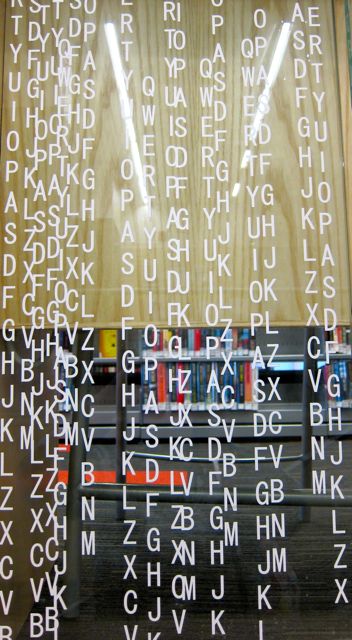
After giving the man my card, I went downstairs to see the Children’s Area and Program Rooms. Gracing the inner sides of the rectangular frame that contained the stairway were alphabet streams flowing with cascades of vertical letters.
With a large space devoted to a KidsStop early literacy centre, the lower floor was alive with colour. According to the information leaflet that the branch head kindly gave me, “Photography is the theme” of Mount Dennis library’s KidsStop. “For many years the Kodak plant, now closed, was a major fixture of the community.”
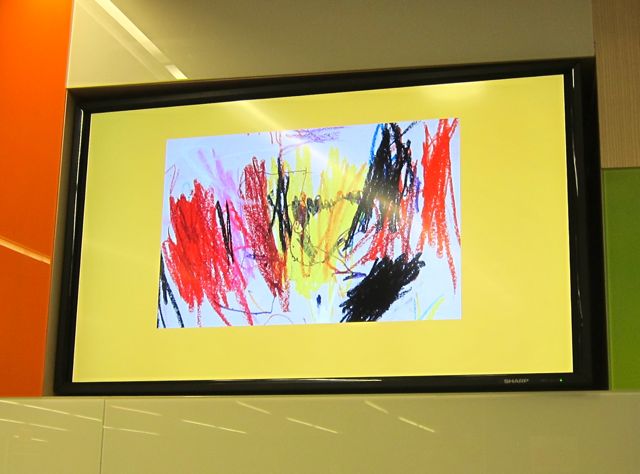
A media wall invited engagement thanks to its screens with photo loops, a reading nook, and even a puppet theatre. I especially enjoyed seeing the children’s artwork chosen for photo-loop display.
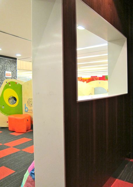
Puppet theatre patiently waiting for puppets.
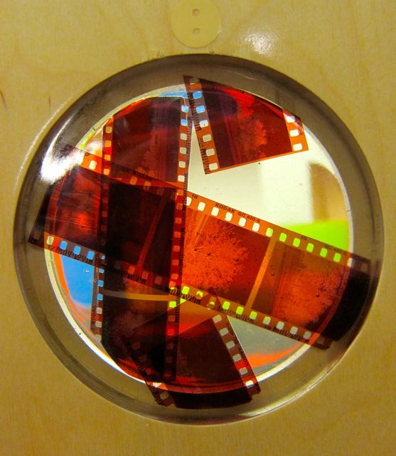
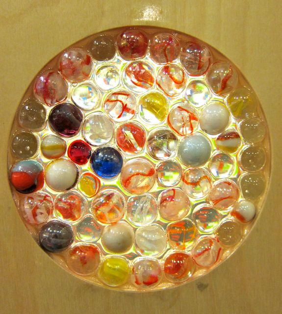
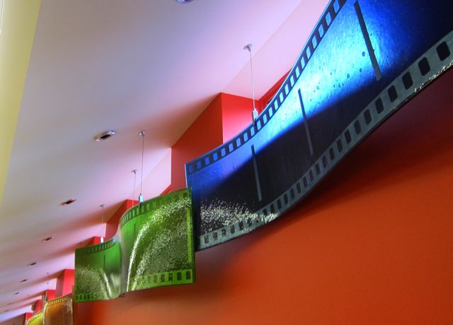
KidsStop’s wooden “kiosks” offered great educational fun with an artistic flair. The marbles, film strips and stained glass struck me as particularly imaginative details.
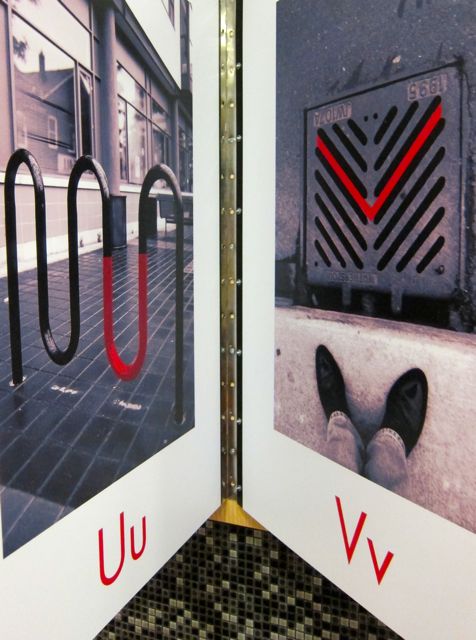
Secured to the wall for easy page-turning, Zoran Milich’s The City ABC Book inspired fresh visions of literacy. I loved the way this giant book taught me how to look for letters in the shapes and forms I encounter every day in the city.
The City ABC Book by Zoran Milich
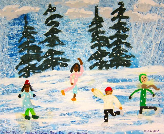
In a large room behind the KidsStop, potential for puppetry was increased with the presence of a puppet hut. It was also a place to view old photos of the neighbourhood and local artwork by students from Bala Public School.
When I wrote my first post about Mount Dennis in 2009, I described it as art-friendly, and I am so glad that the new version of the branch has stayed true to its dedication to celebrating children’s art.
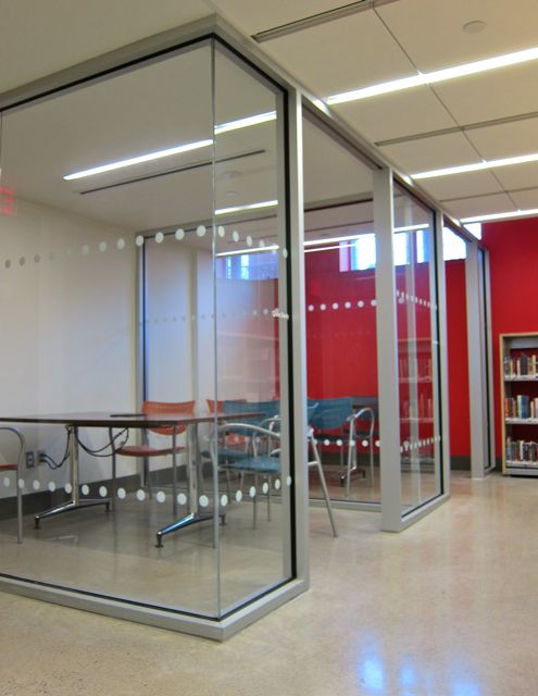
In the northeast corner of the lower floor, I discovered two glass study cubes. During my 2013 visit, a tutor and child were working on a French lesson together. As I took photographs of giant filmstrips along the east wall, pleasing phrases such as “Le chat est sur la table” and “Le chat est dans le tiroir” rang out from the study corner.
I also enjoyed how the morning sun created magical effects on the decorative films strips. However, the strips were not just for show; the Mount Dennis information leaflet explained that they also served as practical magnetic substrates for displays of children’s artwork.
Before I left the library, I selected some books from the multilingual collection, which included Vietnamese, Spanish, and French. (Four years previously, Portuguese and Korean were part of the collection too, perhaps a reflection of changing demographics).
Thank you, Mount Dennis, for encouraging art, quiet reflection, Saturday French lessons, and new ways of looking at our world!
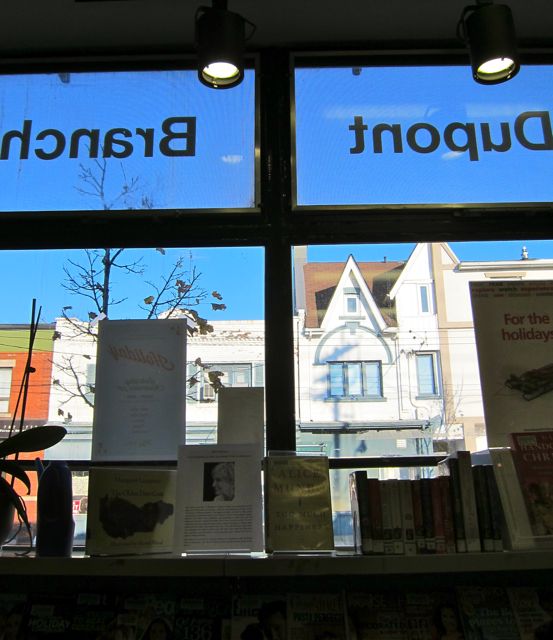
When I found Perth/Dupont Library after a pleasant stroll in the Junction, I was struck by how architectually-integrated the branch seemed. It looked like it had been lovingly tucked into its storefront room by the surrounding community.
Similar in size to Davenport Library, Perth/Dupont’s interior was off-white with olive trim and featured an exposed grey heating duct that snaked around three walls.
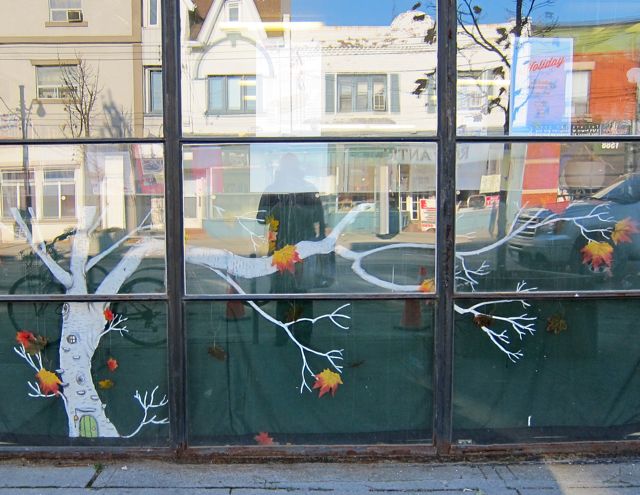
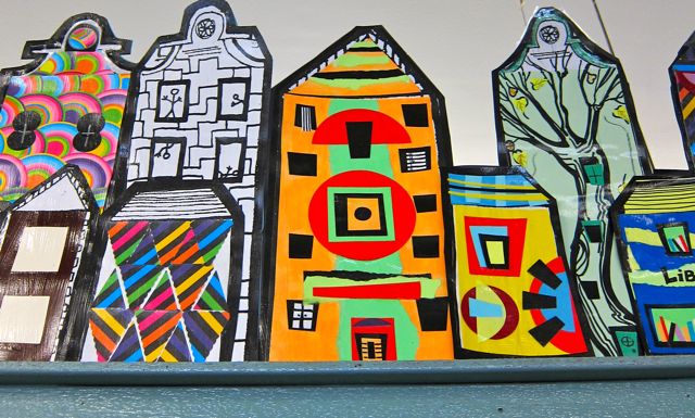
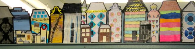
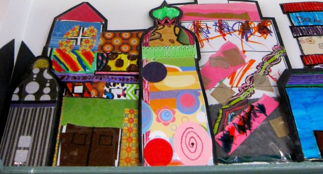
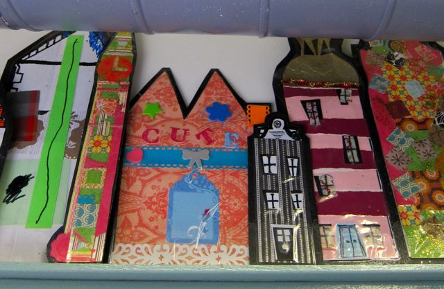
Not only was the library building in harmony with its neighbourhood, community artwork that decorated the interior also reflected the local style of architecture.
On my first visit in 2010, a blue alligator had kept watch from a platform above a square column built into the southeast corner of the library. And on a matching platform in the southwest corner, two white teddy bears with red-ribbon bow-ties served as guardians of their domain. In 2013, artwork had replaced alligator and bears, but luckily some photographic evidence of the blue gator remains (providing a solid clue that my camera skills have improved).
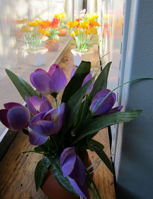
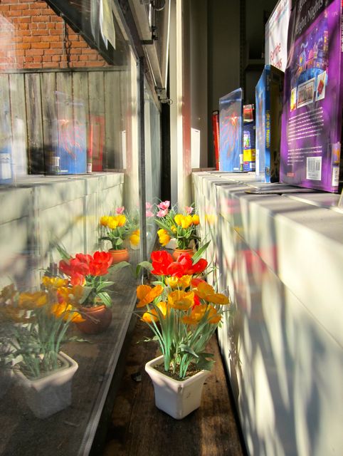
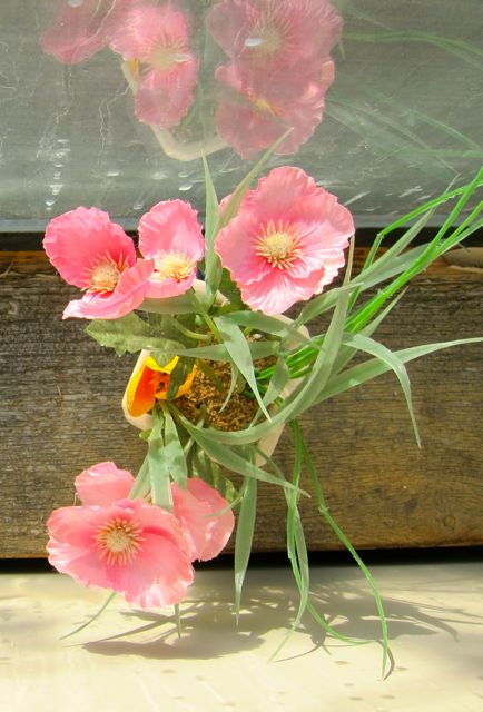
My 2013 visit also revealed a vision of flowers behind the bookshelves. Placed there to catch the rich southern light, the flowers delighted me with their winter-defying spirit.
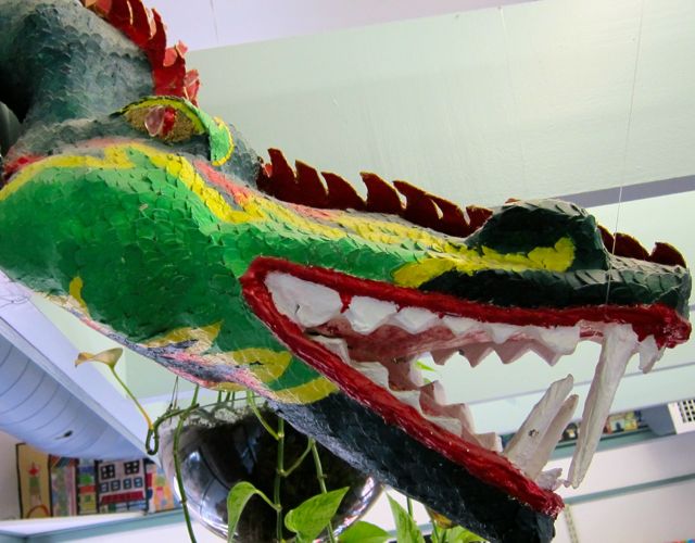
Near the centre of the south wall was a heavy wooden frame that supported a large dragon face. This creature was a very toothy specimen indeed, and it sported a fang overbite without braces.
Not outwardly intimidated by the dragon, I sat at a table between the Portuguese collection and the checkout desk for a few hours, soaking up a typical weekday afternoon at a branch that appeared to be a second home to the families who brought their kids to read and play.
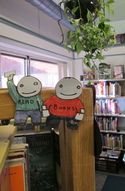
When patrons came in, the librarian at the desk greeted them by name, including the smallest ones. What’s more, she engaged in relaxed conversations with the parents and didn’t yell when a few rambunctious kids crawled inside the paperback display frames. When the game of chase grew more wild, mindful moms said, “Remember we were going to practice our inside voices? This is a library, not a playground.”
Even though Perth/Dupont is not technically a playground, I liked how the kids showed a natural sense of ownership; they knew it was their library even if, in their exuberance, they may have tested the acceptable limits of indoor decibels. What better testimony to Perth/Dupont’s genuine welcome to local families!
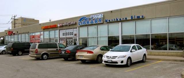
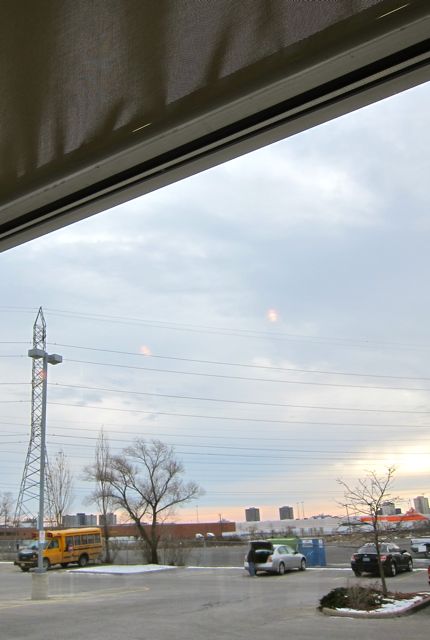
Disguised as an unassuming beige box, Northern Elms Library (2005) proved to be an oasis in a concrete desert. Although strip-malls along Kipling and Rexdale compassed it round, this small branch offered quiet and sunlight to its urban patrons.
2013
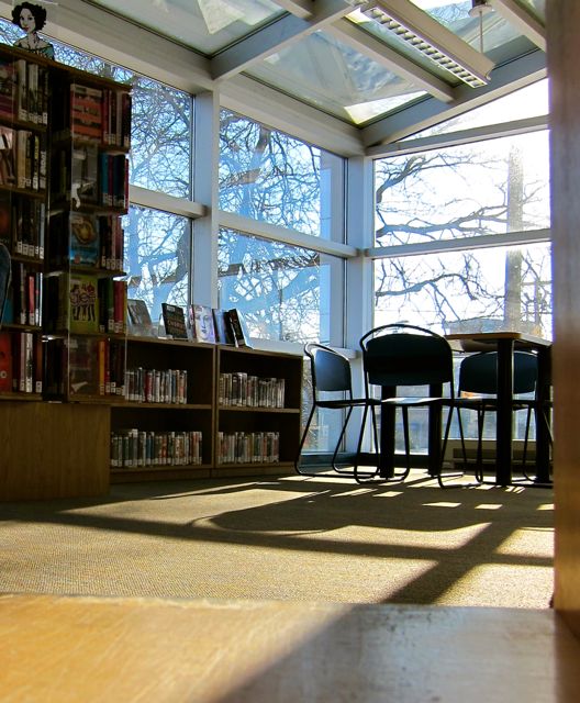
From a black cushioned chair in front of the east window, I absorbed solar energy while I admired Northern Elms’ compactness. Moderately busy on an October Saturday, the library’s entire holdings fit into one room.
2013
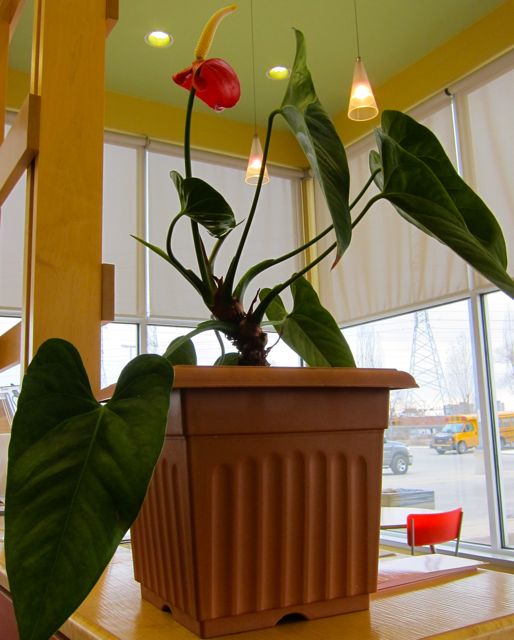
Dark orange, creamy yellow, and pale green covered the walls, and the floor tiles echoed these colours in both swirly and linear patterns. Composed almost entirely of glass, the south wall easily delivered light for the entire outfit and nourished extrovert flowers beside a wooden lattice.
20132013
Hovering from the ceiling in the Children’s section was a circular structure that looked like a UFO mothership. However, it differed from commonplace spaceships in that it was tricked out with four dainty hanging lamps.
2013
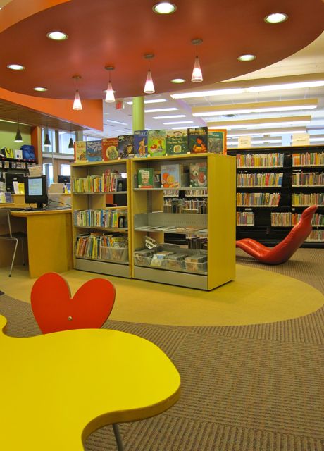
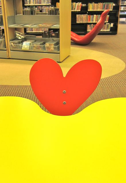
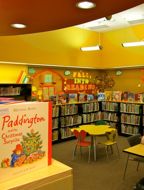
Closer to the ground, a yellow table top in the shape of a fried egg was joined by a red chair with a heart-shaped back, a yellow one with a flower back, and a green smiley-face chair.
2013
This corner of the library wasn’t just about the cheery furniture, though. On my first visit in 2009, gravitas was added by mysterious images of spiral galaxies and nebulas on a nearby bulletin board. When I returned in 2013 to take pictures of the branch, the board’s theme was “Fall Into Reading.”
2013
Don’t let Northern Elms’ small size fool you. Its grounded yet cosmic appeal transcends gas stations, money markets, power lines, and parking lots.
When I saw Amesbury Park for the first time, I liked how it rested in front of a grassy mound of parkland on the south side of Lawrence Avenue West. Its interior had the care-worn look of a neighbourhood facility in high demand, but the library still defined space in interesting ways.
2013
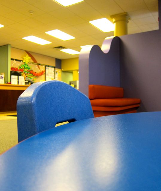
For example, a curved purple screen marked the border between the lobby and the Children’s area and served as additional back support for a cushioned red bench.
On my initial visit in 2009, the wave-shaped divider contained an open porthole that encouraged patrons to imagine a submarine universe, but the portal was absent in 2013.
20132013
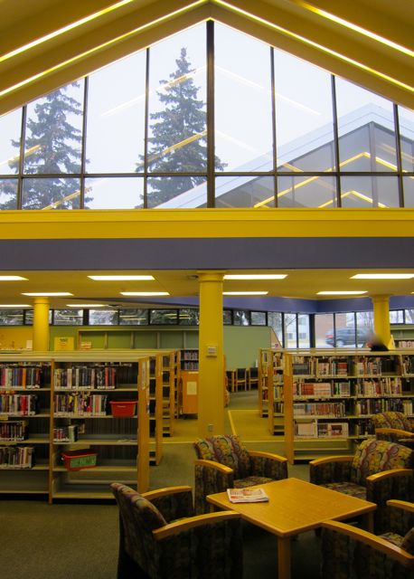
Nevertheless, plenty of windows remained to illuminate the collections, including two giant triangular skylights and many large windows that faced the park.
2013
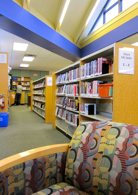
As the photographs suggest, triangle shapes abounded in this purposeful yet relaxed parkside branch. However, lest I float off in a reverie of sunlight and triangles, I should mention the large ESL section and offerings in French, Spanish, Gujarati, Hindi, Italian, and Vietnamese. (By 2013, the Tamil collection had moved to Downsview branch). After admiring the multilingual collections, I moved on to Romance. While I was crouching down to examine the spine of a novel called Armed and Devastating, the lights went off briefly, signaling the library’s imminent closure. I enjoyed a few seconds of bathing in natural light — silver and blue on a late autumn afternoon — and gathered up my notebook and book sale items. Then I left Amesbury Park, my eighty-sixth branch, with the sense of an afternoon well-spent.
Eatonville Library resides at the intersection of Burnhamthorpe and Highway 427. A reconstruction of the building occurred in 2000, but heavy use has since tarnished some of its millennial shine. I sensed a more gritty vibe from this popular branch whose patrons’ cultural diversity reminded me of branches closer to my home in Scarborough, such as Fairview,Albert Campbell, and Cedarbrae.
2012
On my first visit in 2009, I noticed a man praying on his knees behind the paperback carrels, rising and then returning to rest his forehead on the floor again and again. Not far from the devout man, library materials were on offer in Chinese, Serbian, Korean, Polish, Punjabi, Spanish, and French.
Eatonville’s children’s section was vast and well-stocked with English and multilingual books, but graffiti carved into the wooden window bench provided more urban realism than the library was probably looking for. While I like graffiti as a form of expression, it troubled me to see swear words embedded in a library bench.
2012
Even the stuffed animals that lined two high shelves had seen more prosperous times; many of them were stained with magic marker, fur-tattered, and ready for retirement. Nevertheless, the sheer volume of the stuffed assembly was impressive: a frog lying on his back, a bunny, a duck, a blue and green bumblebee, a blue dog, a burgundy elephant, a clown, an electric-lime-green bear, a black hen, and a panda bear in a blue snow suit. (On my 2012 visit, I noticed that some of the more worn animals had been removed).
20122015
As I waited in a long line to check out a travel DVD, I gazed up at the high ceiling and appreciated the calm it afforded. In fact, several station points in the library provided uncluttered views and a sense of openness.
20152015
Walking back to the car, I admired the tall grasses planted around the perimeter of the building and a footpath composed of recycled manhole covers, now permanently free from the constant press of Toronto’s vehicles.
20122012
As I looked in my rear view mirror, the asymmetrical hulk of the library struck me as resembling a silver ocean-liner docked at the highway’s edge or possibly a gray whale taking a rest. Whether ship or mammal, I felt grateful for Eatonville’s vitality, commitment to diversity, and unconventional architectural beauty.
Cool concrete rectangles defined my first visual impression of Oakwood Village Library. The building’s calming interior colours, especially the mottled blue and grey accent walls, were a balm to thirsty eyes.
Even though Oakwood Village’s straight lines and concrete stairs reminded me of a university library, the lively clientele prevented academic dust from accumulating. For example, a joyfully chaotic face-painting event had just broken up when I turned up to see the library for the first time.
2014
Phalanxes of strollers streamed toward the exit, only slowed by a few recalcitrant toddlers in the collector lane. Wide aisles kept the traffic flowing peacefully.
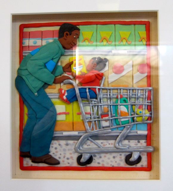
On the east side of the room, an expanse of carpeted floor awaited the next storytelling audience. This open area’s only decorations were three art pieces by Barbara Reid. My favourite one depicted a father and daughter in a supermarket. I loved how Reid was able to make the plasticine glow with textile warmth.
Artwork by Barbara Reid
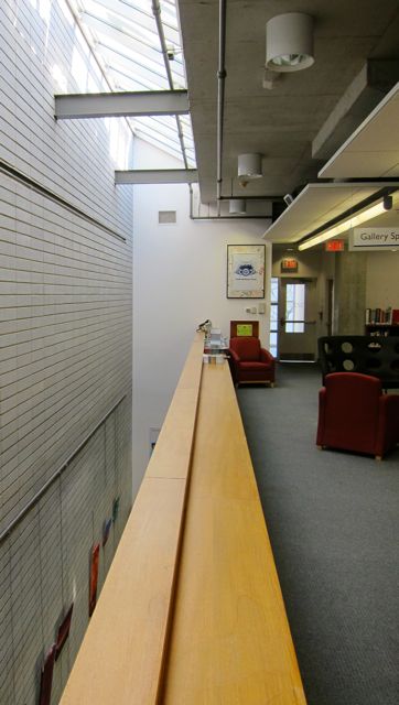
The upper floor also had a very roomy east side, although it appeared slightly less spacious because of the armchairs for newspaper-browsers. Actually, the second floor was almost exactly the same size and shape as the main level, except for a narrow open space on its north side. I looked down the gap as I leaned against the ledge, catching a glimpse of artistic activity below.
2014
Near the ledge were a couple of wide black chairs whose high backs contained large uniform holes. These leather chairs furnished the Teen Section, so it wasn’t surprising that I saw two actual teens interacting in them. One kid remained seated while a friend pretended to punch his head through the holes. Clearly, this was not a love-seat.
2014
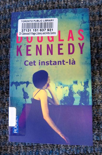
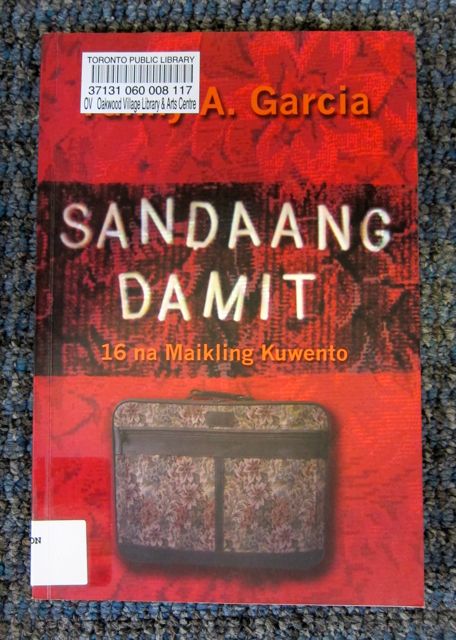
I moved away from the edifying scene to gaze at shelves filled with books in French, Tagalog, and Italian (Spanish and Portuguese were no longer available at this branch in 2013).
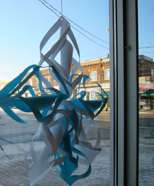
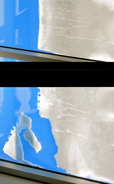
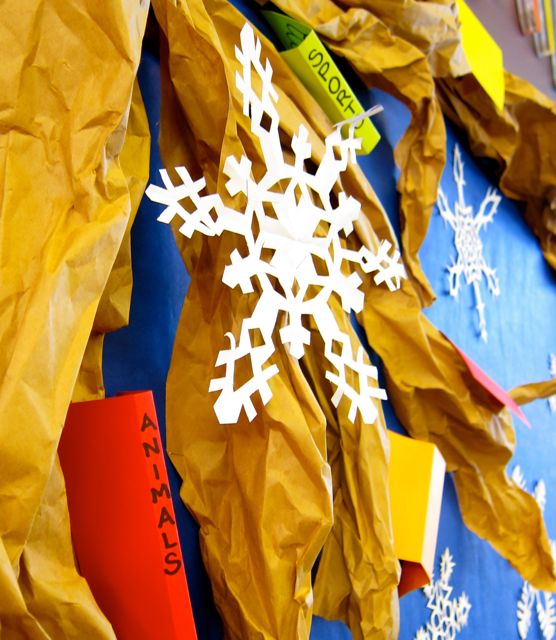
With only one floor left to visit, I trotted down to the basement to see the theatre. However, the door was locked, so I returned to the main level and studied a giant paper snowflake and authentic snow creating patterns on the skylights near the north wall.
20142014
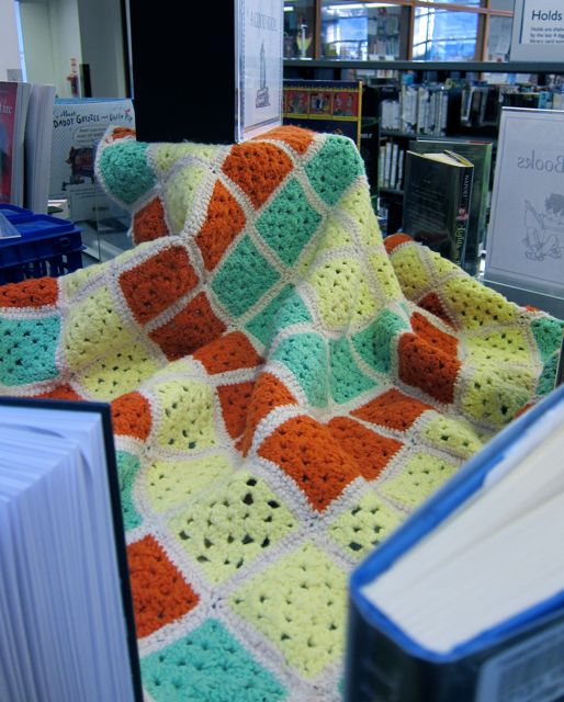
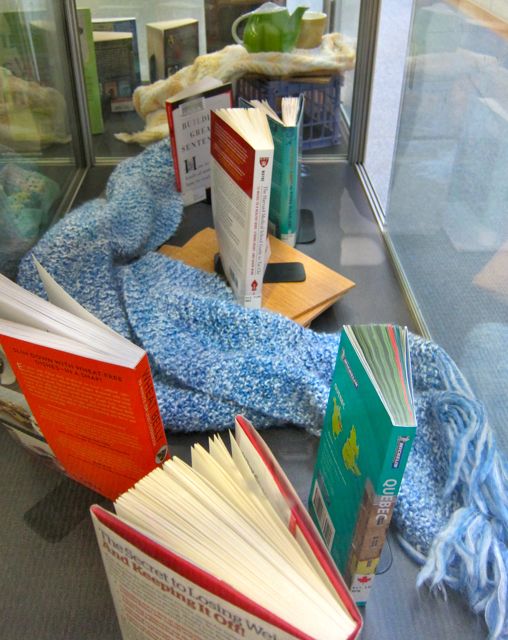
In response to the snow, knitted blankets and scarves provided the perfect warming backdrop to a display of new books on the ground level. Fortified by the cozy textiles, I left Oakwood Village full of gratitude for this literary sanctuary filled with hospitable light.
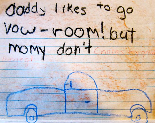
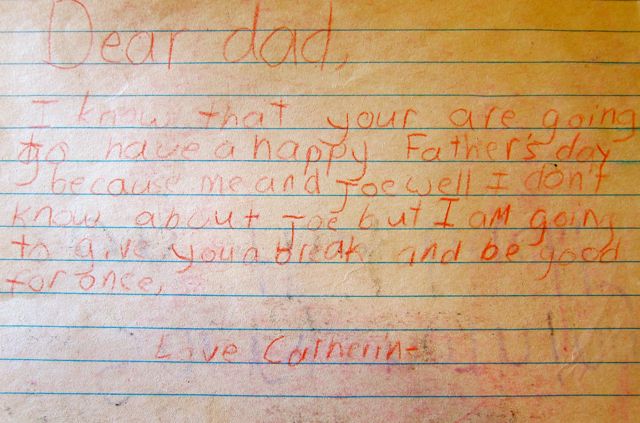
From the depths of keepsake piles in my mother’s house emerged a Father’s Day card and a birthday gift that I made in the 1970’s. The inside of the Father’s Day card contained a car and some of my thoughts.
Dear dad, I know that your are going to have a happy Father’s day because me and Joe well I don’t know about Joe but I am going to give you a break and be good for once. Love, Catherine
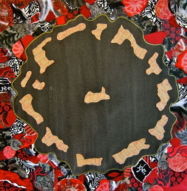
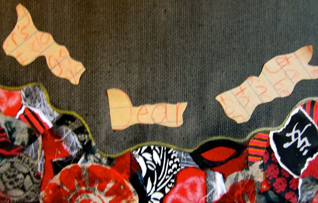
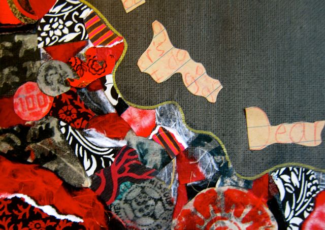
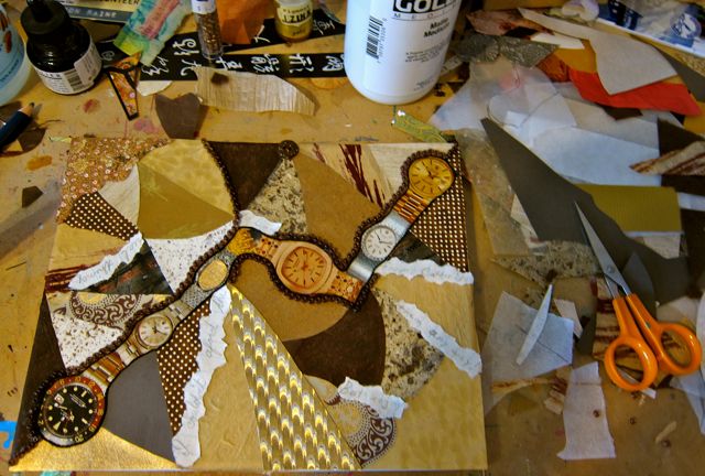
The Father’s Day message became the centerpiece for a recent collage in his honor.
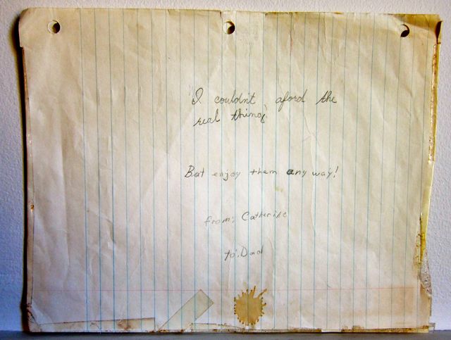
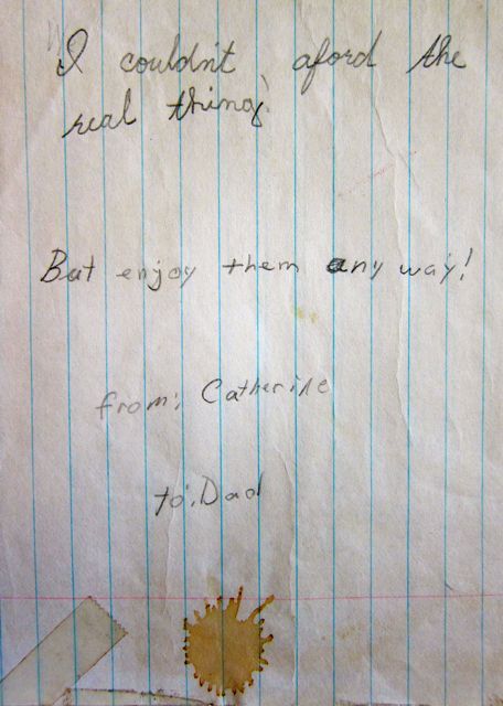
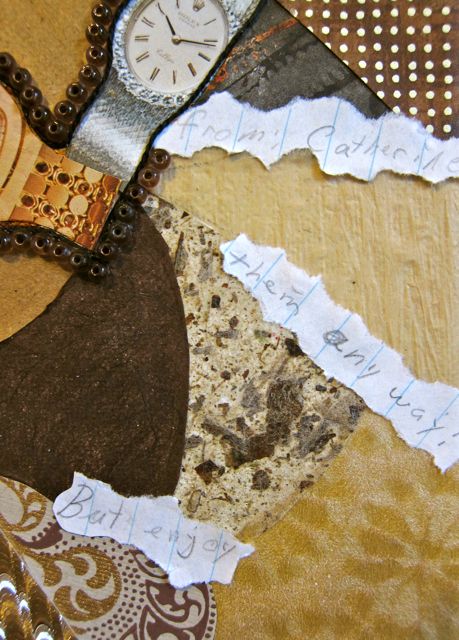
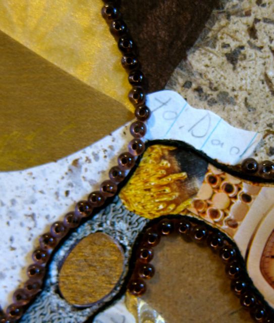
The second piece of 1970’s ephemera was a birthday gift for my dad. It was a hand-taped envelope made from lined notebook paper that contained watches that I’d cut out from magazines. (The coffee stain is original).The long-ago selected watch photos and text from the card inspired a second collage for my father.
I Couldn’t Afford the Real Thing, Catherine Raine 2015I Couldn’t Afford the Real Thing, Catherine Raine 2015I Couldn’t Afford the Real Thing, Catherine Raine 2015I Couldn’t Afford the Real Thing, Catherine Raine 2015I Couldn’t Afford the Real Thing, Catherine Raine 2015
Dad, thank you for keeping the cards that I made for you so many years ago. And thank you most of all for being such a fun, supportive, and loving father. I miss you!
As I walked through the lobby of Don Mills Library, a title in a book display briefly stopped my momentum: I Kissed a Zombie and I Liked It. Then I walked into the library proper and gazed upward to get a sense of the place.
“Warehouse” was the first word that came to mind to describe the main floor, but after a few moments I reconsidered. Although the large square interior reminded me of a box-store, its decorations saved the atmosphere from soullessness.
2015
For instance, I have never seen a warehouse that displayed paper snowflakes. Nor have I observed an endearing bunny and elephant sharing a hot air balloon basket.
2011 (Balloon basket and kites were not in evidence in 2015)2011
I also loved the soaring kites in the rafters, perfect for such an expansive ceiling.
2015
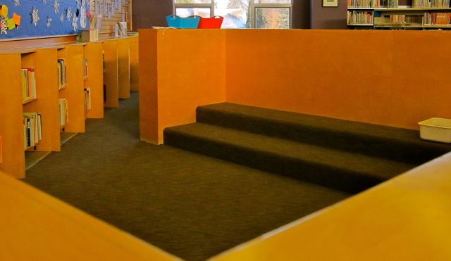
Over in the children’s section on the west side, I noticed the story-telling steps and play area, where wooden walls created a distinctive space for drama.
2015
The Young Adult wing on the opposite side of the main level also fostered a special sense of place, for its wall-to-floor windows on two sides invited openness and relaxation.
2015
After admiring the east wing, I trotted downstairs. There, I noticed a more traditional library atmosphere, and the basement stacks reminded me of college libraries in the Midwest. The lower level at Don Mills also offered an auditorium, a meeting room, a small study room, and facilities for an Adult Literacy program.
Returning to the upper level, I puzzled some fellow patrons by taking photographs of books. I especially wanted a picture of a “Quick Picks” bag because I’d never seen this innovative option at other TPL branches. The bag contained four books chosen by a librarian, and the commands to “Grab a bag. Borrow them All!” served to combat indecisive dithering at the shelves.
As a district branch with a robust book collection, Don Mills definitely spoils its users for choice. For example, the large French collection yielded a petit vampire with a tail like a turnip root and Jeannot and Margot (or Hansel and Gretel en anglais).
In addition to French, Japanese and Chinese had substantial representation, and there were smaller collections of materials in German, Arabic, Spanish, Persian, and Hindi.
Indeed, Don Mills covered the gamut of the library experience from Art to Zombies. This was more than enough reason for a happy shadow dance!
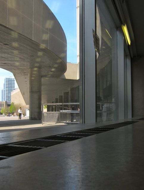
City Hall Library is that rare branch that can pull off coziness and decorum at the same time. Its size (5,074 square feet) makes it seem approachable, but a lofty ceiling and serious grey walls show the appropriate level of dignity required for co-residency with Toronto’s municipal government offices.
2015
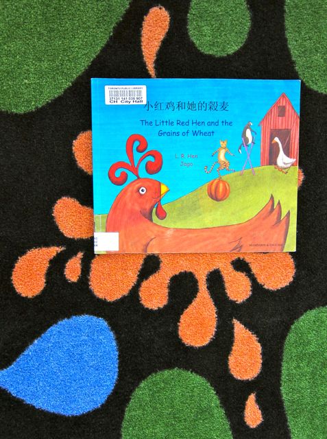
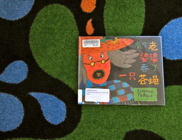
In addition to being cozy and important, City Hall is also decidedly groovy. In fact, grooviness prevents City Hall from taking itself too seriously, as evidenced by the funky carpet in the children’s section, a triangles-on-acid painting, and the lively view of Nathan Phillips Square available from the south-facing windows.
On City Hall visit in 2011, I was in good company when it came to enjoying the chairs at the south windows, for I noticed piles of magazines left behind by previous afternoon readers. (A staff member told me that there are lines out the door during lunch hour). Stacked at random on a long stone bench were slightly rumpled editions ofPeople, Hello, Popular Science, Spiderman, and Vogue.
20152015
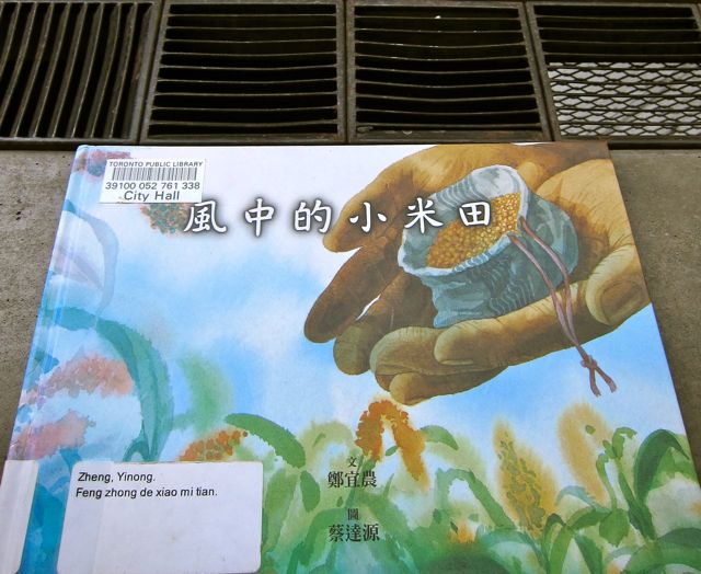
One weighty tome stood tall among the fluffier reading fare on the bench: Canada: An Illustrated History. And I personally added several more books to the piles of reading material: Let It Shine, Besa, and Twilight in Chinese.
In spite of City Hall’s businesslike vibe, it contained lot of interesting nooks and angles that offered respite from the brisk pace of metropolitan life. For example, the children’s section was tucked away in the corner where two curved walls met. There, disc-shaped cushions silently invited readers to settle more comfortably into a beam of sunlight.
2011
Most quirky and mysterious of all was a partially hidden staircase which led nowhere, Escher-style. As I was taking pictures on the 2011 trip, I noticed a man in a suit walk down the top steps and then disappear behind the walls that hid the bottom half of the stairs. He quickly reappeared at the top, looking confused.
2011
When I asked a staff member about the steps, she explained that the library used to occupy more space (11,000 square feet) in the larger City Hall building. In 1996, a substantial part the library’s collection was transferred to Urban Affairs. That’s when the stairs were walled off from the current library space.
2015
I hope the discombobulated man eventually found the exit he sought. And may multitudes of patrons continue to find their way to this groovy place of relaxation in the heart of the city!
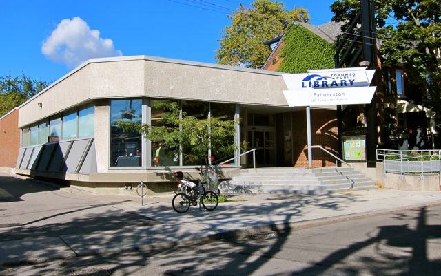
Located just west of Bathurst on Bloor, Palmerston Library is small in size but hugely popular. Each time I visit this branch, it is packed to capacity with readers, web-surfers, and shelf-browsers.
At first impression, square angles and white paint seemed overly prominent at Palmerston, but what saved it from institutional blandness was a display of 2009’s Summer Reading Club illustrations near the entrance. These pictorial book reports contained time machines, fire engines, dragons, and volcanoes (among many other items).
To the left of the entrance, a wizard kite flew overhead in a floppy purple hat that was part-toque, part-nightcap. Wire-rim spectacles and a long gray beard reinforced his scholarly image, as did the reserved manner in which he had tucked his hands into drawn-on sleeves. (The wizard’s arms were actually more like implied limbs, for they served as the kite’s side flaps). The rest of the wizard’s body was one very long purple swoosh of kite material, spanning the children’s section diagonally.
2015
The wizard had disappeared when I returned to the branch in 2012 to take some photographs. Having served the library for many years with distinction, the wizard’s tenure had come to an end.
When Palmerston opened in the early 1970’s, it was a children’s library. Almost forty years later, the children’s books are still plentiful, including lots of French ones, even though the branch now caters to teenagers and adults as well.
2012
The adult section offered a plentiful supply of Korean materials and some Spanish ones. Also, a small Local History Collection displayed titles such as The Riot at Christie Pits, The Annex, and Honest Ed Mirvish: How to Build an Empire on an Orange Crate.
Honest Ed‘s brilliantly corny signs weren’t visible from my table near the computers, but I didn’t mind. My favourite aspect of Palmerston is its ability to provide a scholarly shelter from the bustle and noise of nearby Bloor Street. Palmerston, thank you for your peaceful atmosphere, children’s art, wizard kite, colourful books, and neighbourly attitude.