


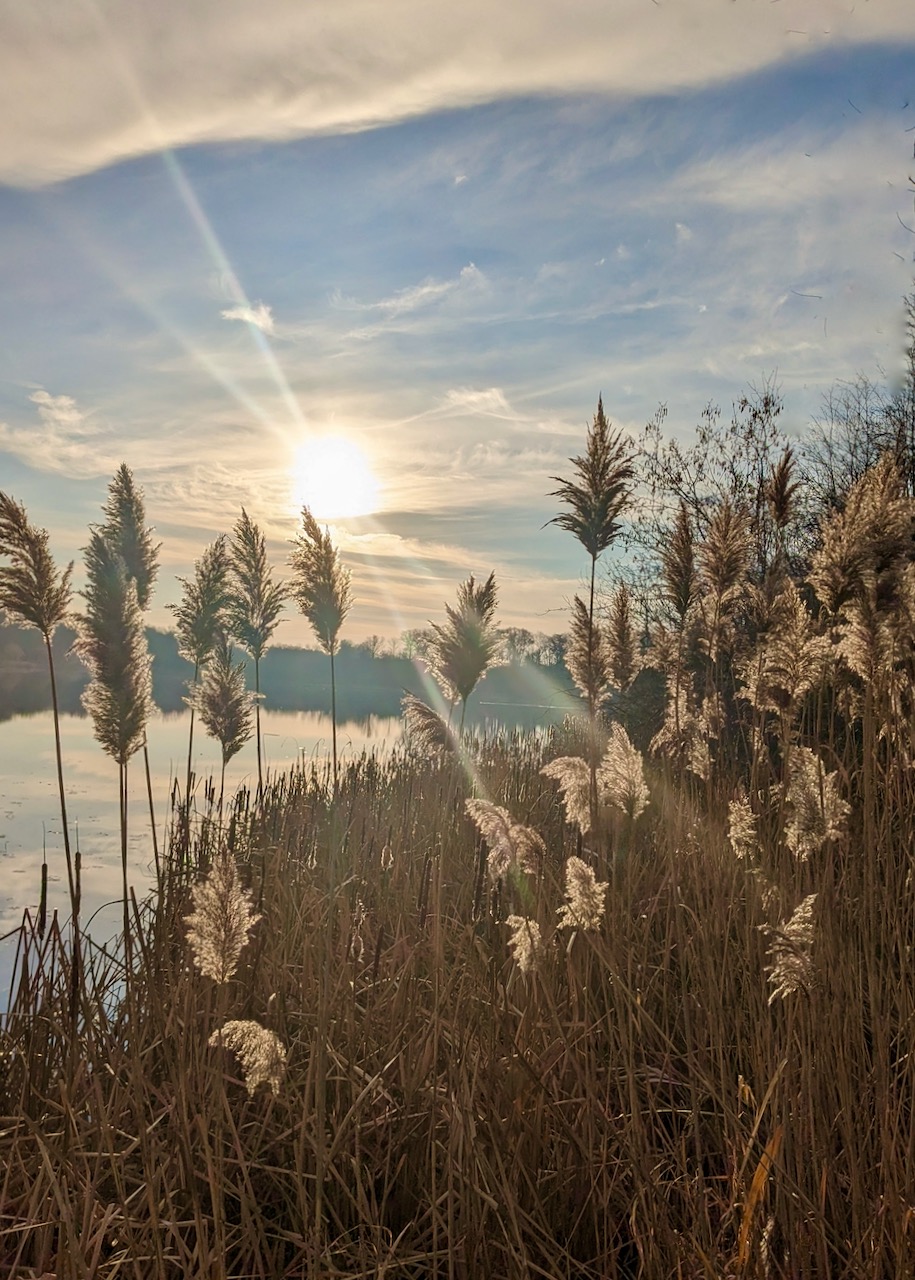
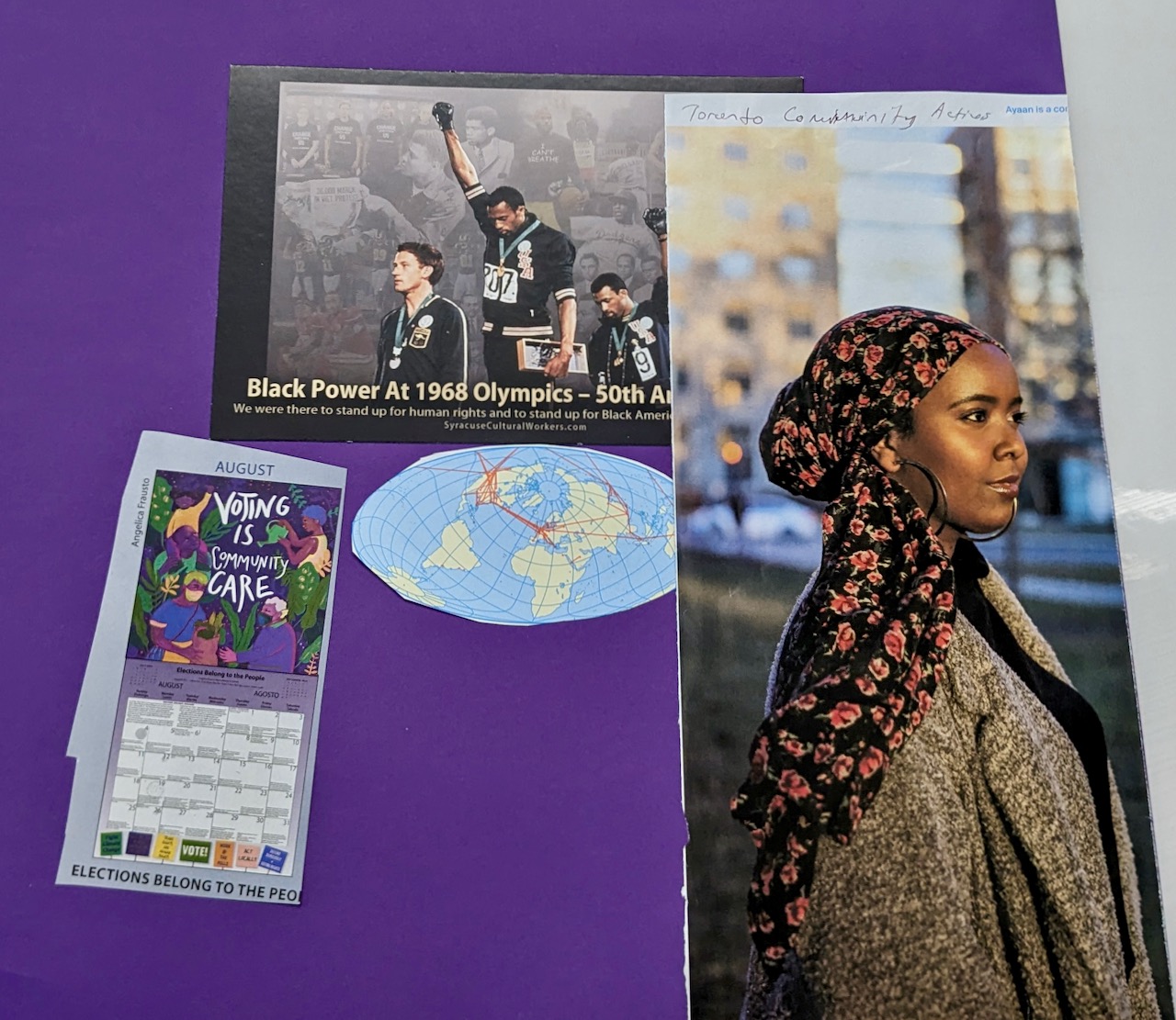
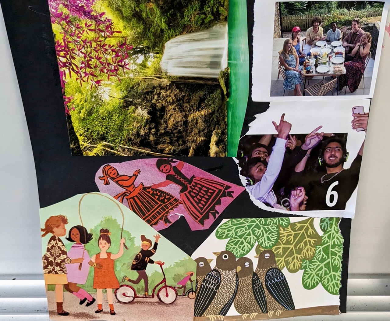
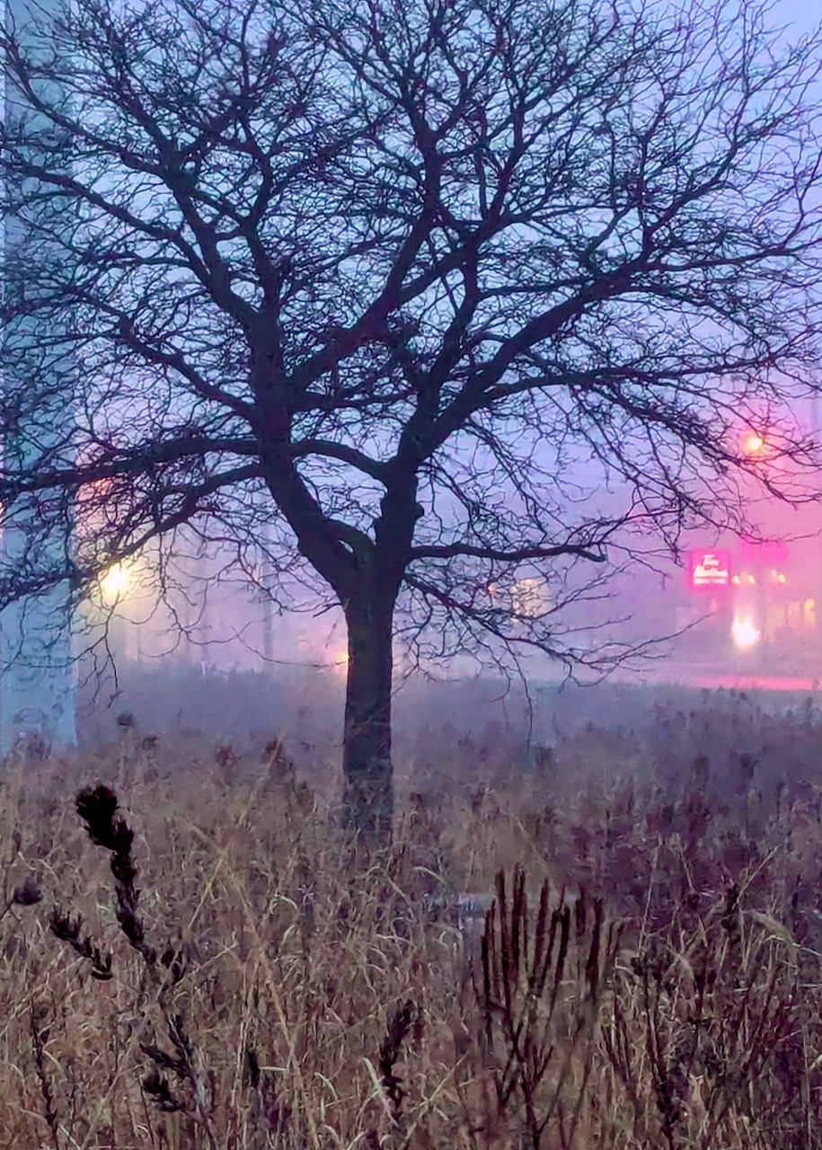
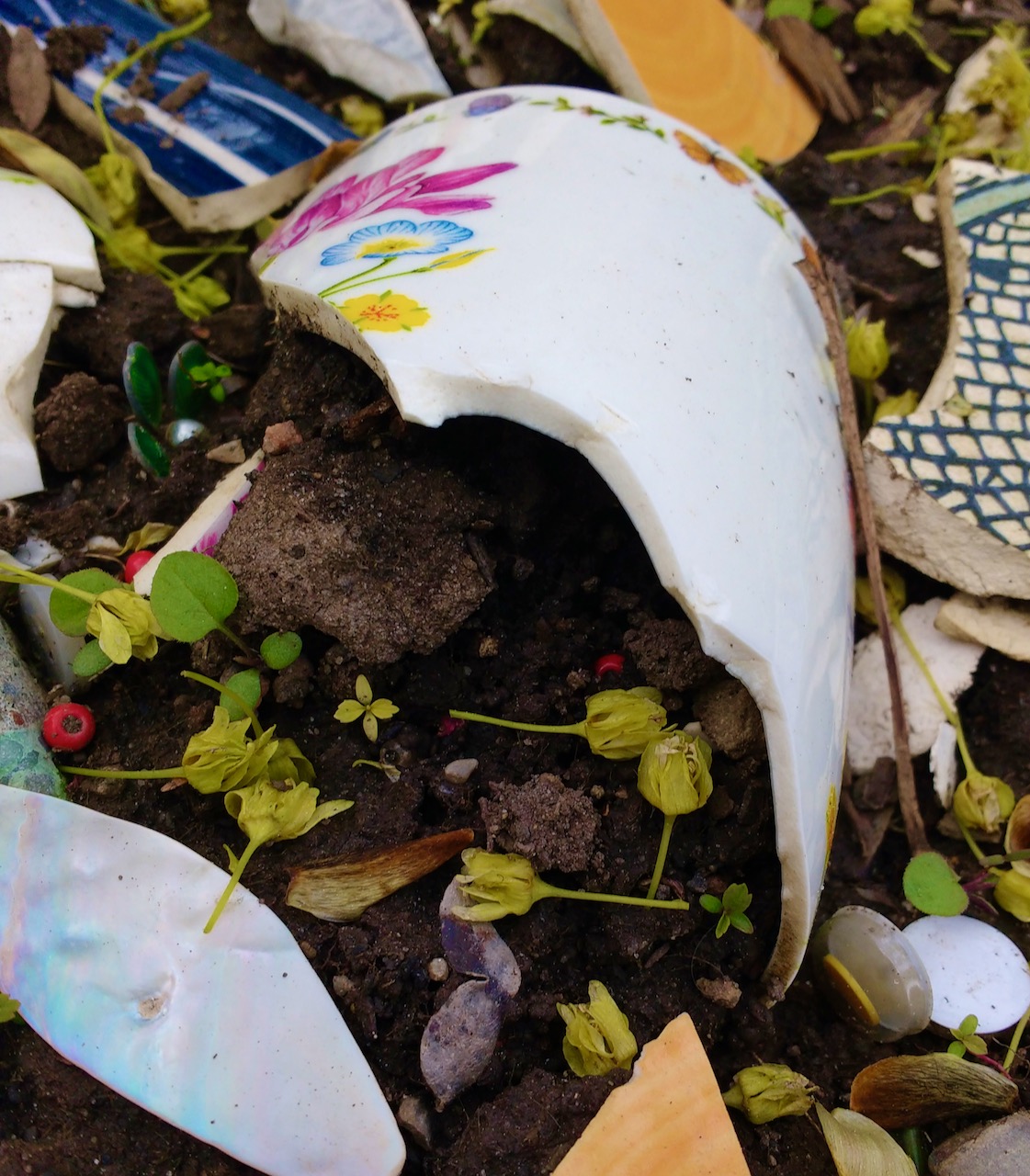
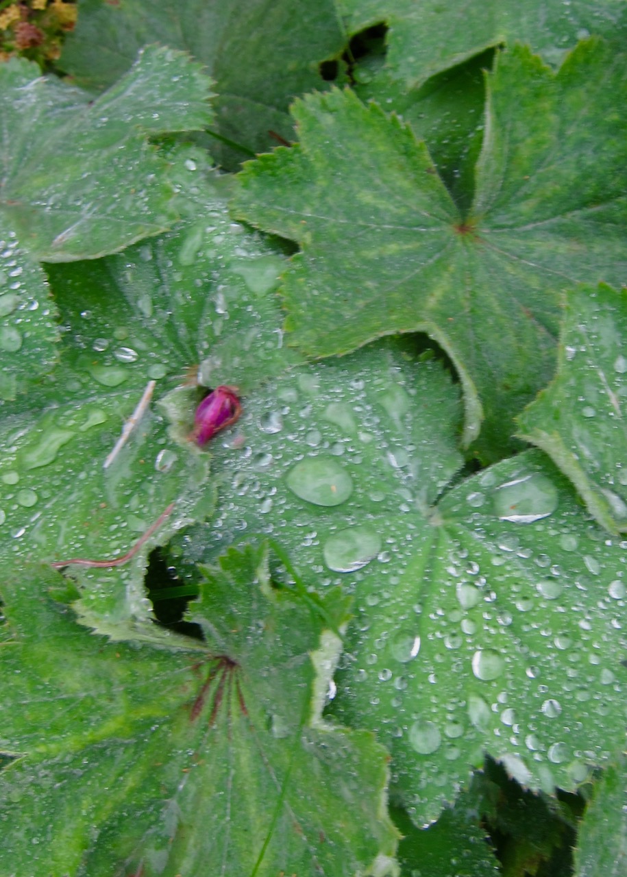
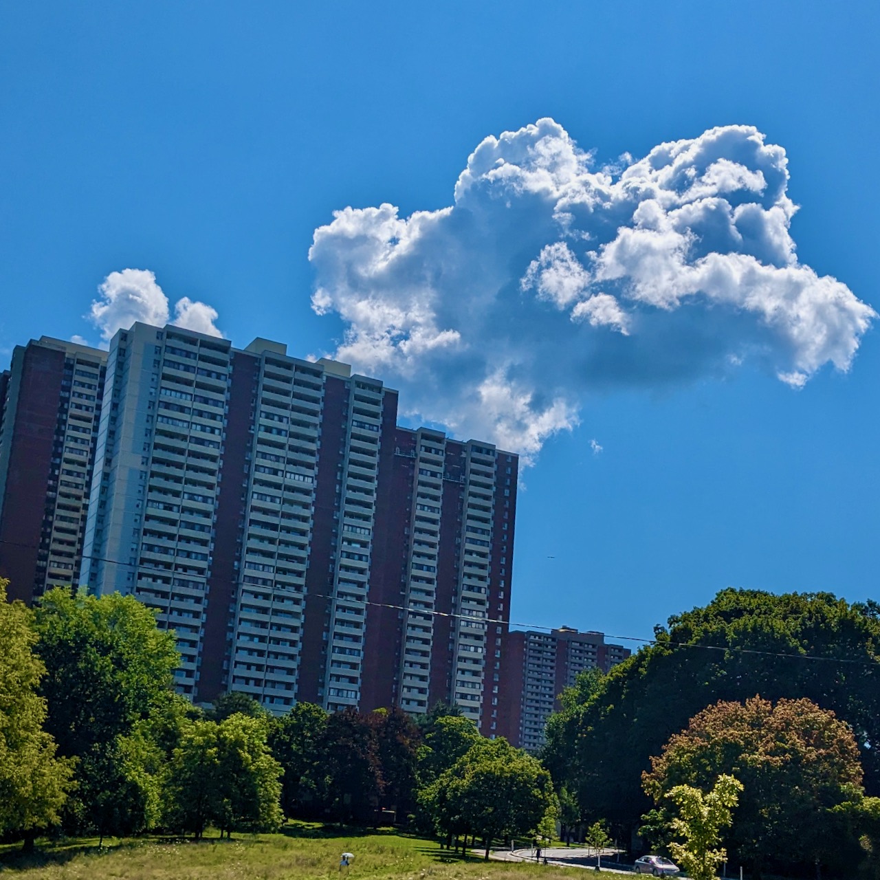
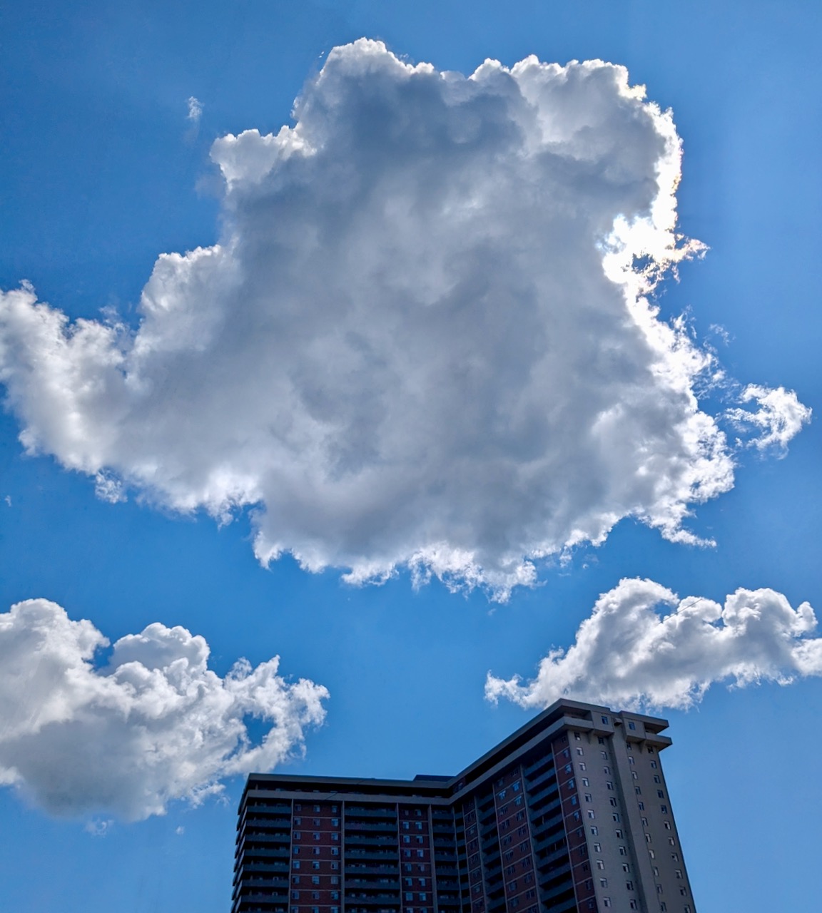
Sheilagh and I’s first JourneyDance of Manifestation and Vision Board Workshop took place in 2018, and it has returned every January since! On Sunday the 15th, fourteen women danced and collaged at The Pink Studio, sparking engagement with goals, wishes, and desires for 2024. According to tradition, Sheilagh led the movement component first, and I followed with the vision board experience. I loved the studio’s energy that afternoon: lively and playful yet grounded in reflective expression.
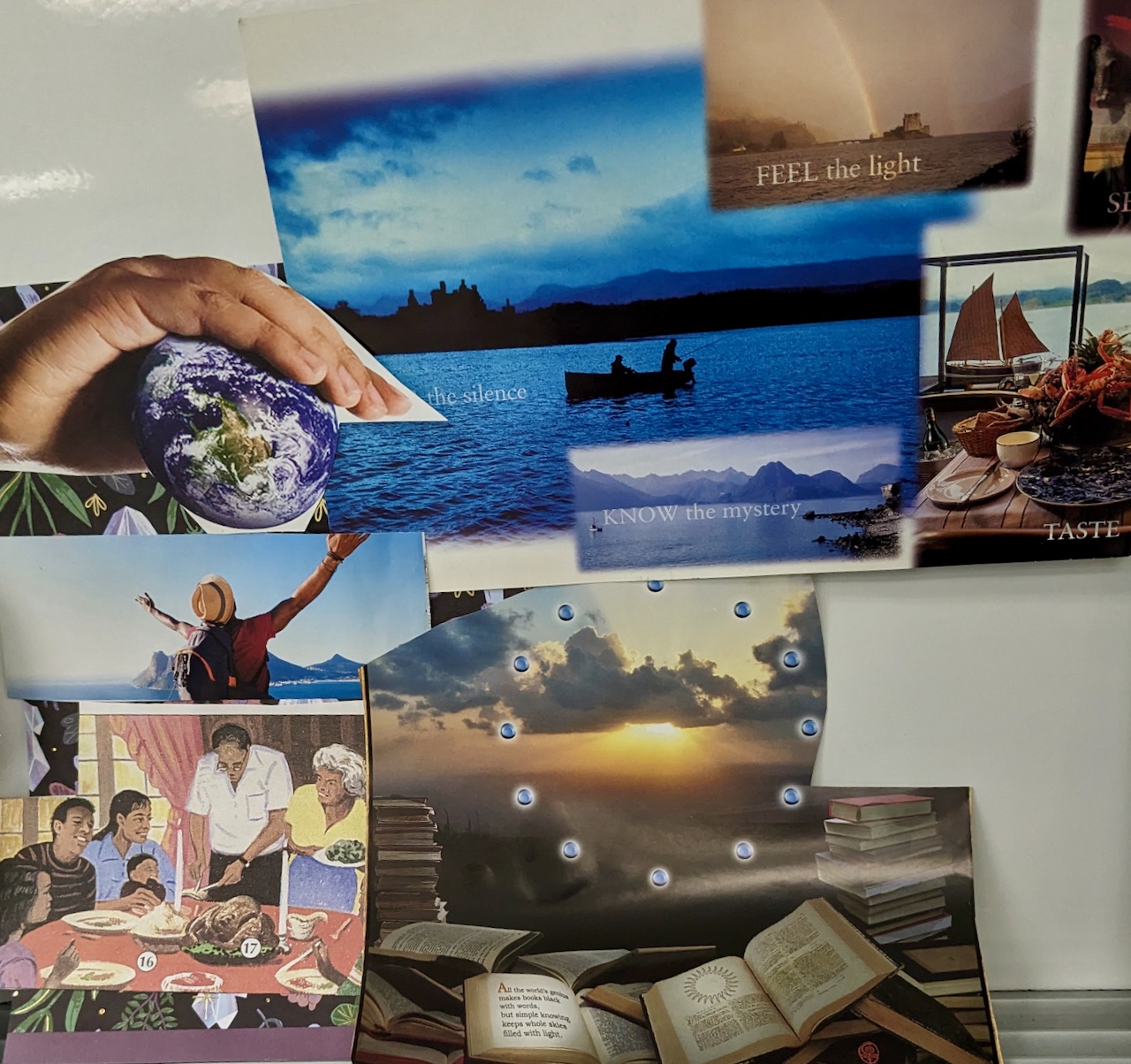
For this year’s workshop, I tweaked an element of my facilitation. As the last song of Sheilagh’s set mantled peace over the people stretched out on the floor, I placed piles of images in six different spots by the dancers instead of concentrating them in one big pile.
After the music stopped and Sheilagh prompted participants to sit up in their own time, I introduced the vision board activity and stressed the importance of following instinct when choosing images. I also encouraged folks to expand the hunt for materials to all six piles if the closest one didn’t provide the right Yes! moments. Although not anticipating conflict, I added, “Two people rarely reach for the same image at the same time, but if that happens we can resolve the issue with a dance battle!” This got a laugh, and Sheilagh declared, “I want to see this dance battle!”
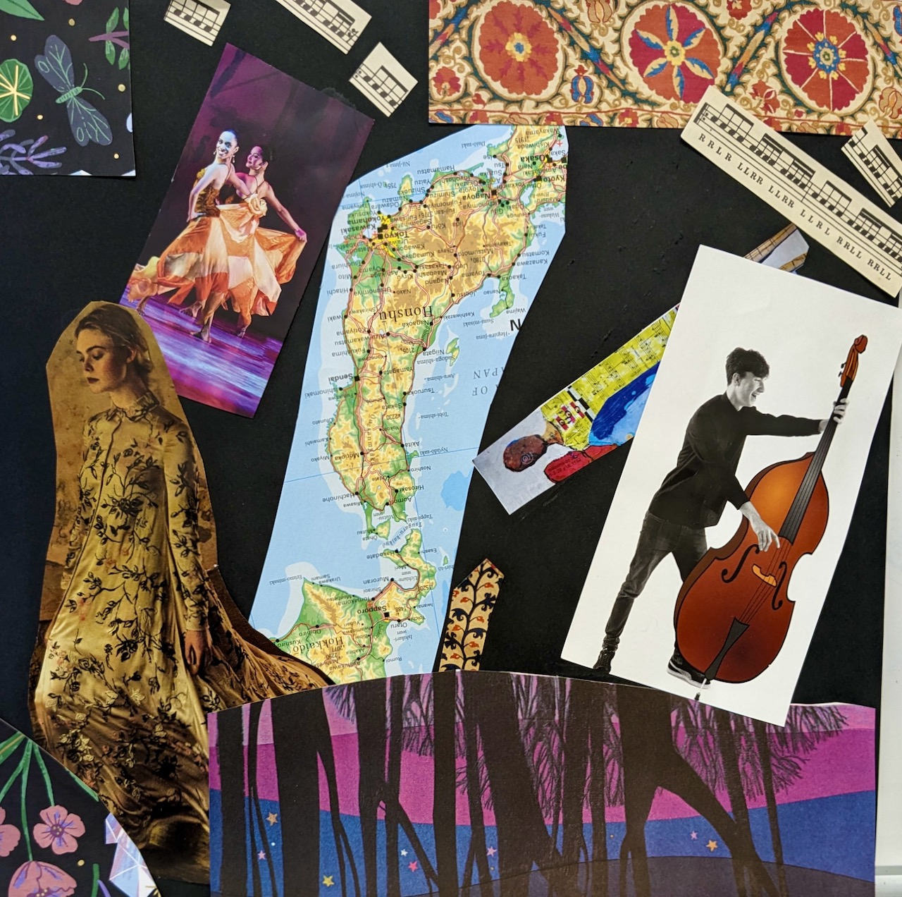
Once the art-making got underway, I was happy to observe how the smaller piles strewn across the room gave rise to organic groups of three or four who encircled the supplies like campers round a fire. Soon the community sank more deeply into the work, and it was lovely to hear people chatter, laugh, and be silly as they chose their pictures and experimented with ideas. As for me, I enjoyed proffering backings, glue sticks, scissors, and stickers as I walked around checking if everyone had what they needed.
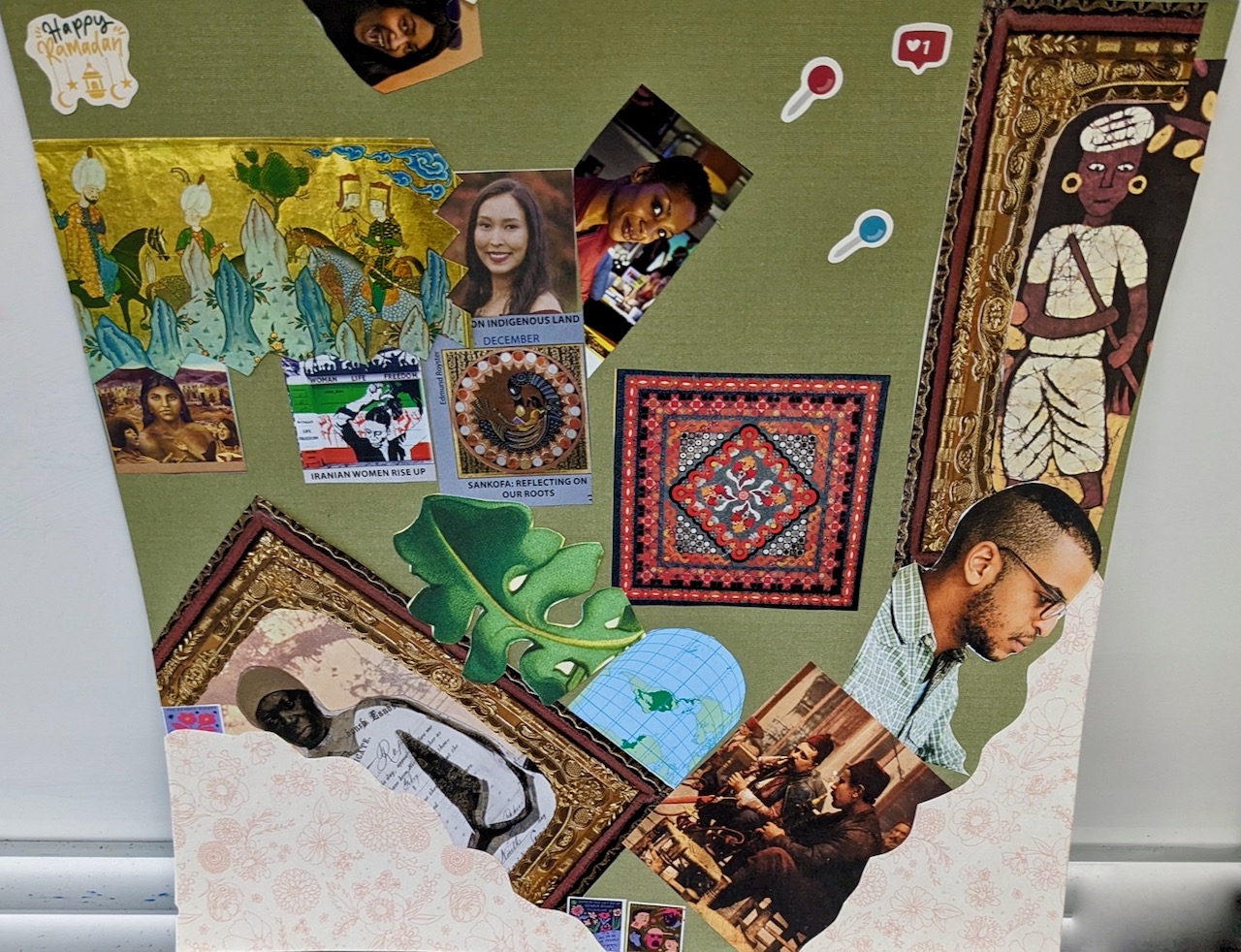
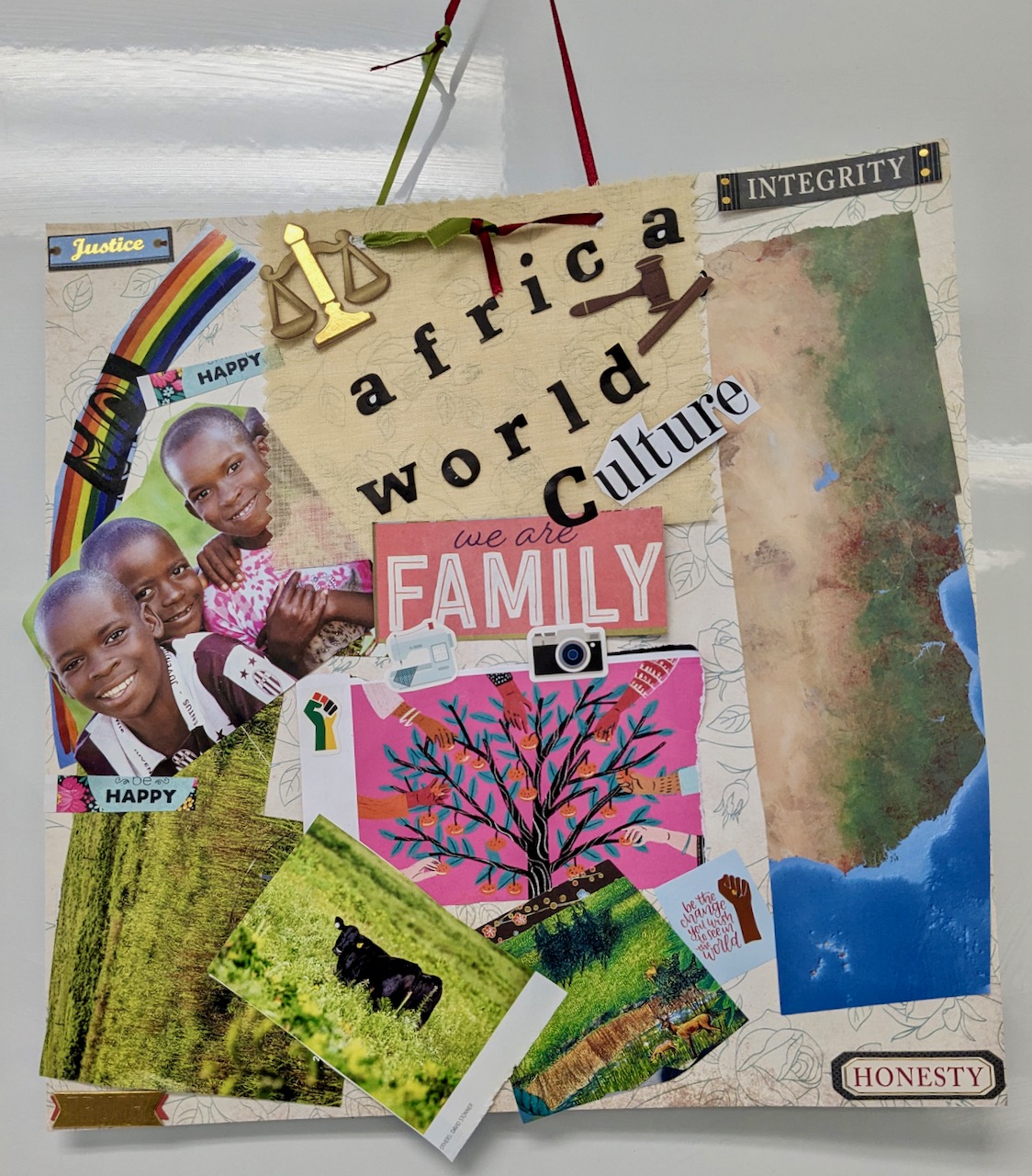
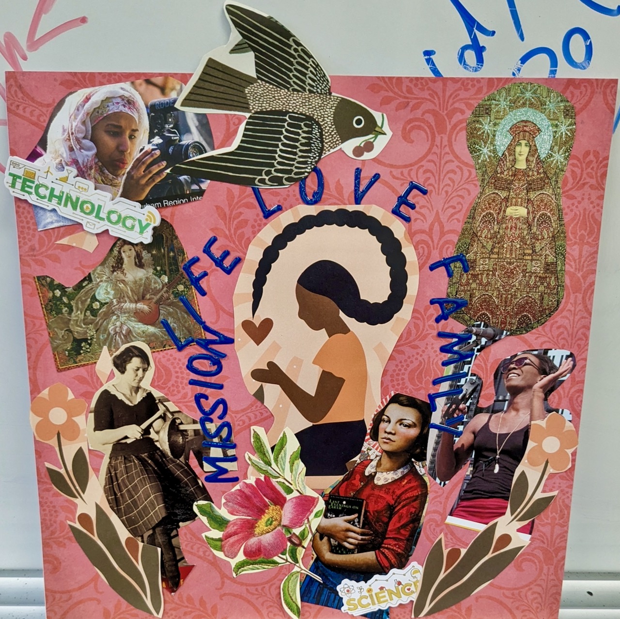
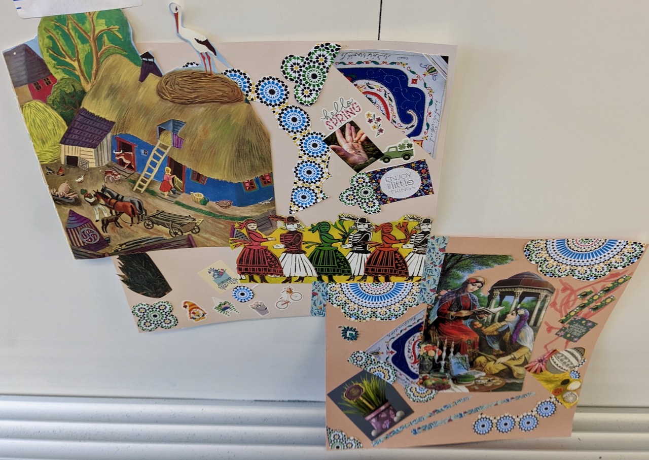
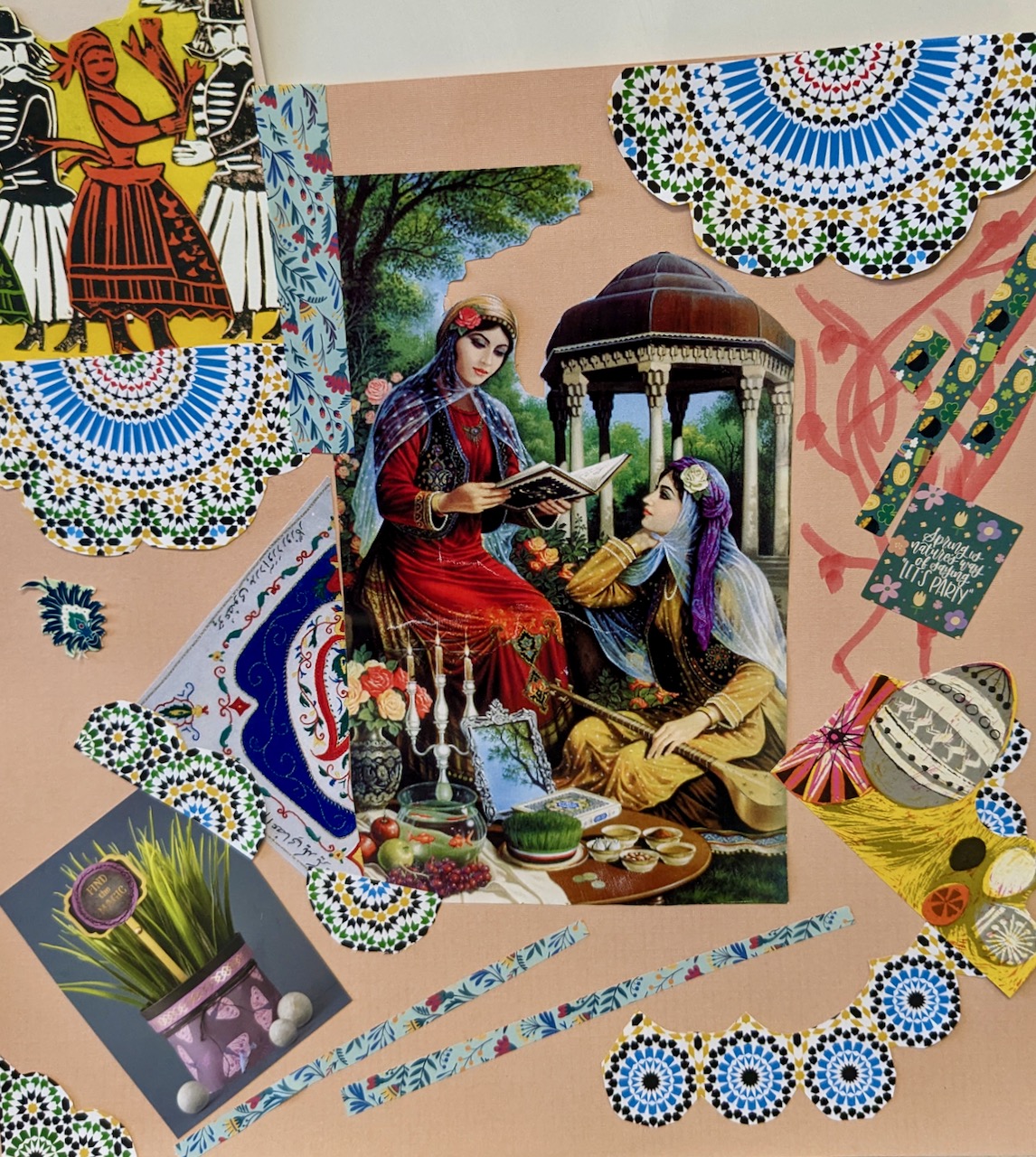
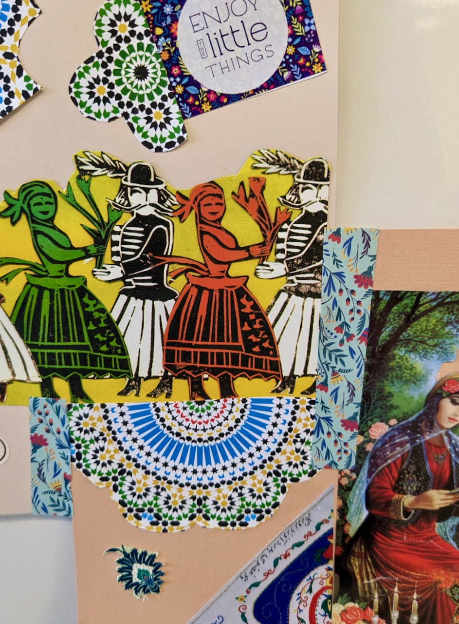
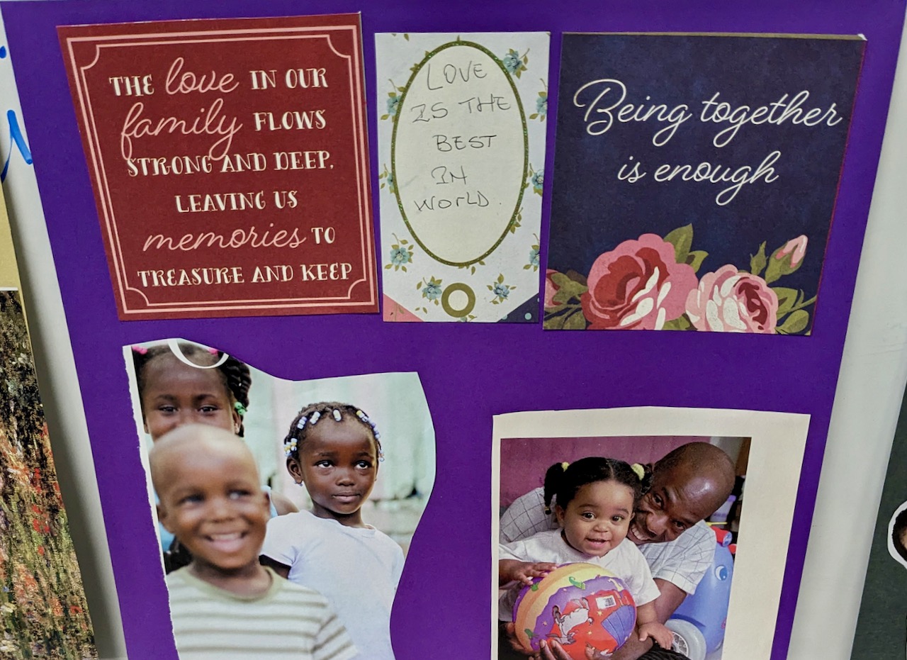
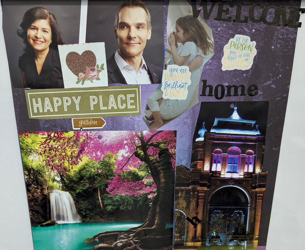
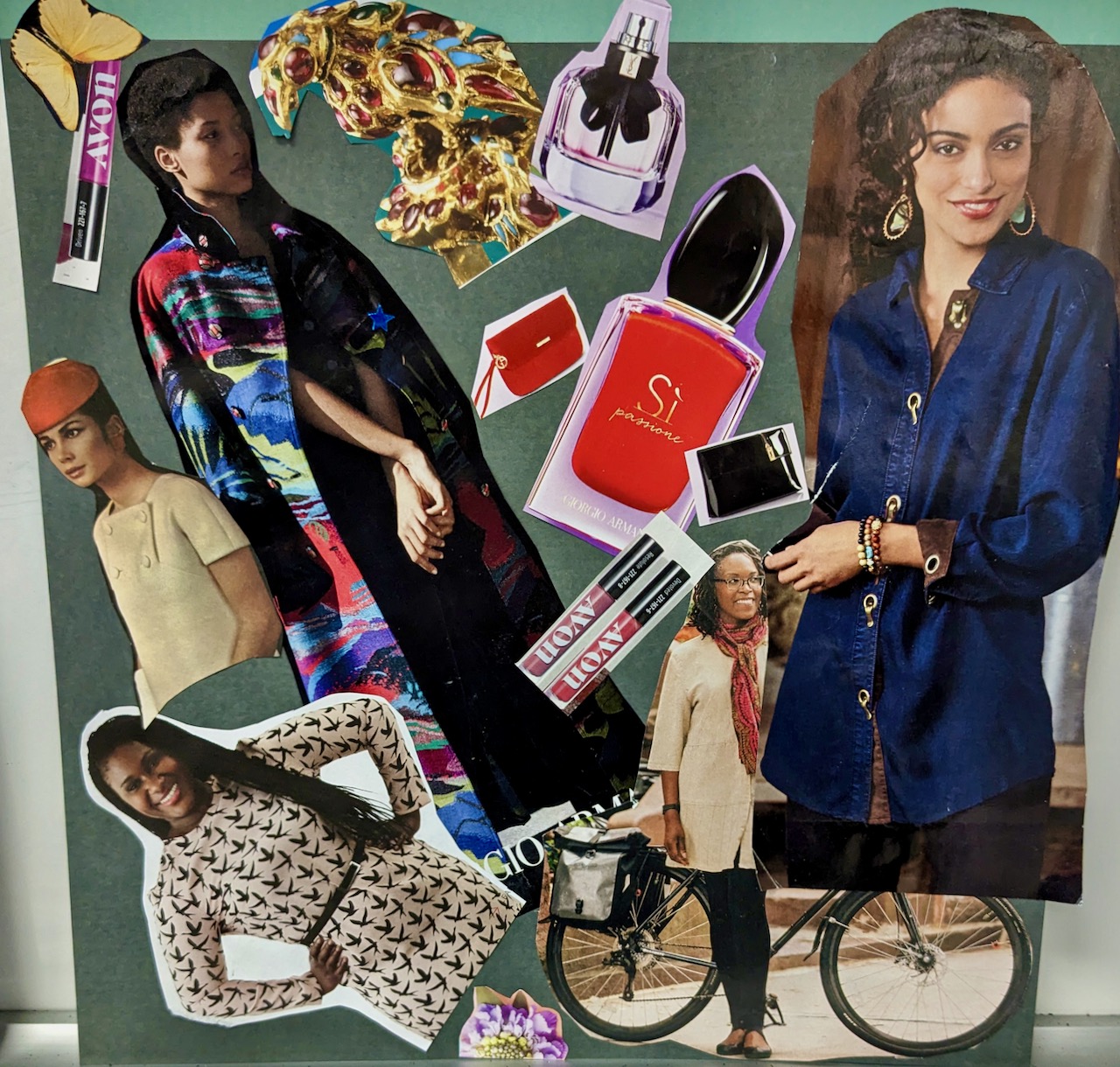
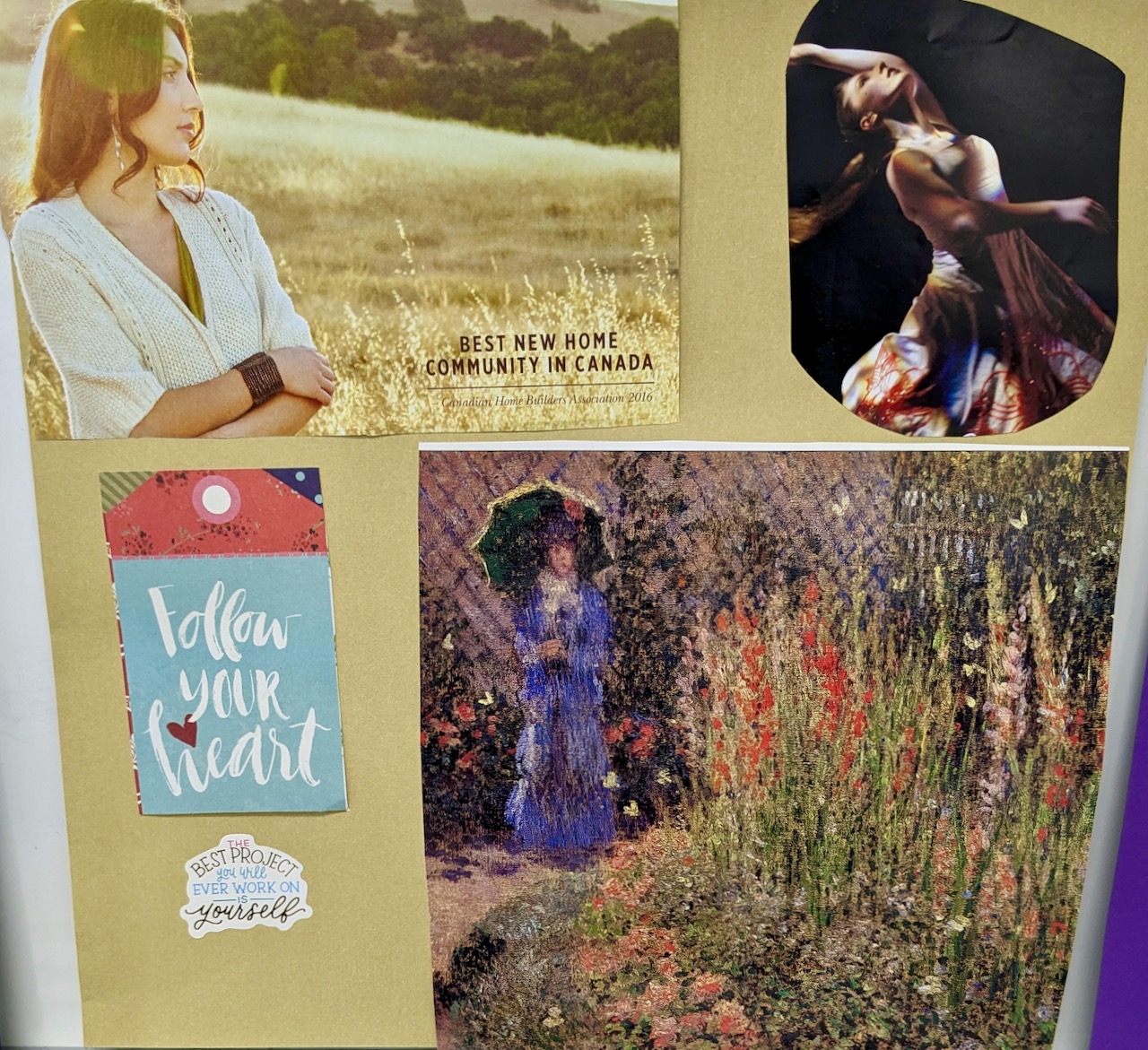
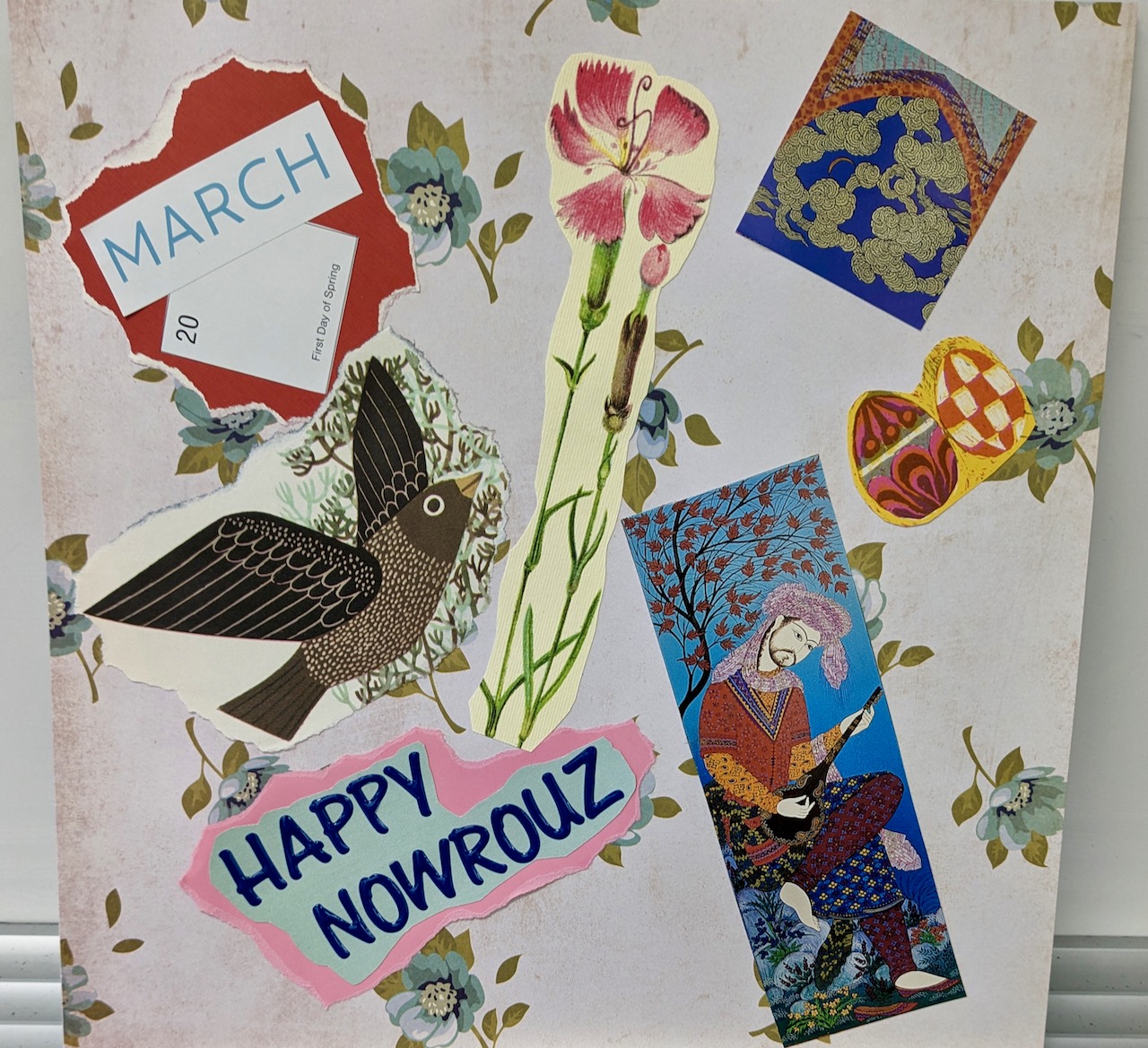
When the session’s end drew near, all were invited to present their vision boards to the entire group. It was exciting and uplifting to witness multiple narratives threaded into the artwork, and many beautiful details have stayed with me. The following memory snapshots contain only a taste of the experience, for rich meaning infused every piece:
Considering cat adoption, one person placed images of cats in a corner of her board. After scissors released the felines from an illustration, she fashioned fancy cat-hats styled with plumes and bows from a 1970’s book of paper dolls.
Another woman affixed an old library-book pocket and its attendant card to her piece. The last date stamped on the card was from 1992, a year which held personal meaning for the maker. Thanks to her vision and preparation, the library pocket received new contents: strips of paper printed with poems that she had brought especially for the workshop.
Also playing with hidden elements, a different participant put stickers on her backing and covered them with a paper showcasing kaleidoscope patterns in pink and blue (gluing down only one edge). She lifted the flap of the patterned paper to reveal the stickers, which contained words naming emotions connected to entering a new stage of life.
Another attendee spoke of how strongly she resonated with a quotation from the Women Artists Diary that she pasted to her vision board: “Not fragile like a flower. Fragile like a bomb!”
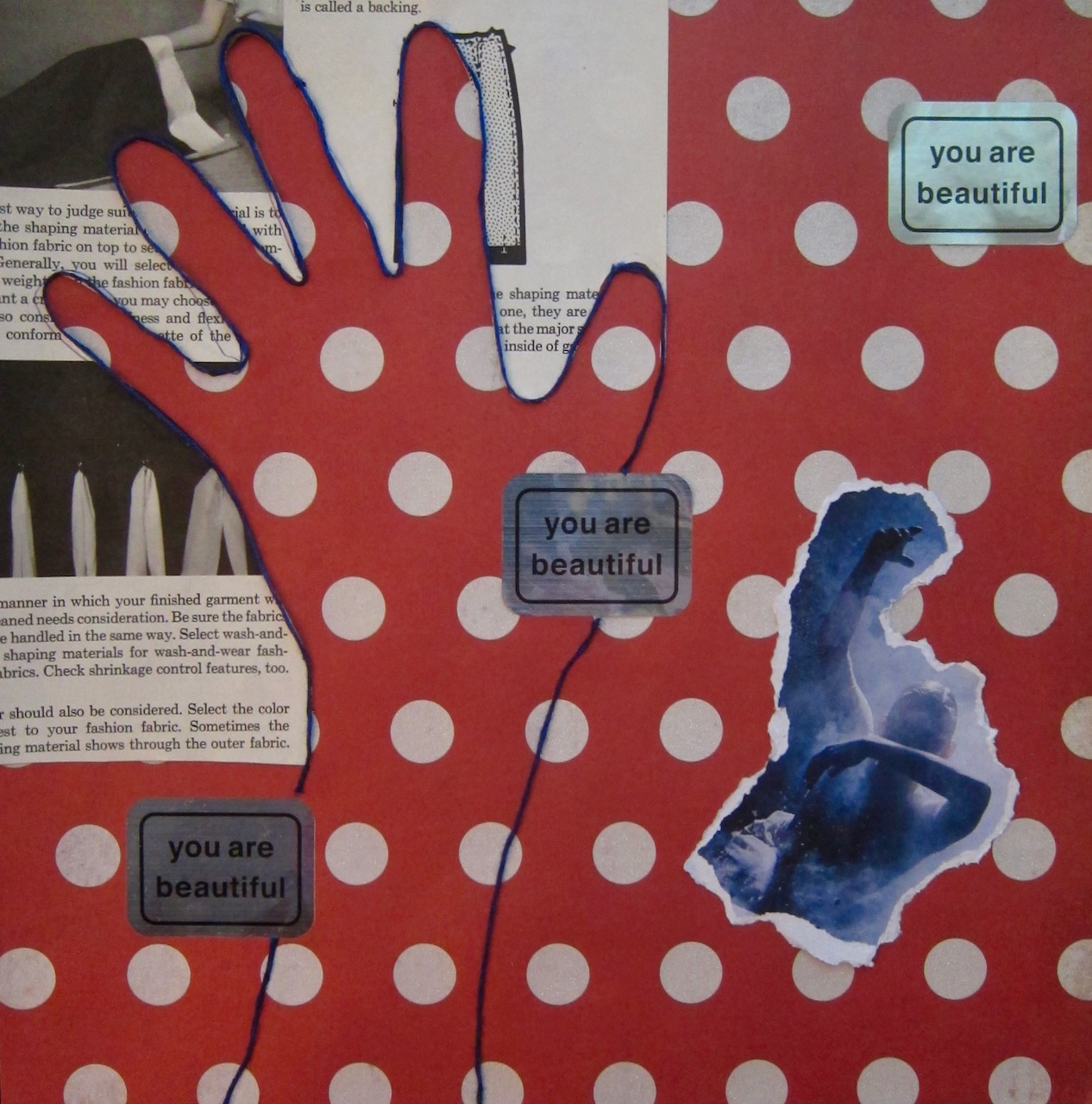
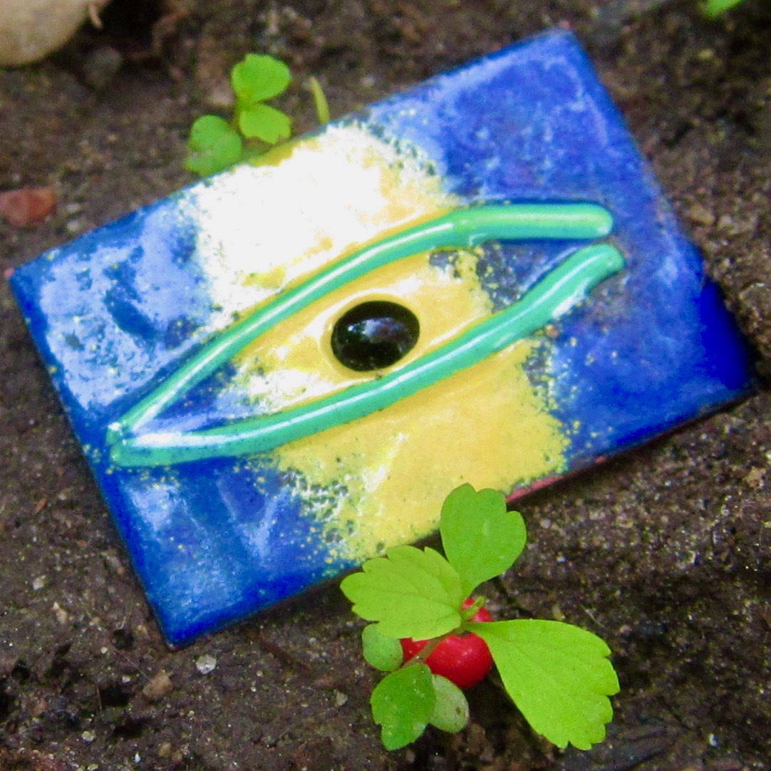
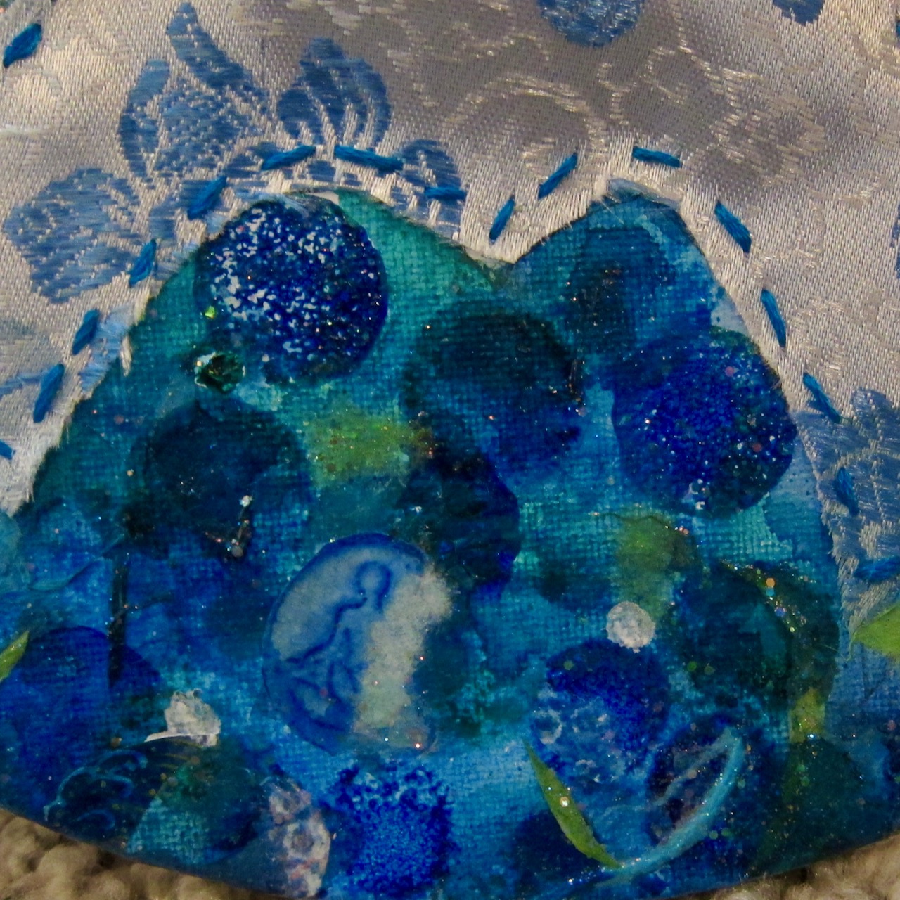
Acting on the wish to embrace creativity, another participant traced her hand over a vintage dressmaking guide, cut it out, and glued it in place as a reminder to use her hands to make more art. Later, the negative space from the paper she left behind inspired the completion of “Dancing Hands, You Are Beautiful!” (2024) pictured below.
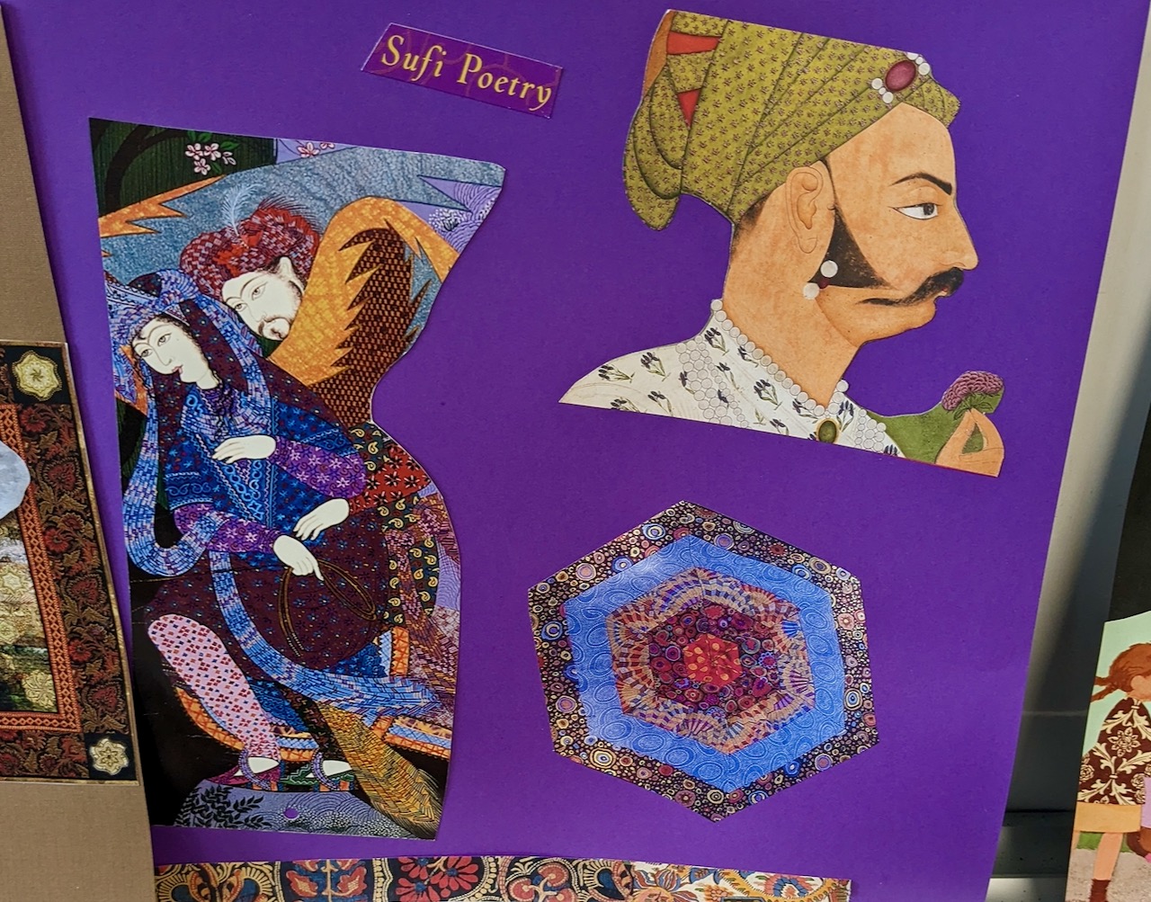
Finally, one woman’s vision board featured Jalal ad-Din Muhammad Rumi’s words about the wisdom that passes from soul to soul. This verse had spoken to her from a calendar page, destined for her collage. As she read the poem aloud, silence filled our workshop gathering, itself a soulful manifestation of movement, connection, imagination, and hope.
Friendship knits us close,
but bedside attentions hasten me closer,
find me fishing for fabric
below the blades of your shoulders
to snap the gown together back to front,
then fasten bracelets to rock-n-roll wrists
and fold a blanket over your feet.
***
Fully tucked from chest to toes,
you hold up hands as teachers
who tell a story of siege:
fingertips furrowed by siphoned fluids,
nails shrunken by a fungus that profits
from sapped immune system,
vasculitis scattering its scarlet marks,
and the sober port implanted in your left arm.
***
When the dinner tray arrives, you check it out,
delighting in rosy chunks of melon,
calling them sexy and inviting me to share.
This prompts glad rummage in a dresser on wheels
for a fork nestled in cache of butter pots
and sweetener sachets, pink and white.
***
As I boost mattress-firmness from 5 to 7,
you describe the Olympian efforts needed
to centre your body in bed,
the triumph of standing for 15 seconds,
pain searing hips and legs, shooting like lightning,
your broken back screaming No.
***
Though suffering torments untold,
you nevertheless look outwards,
still notice a new haircut,
praise my purple glasses, and accuse me of flirting
with the Robo Coffee Bot in the lobby.
I love you for not giving End-stage Liver Disease
the right to devour your delicious banter
or eclipse the firestorm of your charm.
This to me is valour, this to me is grace.
***
Yes is the answer to your request
to read the poem where your father
lifts you into the pony’s saddle at the local fair.
At the sound of this verse, confinement
and paralysis dissolve, inciting tears to fall
as you say, I can feel my father here. He’s here.
***
Held by this truth, grief and love saturate me
throat to chest, sensing how family and time return
to encircle you with solace from age six to sixty,
never divided, never abandoned, never lost.
Memories of my own father’s smile melt composure,
and I dash to the pantry to fill paper cups with half ice,
half water, hoping the coolness will last after I leave.
***
On my return to Bed 2, you ask if I smell bowel movement
and buzz the front desk to state, I need a change.
At the sight of nurses with fresh bed pads,
I step into the hall while they clean your ass, crotch, and thighs,
careful of rashes, mindful of pain.
***
I sit with you a little longer,
and soon dark brown eyes begin to close
and re-open at shorter and shorter intervals,
sleep stealing the ends of sentences.
Unsettled at first, I come to respect
the eloquence of drowsiness
that tells me time to go and let you rest.
***
Another visit is planned,
but I never see you again
nor hear you harmonize
with Free Falling on the radio,
lyrical instincts unbroken,
deep voice dancing into curtained corners,
soulcraft that shatters
silent windows with its flight.
Right cheek warmed by friendly planks,
I sprawl beneath a chosen window
that spills its sunshine on my lips,
ladles honey heat over tilted nape.
I roll from side to side, waking combs of beeswax
and provoke the floor to creak an invitation:
“You can ask me anything.”
***
Unsure, I glance to the mirror for answers,
but it speaks only shame, does not listen.
I fling away my glasses, and the judge dissolves to Wisdom:
examining my body is only one way to experience it.
***
Rising yesward on bolder knees,
I study the high ceiling,
ten tall windows with fans whirring on their sills,
the fire exit platform threaded with vines –
and this choir of generous portals shouts
“Get Your Freedom Here!”
and bids me stand.
***
Now on my feet, I allow shoulders and wrists and thighs
to shake off dutiful belittlements —
the should’s, the sorry’s, the shrinking silences —
and let them be shed and shredded on the dance floor
somewhere south of broken.
***
For once, my hips don’t apologize for their curves
and they dare me leap from mountain bridge
to thunder-soaked river, where I wrestle
with dangerous currents I’ve shunned out of fear.
Surrender to the river tugs me wild open, cracking my thick shell,
pushing, pulling, having me rolling like a beast
who slaps mud on her chest and stamps her hooves
and doesn’t care who thinks she needs a cage.
***
Being here in this dancing river
feels like returning to the fire-girl I was,
burning up caution, sadness, and grief in a healing fever,
reveling in electrical storms that crackle along my bones,
flourishing a purple cape, tasting the salt of delectable effort,
spine loose, palms grateful, instinct hushing intellect,
feet singing over noise of the brain.
Here in this movement, I inhabit my body, my rightful home.

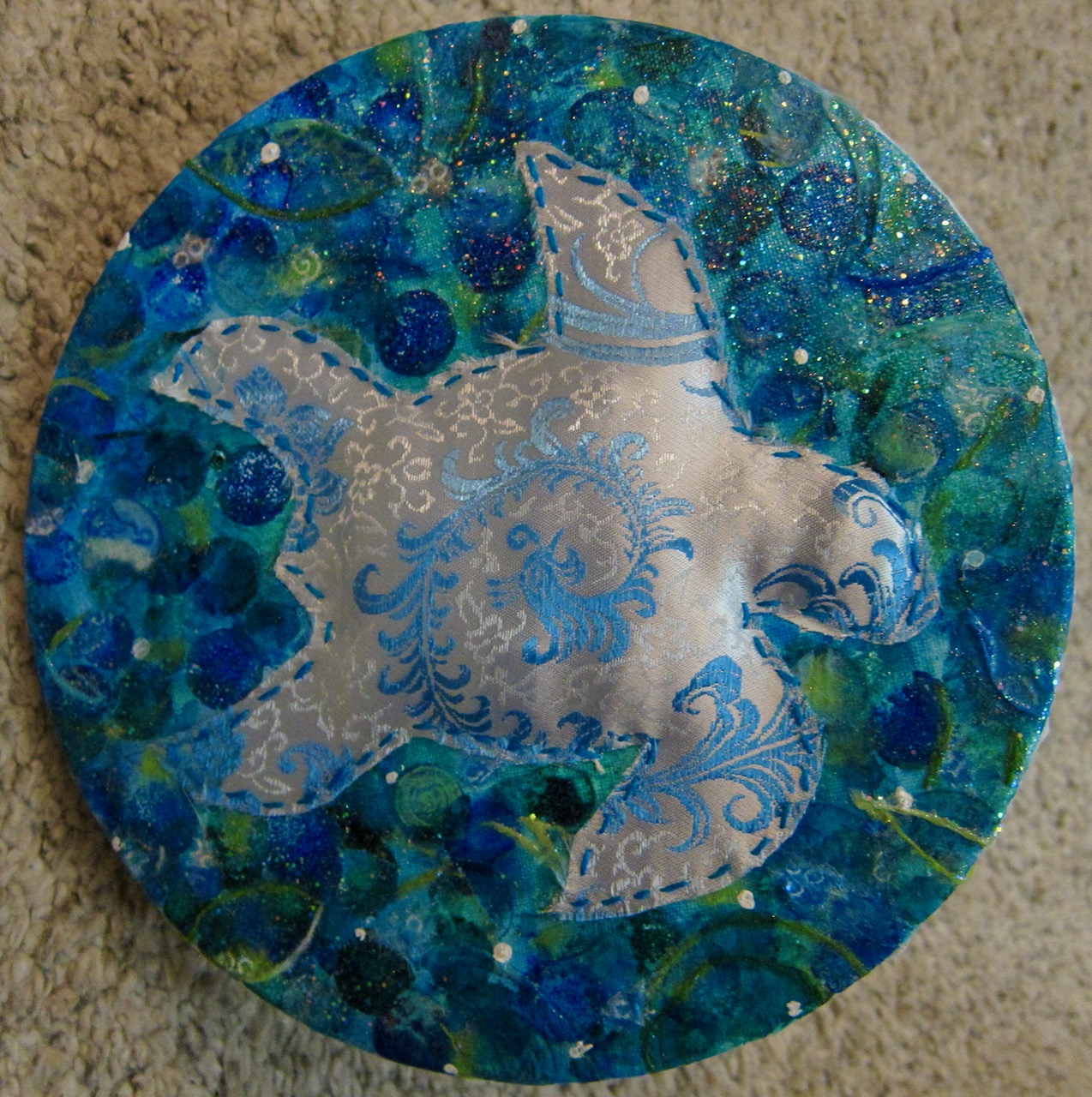
My friend Ellen once told me that turtles were one of her favourite creatures, and I hope she would have enjoyed this collage devoted to her memory.
I am a ruined barn, empty but smelling of ancient hay. I sit in a lost valley, no longer a shelter nor part of a living farm. I used to be warmer, to glow orange from lanterns on February mornings, to retain animal heat. Now my shadows fill in their outlines, brief flashes from the highway my only relief.
I am tired of being a relic, a rural ghost who attracts photographers from the city. Their insulting attention reminds me that I am just a skeleton of economies past, a symbol of romantic decay.
All my sounds are whispers and echoes now, where once I heard grunts, shouts, whinnies, cries of pain and hunger. It’s so quiet now. Ruin is quiet. My unsteady walls feel dry, brittle, so straw-like that one warm hand on my door would set me ablaze. I welcome this fire, this sweet extinction into ashes.
When it rains, I feel the blessed water soaking my beams, splashing through broken panes, swelling the hayloft floor so that I forget my ladder is broken and my stalls now shells that once held a family’s wealth and sustenance. I miss being whole. I miss being real. I miss the animals I used to protect.
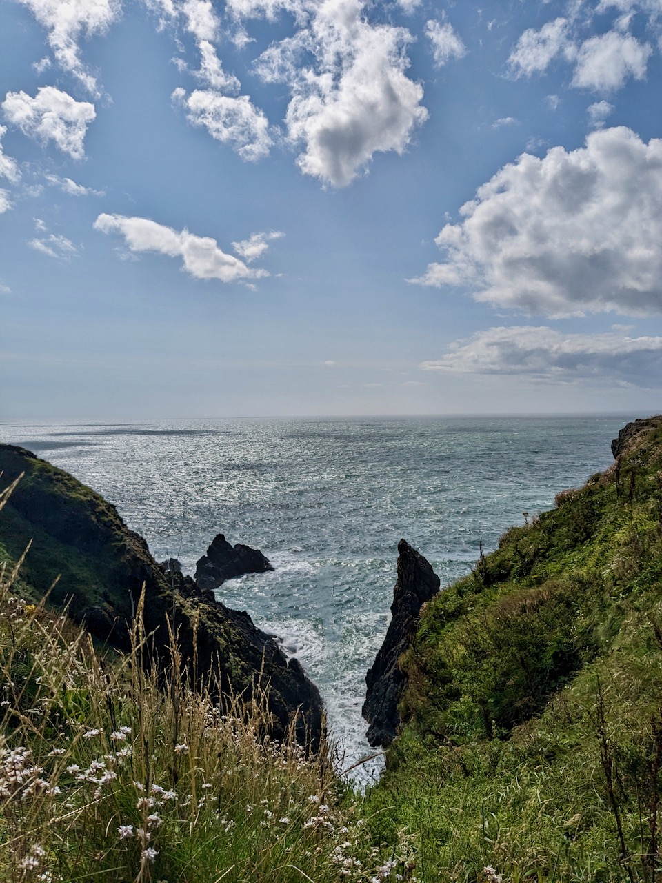

Pollokshields, Glasgow

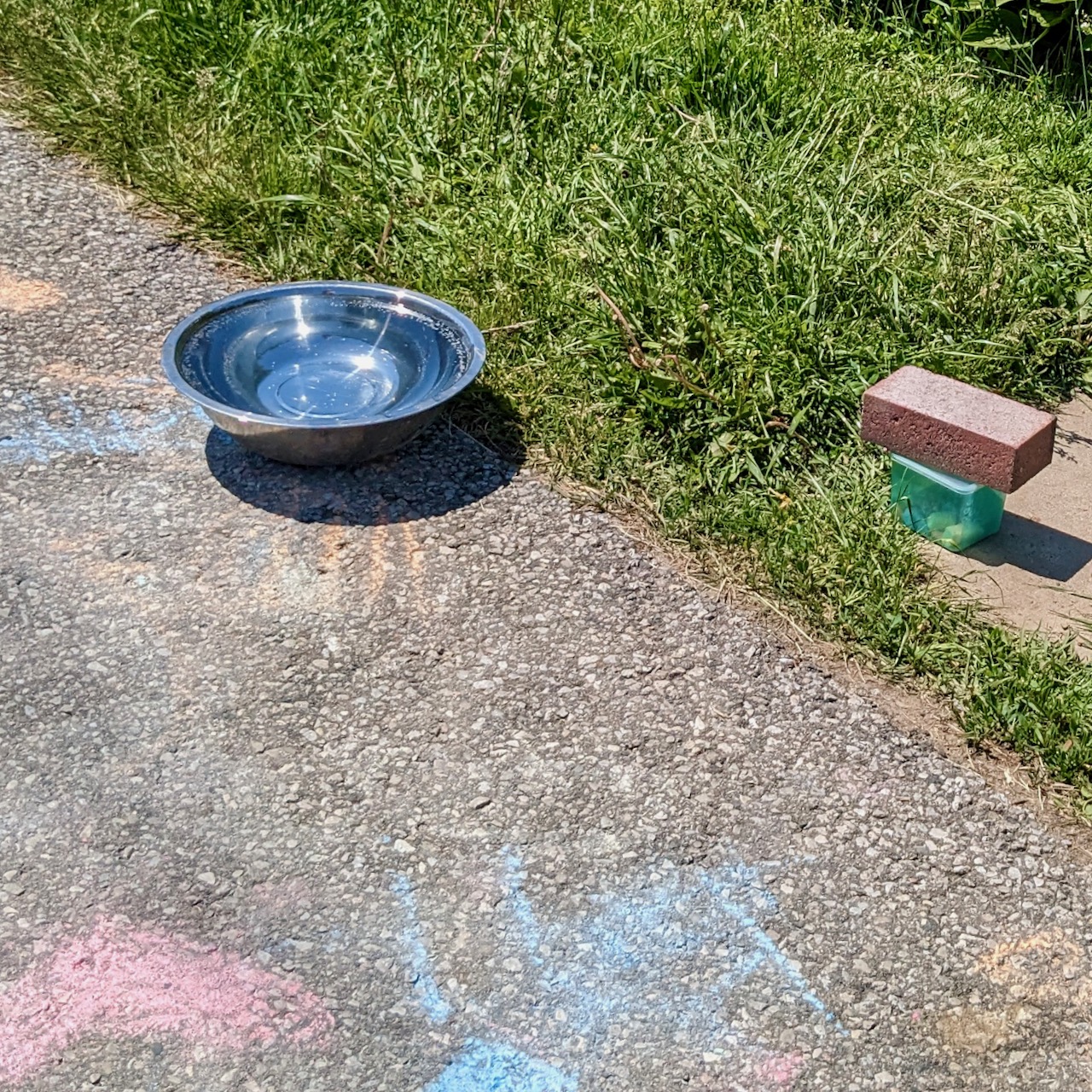
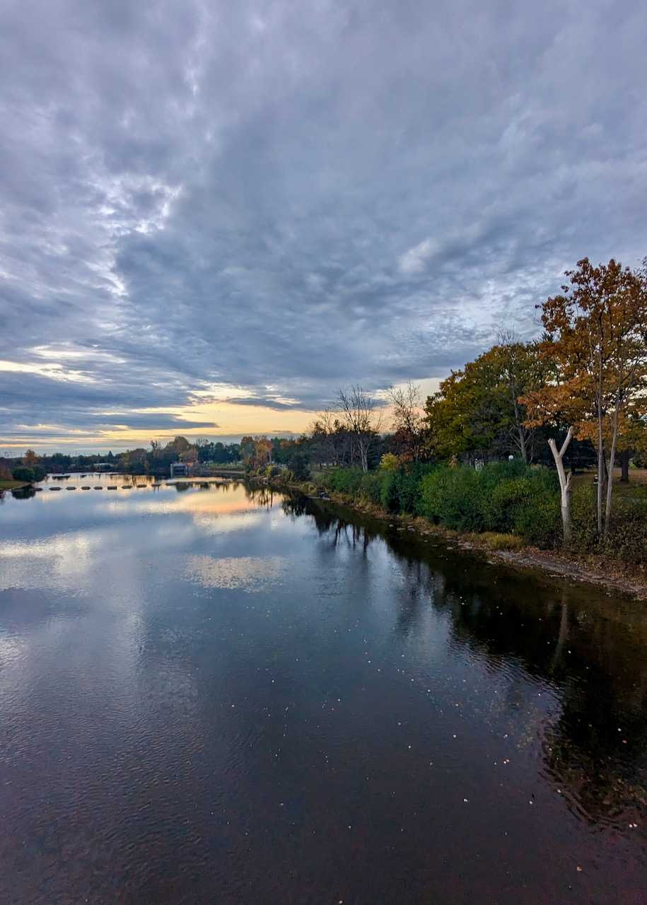
Near the back garden of a trail-adjacent home rests an invitation: give your pet a drink of water and borrow some sidewalk chalk from the green box.
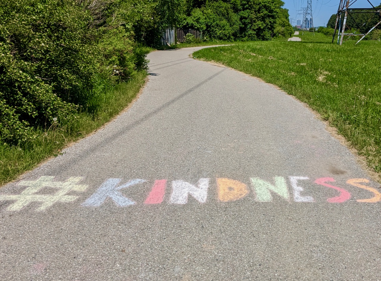
A group of young people had recently accepted the chalk invitation and left colourful words on the path to motivate the walkers, runners, and cyclists who would follow.
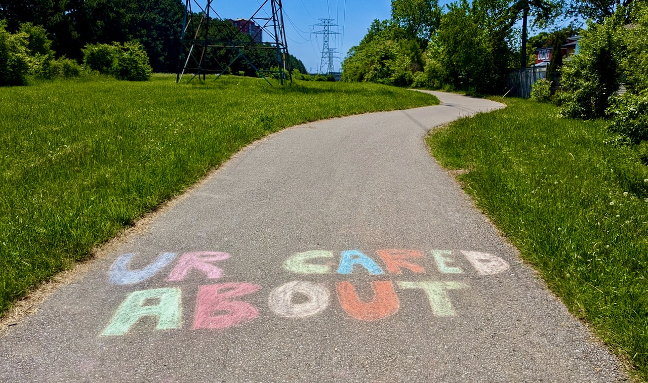
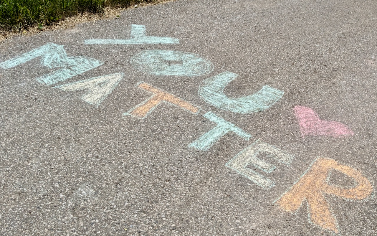
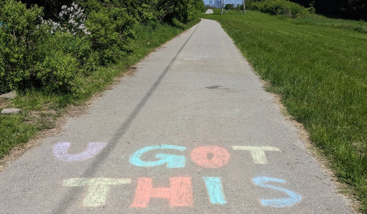
Thank you, anonymous messengers of encouragement!

Thank you, butterfly!
And many thanks to the kind hosts who filled the silver bowl with water and offered chalk for creative expression. You brightened my walk this morning!