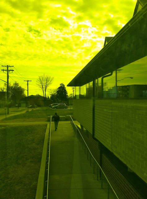
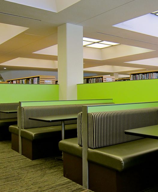
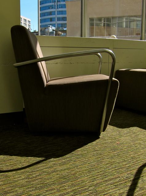
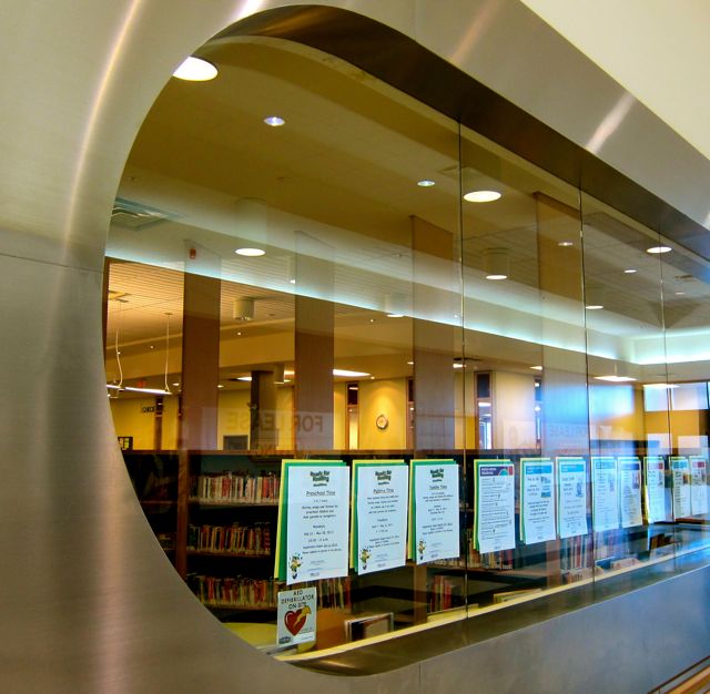
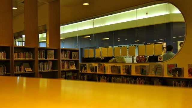
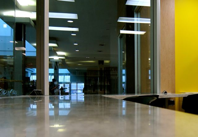
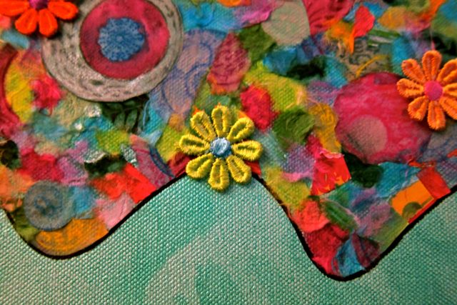
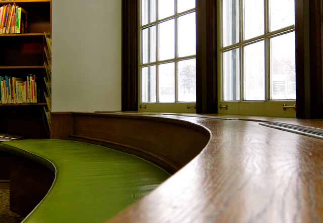
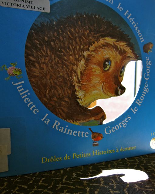
Similar to Evelyn Gregory branch, Victoria Village Library fit right into its neighbourhood setting, taking its place among the generous number of trees along Sloane Avenue in North York. With pale green walls and leafy views from its high windows, Victoria Village’s interior was like a cheerful and well-stocked treehouse.
Although built on a modest rise, there was a sense of elevation when I looked out the big glass door in the west wall. From there, I could see high rise apartments in the distance and trees in the foreground near the library’s parking lot.
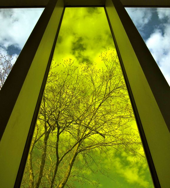
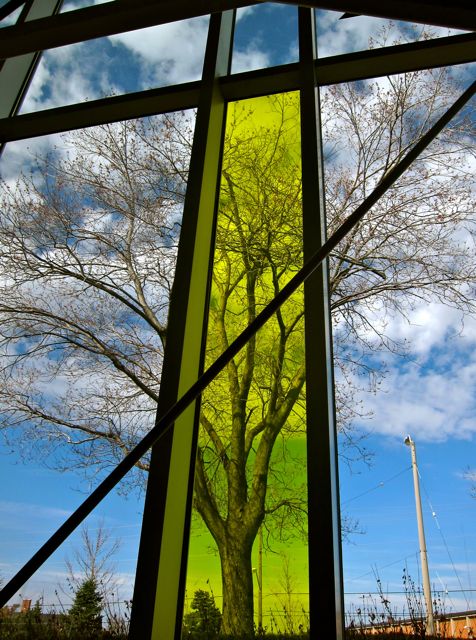
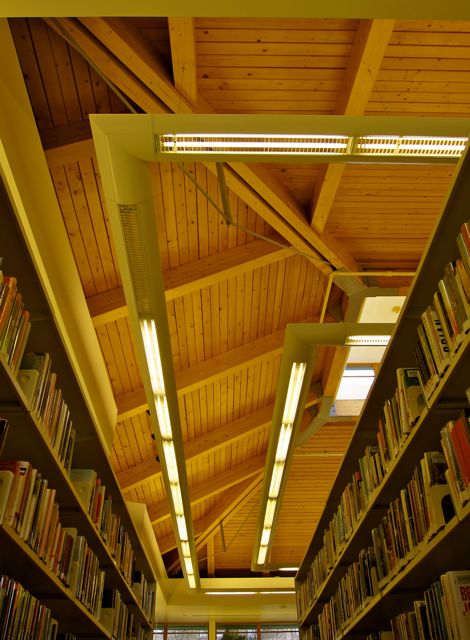
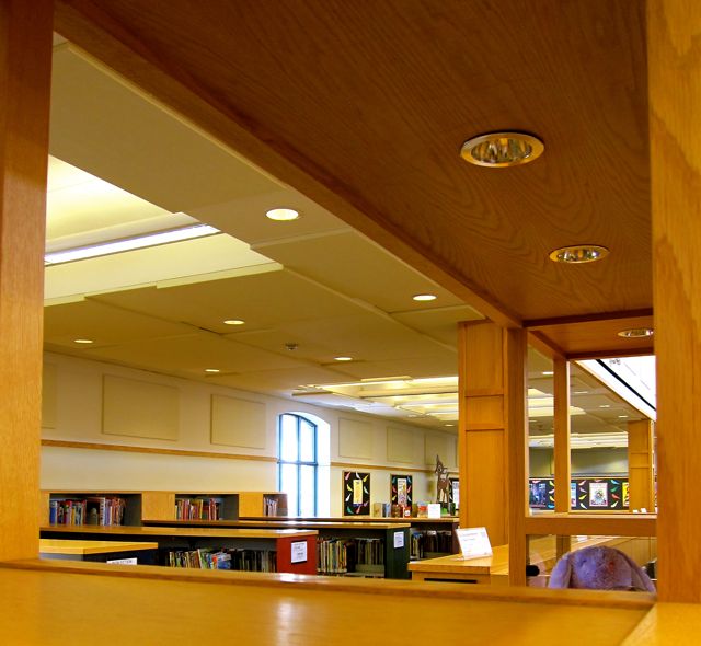
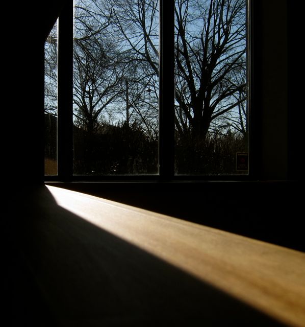
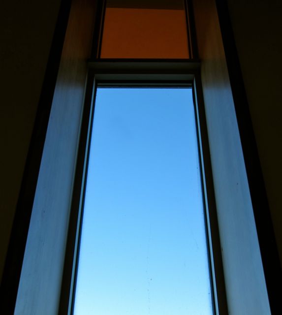
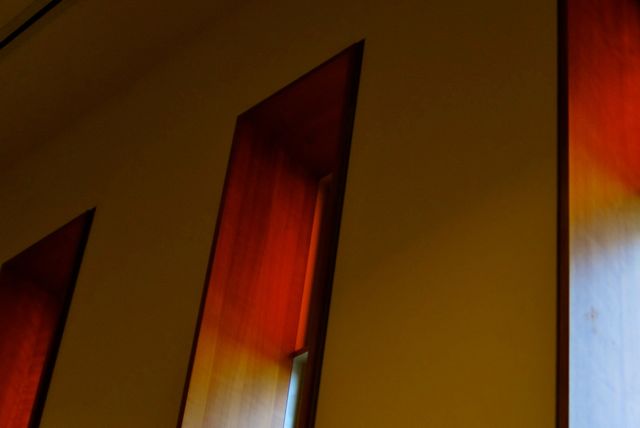
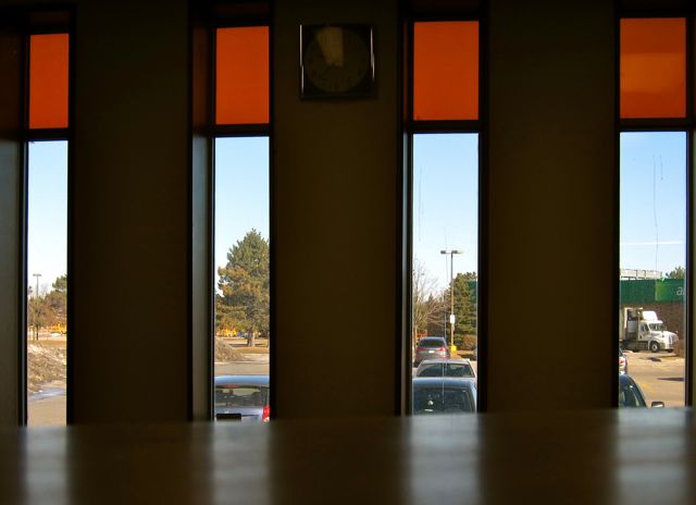
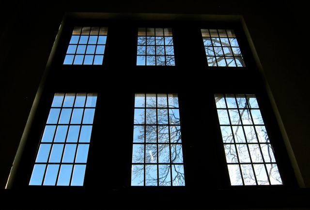
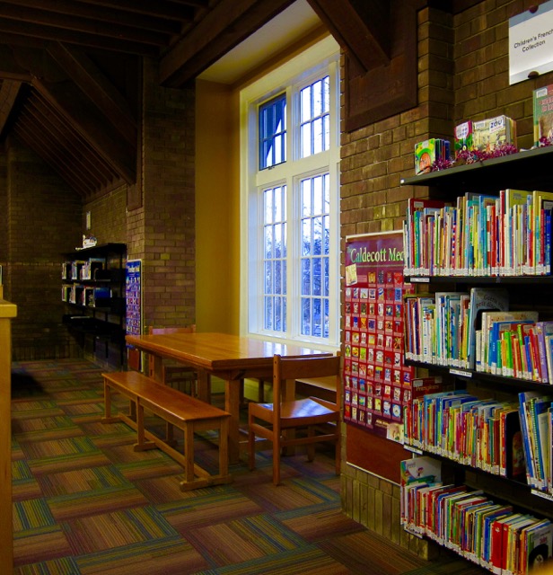
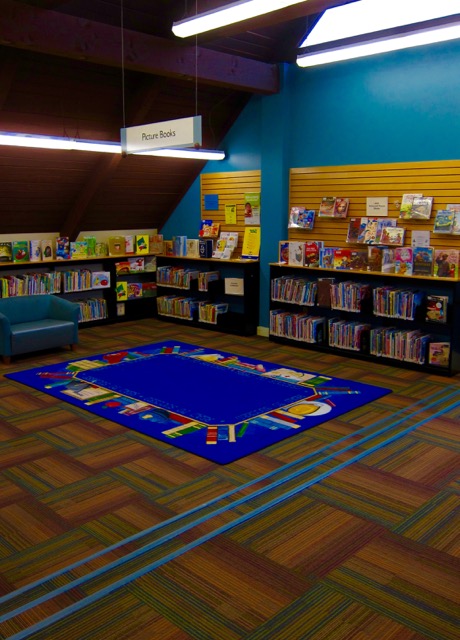
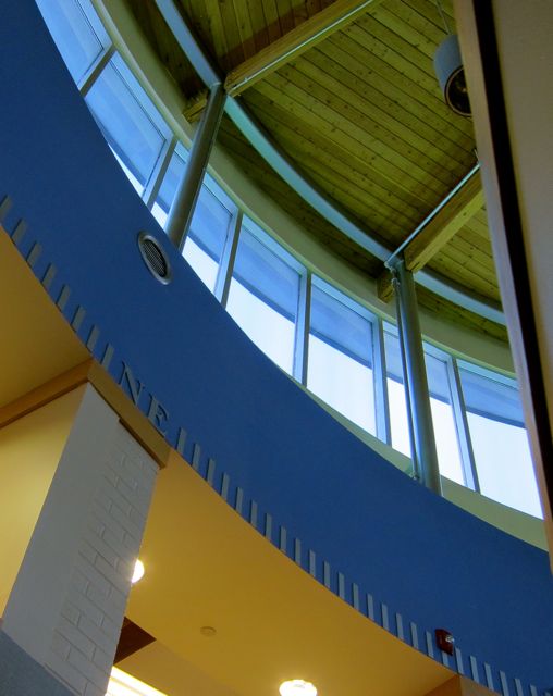
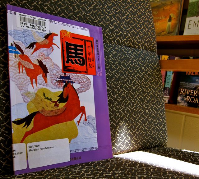
When I turned towards the north wall, I noticed that the ceiling was lower over the Kids and Teen’s Section, creating a long and narrow space illuminated by more than a dozen high rectangular windows side by side. These windows served up a vision of mystical sky slices filled with leaves in summer and dark branch etchings in winter. Below the windows, ESL materials as well as offerings in French, Chinese, and Hindi appeared on the shelves.
2013
In the Teen Zone, two homemade robot friends supervised a busy study table from on top of a bookshelf. Both robots wore pie tins on their heads and had protruding egg-carton eyes taped to their aluminum faces. Large disposable baking tins provided their torsos, and their arms were foil-covered paper towel rolls with hands made from fuzzy silver pipe cleaners. (On my 2013 visit, I saw that the robots had been retired from service).
20132013
Victoria Village also contained a large program room on the basement level. There, a forgotten scarf became a frame through which to appreciate the community area.
2013
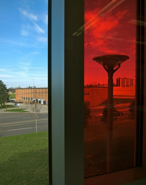
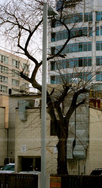
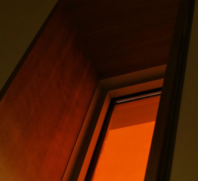
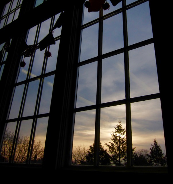
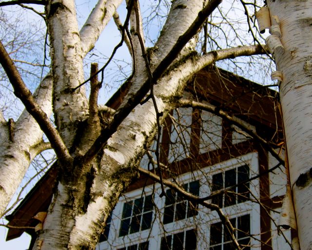
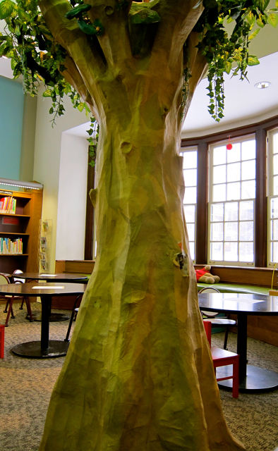
I was reluctant to leave this restful branch, so I walked slowly around the north side of the building after exiting. There I discovered the tree responsible for filling the interior window panes so beautifully. With the setting sun pausing on its branches, the parking lot could momentarily be mistaken for a backyard. And that’s the beauty of a library whose welcoming light shines brightly from summer to winter and every season in between.
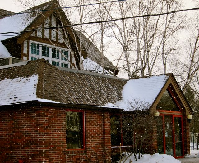
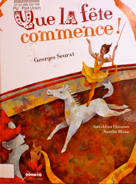
Closer to Pickering than to downtown Toronto, Port Union Library is the most easterly branch in the TPL system. In fact, fifty one kilometres separate it from its westernmost counterpoint, Alderwood Library.
I liked the small-town atmosphere of Port Union Community Recreation Centre, which welcomed visitors with a display of hand-crafted baby clothes. Occupying the west wing of the community centre, the entrance to Port Union branch was just to the left of the knitting exhibit.
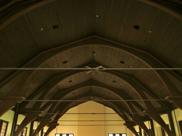
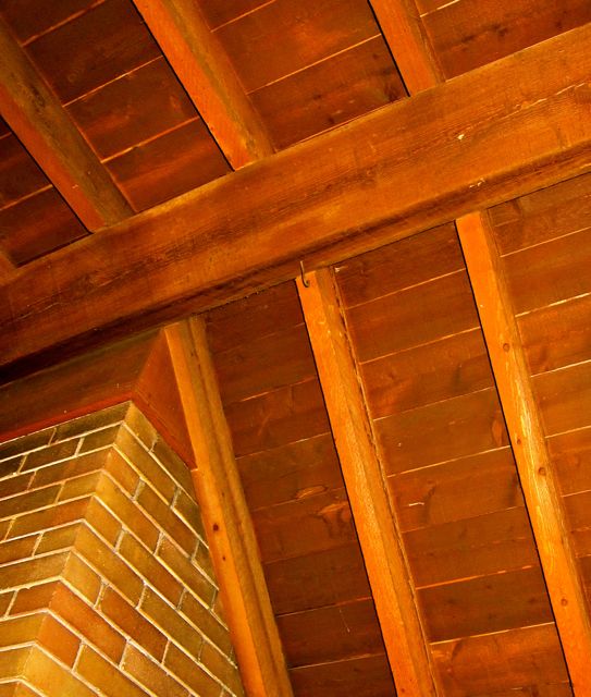
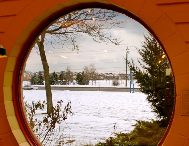
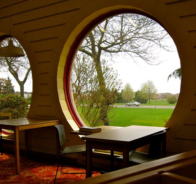
At first glance, the library was an impressionistic collection of red triangles and slanted wooden beams. Though small, Port Union’s tall windows, long side aisles, and unexpected corners made it seem much larger.
What distinguished this den, however, were two large portholes that encouraged soulful gazing for extended meditative periods.
20152015
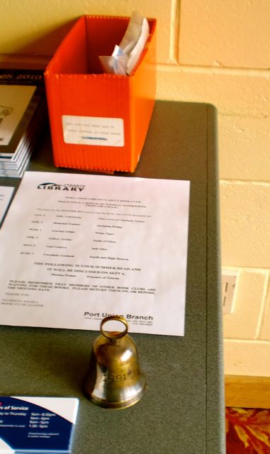
Not far from the portholes, an open door led to a program room. It was already set up for the coming evening’s Book Discussion Group, and I was touched by the care that had gone into the preparations. Each seat contained a copy of What’s On(Programs and Events at Your Library: January-March 2011) and a bookmark. In addition, the front table supported many copies of The Swinging Bridge by Ramabai Espinet, name tags, a meeting agenda, and a bell in case of verbal rowdiness.
2011
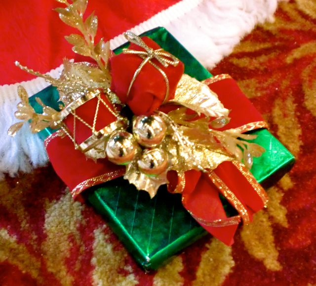
The library was still decorated for Christmas, so after exiting the program room I took a moment to admire the tree and one of the faux gifts underneath. As I crouched to take a picture of the shiny present, I studied the gold-ferns-aflame carpet at close range. It might not have been to everyone’s taste, but I found it festive.
2011
Warmed by wooden ceilings and blessed by portholes, I left the building after I checked out a CD by Yael Naim and a French book which narrated the back story of Georges Seurat‘s acrobat.
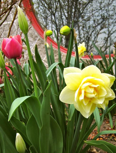
Port Union called me back in 2015, and I enjoyed visiting it in spring as much as I had in the depths of winter. Having appreciated the portholes from the interior perspective, it was time to focus on the exterior before driving back to Scarborough Junction.
2015
Port Union, I’d like to end this post by complimenting the stunning flowers that grow in the reflection of your portholes! Like you, they are cheerful, uplifting, and contemplative.
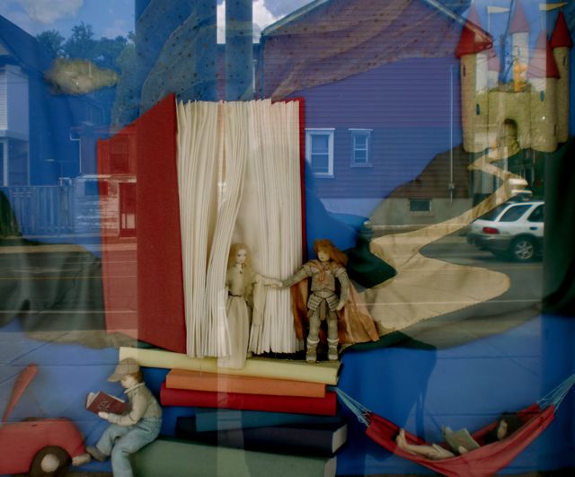
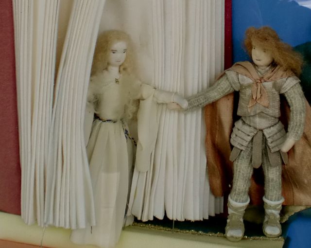
On a summer day in 2010, I took the #83 bus south from Donlands subway station to Jones Library. Even though it was my second visit, the experience was first-time fresh because I noticed so many more details. For example, I’d previously walked right past a wonderful textile art tableau that was displayed behind glass just beside the entrance.
Book-themed textile tableau by April Quan. (Photo taken in 2010, but artwork no longer on display in 2015).
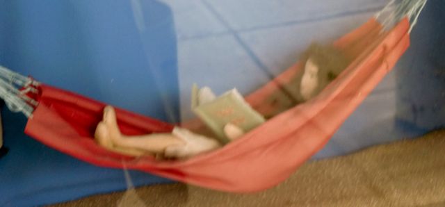
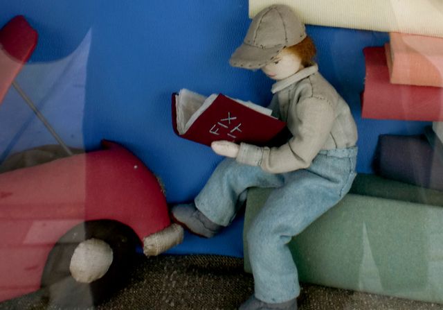
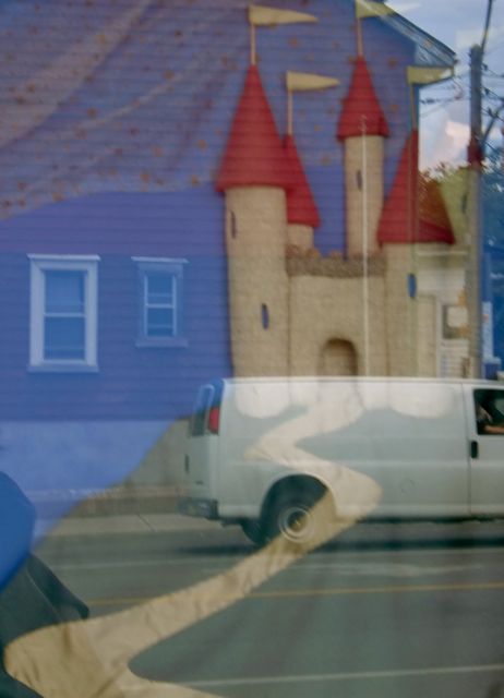
Created by April Quan, the same artist who fashioned the Woolen Castle at Deer Park branch, the Jones piece also featured a castle but had expanded its historical reach to include a hammock-reader and a mechanic.
Come on out of the book, Princess! Artwork by April Quan. Photo taken in 2010.
I loved the way the prince seemed to be saying, “Come on out of the book, princess.” The royal couple seemed unfazed by the presence of a car instead of a carriage and a hammock instead of a bed piled with mattresses on top of a pea.
Hammock bliss. Artwork by April Quan. Photo taken in 2010.Artwork by April Quan. Photo taken in 2010.Castle path gains modern van from street reflection. Artwork by April Quan. Photo taken in 2010.
Stone, wood, and sunshine greeted my eyes when I walked through the entrance to Jones. With the skylight’s help, the wooden floors glowed, and a stone wall near a large decorative quilt further warmed this small neighbourhood branch. Many patrons were taking advantage of the extensive Chinese collection, which included newspapers and magazines, and exuberant youngsters enlivened the computer bank.
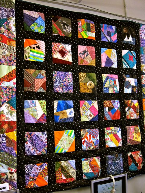
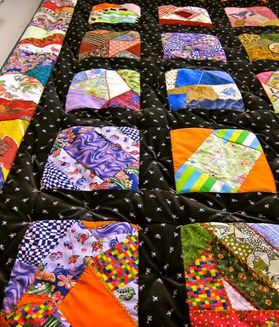
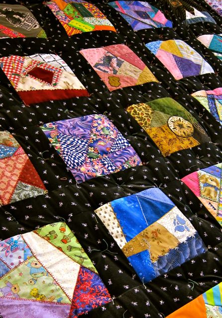
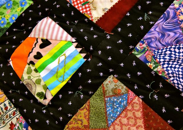
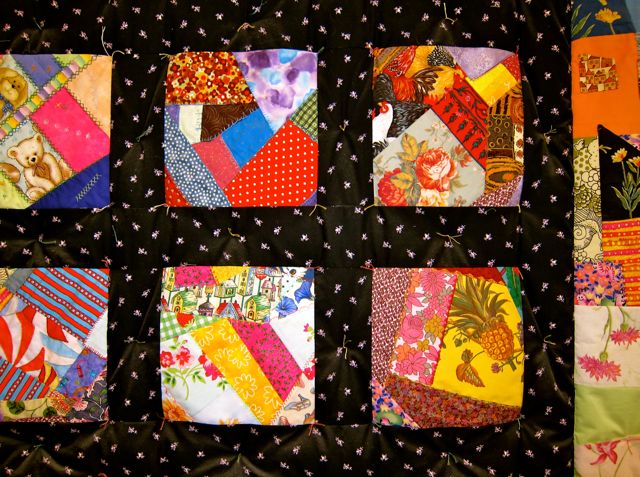
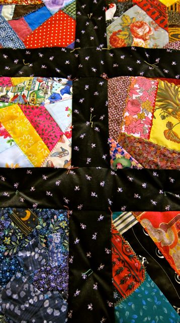
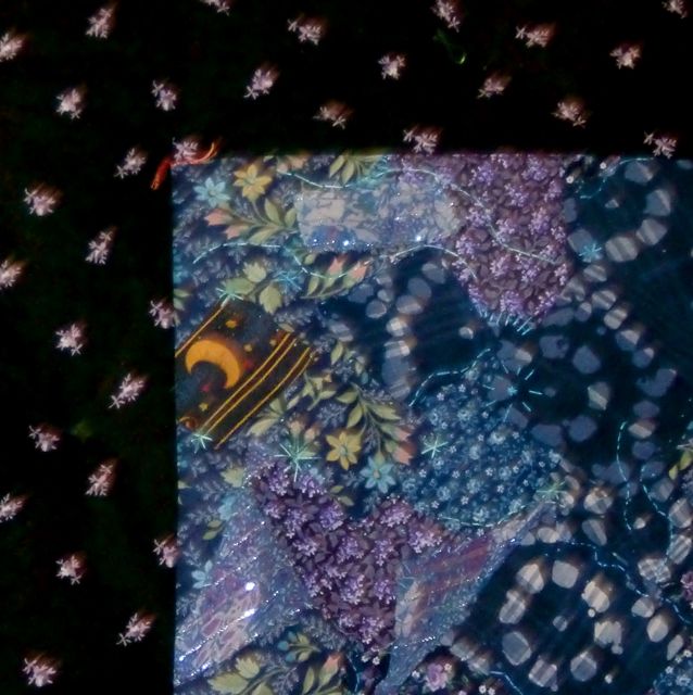
Victorian Crazy Quilt created by volunteers under the guidance of textile artist Sandra Reford in 2010. (Photo taken in 2015).2015
A gorgeous quilt hanging on the wall above the computers captured my attention. From a nearby notice, I learned that the textile piece was a Victorian Crazy Quilt that had been completed in six sessions by a team of volunteers in the winter of 2010. Textile artist Sandra Reford had guided the quilters, and the results of their artistic collaboration delighted me.
2015
I loved how the quilt hummed and vibrated with colour. I could have studied it for hours and found new patterns and pictures, but the following images immediately jumped out: planets, suns, beach balls, tents, flowers, teddy bears, a pineapple, and an elephant. Like a collage, the crazy quilt managed to corral these disparate elements together into a coherent whole.
2015201520152010
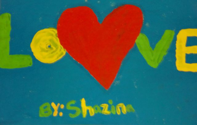
For a branch with only 3,636 square feet of floor space to its name, there was a lot to see and appreciate at Jones. Around the corner from the quilt was a wooden puppet theatre with a black velvet curtain. Leafy boughs filled the windows facing Dundas Street East, and original art decorated the walls above the children’s bookshelves. My favourite was Shazina’s heart-centred LOVE painting. Thick green and yellow letters spelled the most important word of all.
2010
Thank you Shazina and Jones Library, for your large heart, amazing quilt, and hospitable atmosphere!
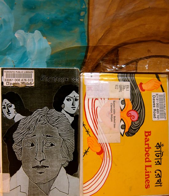
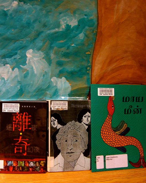
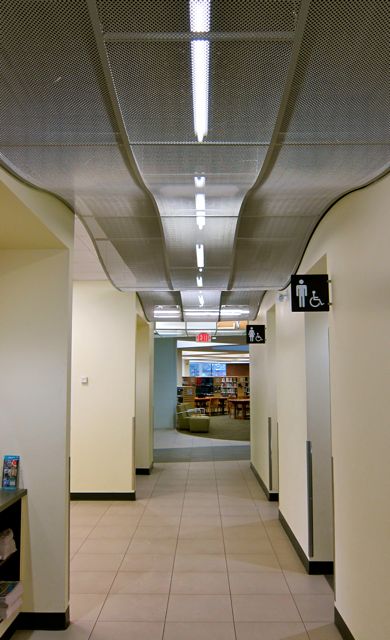
On a 2010 visit to Dawes Road branch, its bunker-like exterior stood in striking contrast to the warm and lively interior. From the lobby, I saw an occupied community room to the right and a large noticeboard devoted to immigrant services. Some of the programs included English Conversation Circles and more formal English classes.
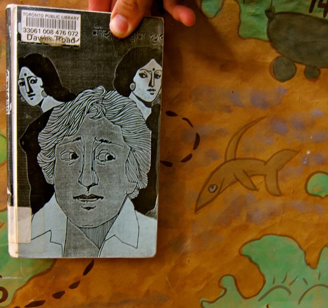
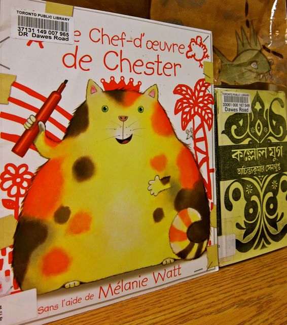
Dawes Road reminded me of Thorncliffe Library before its renovation. Both are small neighbourhood branches that serve a large multicultural population, many of whom live in tower blocks like Cedarview Apartments and Crescent Town. At Dawes Road branch, patrons can borrow materials in Bengali, Chinese, Tamil, Urdu, French, and Hindi. For example, here is a Bengali/English book about Floppy’s friends.
2010
Although Dawes Road resides in one big square room, the Children’s section has the means to be separated by a curtain. I liked the non-fussy atmosphere of this corner of the building, especially the simple stain-glass window decorations made from black Bristol board and waxed paper. Adding Halloween flavour was a purple polymer bat on a chain.
20102010
In addition to the bat, a freaky check out desk and eerie information area upheld the Halloween theme. Normally-sensible signs were draped with faux spider webs and festooned with pumpkin-headed scarecrows, monsters, and spiders.
I was tickled by the idea of a haunted returns box that featured a caution pumpkin beside the book slot. I wished for an audio device that could emit ghastly moans every time an item was dropped in the box. Even better, a reproachful voice could wail, “Your books are overdueooooooo!” when it detected a late return.
2010
Before I took my leave, I checked out a volume on Greek and Latin word origins. The librarian processed it with a spooky scanner that unnerved the check-out experience with a plastic spider.
Walking back to the car with my spider-scanned book, I felt impressed by the high level of Halloween spirit that Dawes Road had displayed.
2010
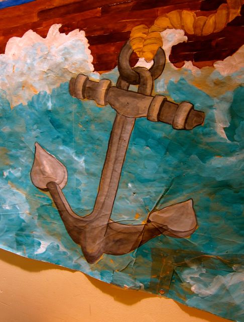
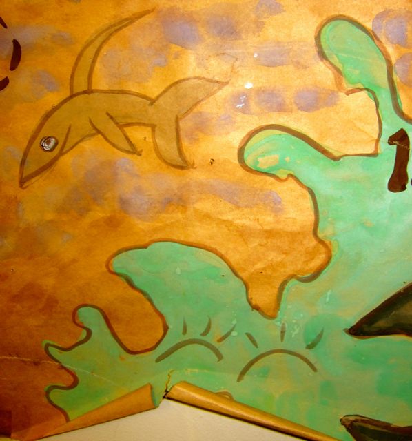
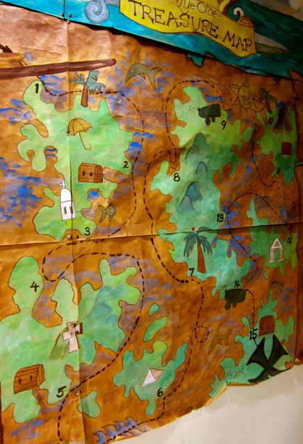
When I returned in 2015 to take new pictures for an exhibit, the check-out spider had crawled out of the premises. However, I discovered a hand-painted treasure map on the west wall just to the left of the beige curtain. I inquired about the artist of the map and learned that she was a beloved local teacher who used to bring the children in her classes to the library.
The creases, tears, and taped-up bits enhanced the artifact’s appeal, for though the map was old, much care had been lavished on its creation.
The map also served as an excellent backdrop to showcase Dawes Road’s varied book collection.
Concerned Man Shows Concern About SharkChester Is Less ConcernedStill ConcernedNever Fear, Concerned Man. All is Well. The Haunted Returns Box of Dawes Road Library Is Not Really Haunted!
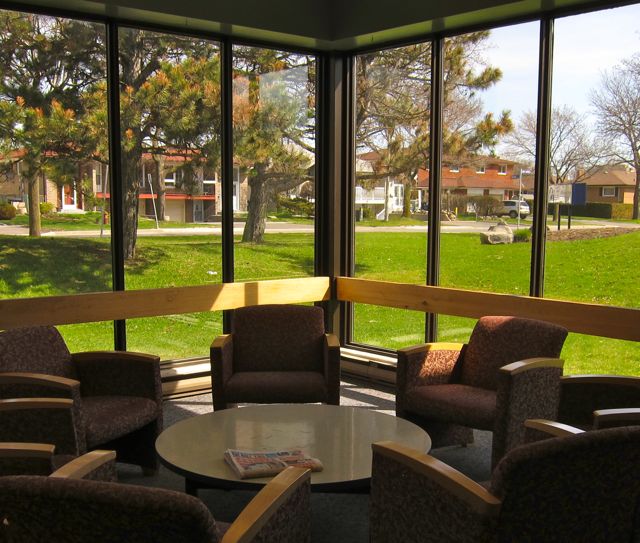
The 61st branch on my library pilgrimage was Pleasant View, which I checked out for the first time in 2009. It was the very last branch east of the Don Valley Parkway that I hadn’t visited up to that point.
20121970’s time capsule! Photo taken in 2015.
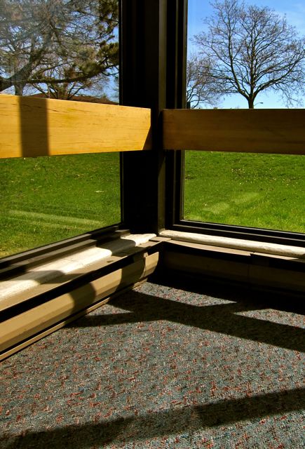
As I ambled around Pleasant View, I discovered a medium-sized auditorium and shelves with books in Chinese, French, and Italian.I was especially taken with the open reading areas. There was one in each of the four corners of the building, all with comfy chairs and floor-to-ceiling windows.
201520152015
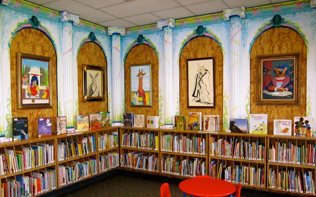
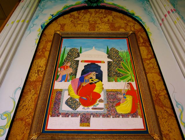
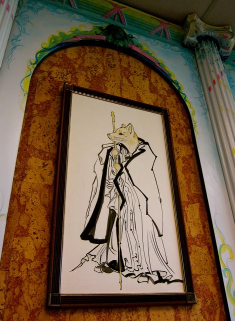
Though Pleasant View’s character seemed very pragmatic, it also had a whimsical side. In the Children’s section, five arches that contained animal portraits were separated by flat columns that had been splattered with pink and green paint.
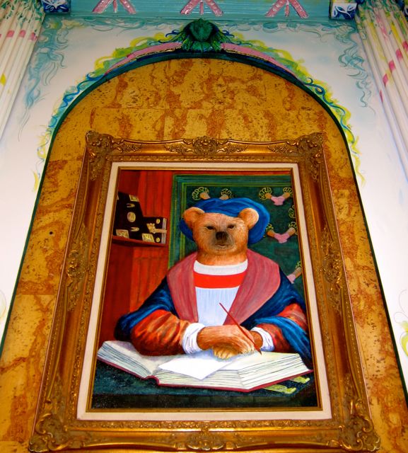
Proceeding from left to right, the first portrait starred a seated deer wearing a sari. Relaxing in a temple grove, the deer held a book in her hooves as she enjoyed a serenade by a woman with a sitar and a man with a drum.Next to the deer was a picture of a rabbit with an enigmatic expression and a pleasingly-draped blanket over one shoulder. The third frame depicted the head and neck of a cheerful giraffe. She wore a patterned red scarf and an unstructured tunic.The fourth animal’s identity was unclear to me; possibly it was a fox, but its whiskers looked feline. Priestly robes bestowed an extra measure of gravitas on the cat-fox.The final animal portrait featured a scholarly bear at work in his study. He wore a robe like an Oxford don and a blue hat in the shape of a Yorkshire pudding.Inspired by the studious bear, I left his host library even more determined to visit the remaining thirty-eight TPL branches!
I knew right away I was going to like the new Cedarbrae Library when a bird man on stilts waved his fuzzy rainbow duster of welcome at me. With a ukulele strapped on his back and wild tufts animating his head, the bird man was giving guests the highest fives of their lives as they approached the entrance.
2010
Energizing the post-renovation party, tabla drums and sitar beats floated down from the second floor. The size of the crowd was impressive but not overwhelming. With 31,500 square feet of room to manoeuvre, the new space was equal to the challenge of accommodating so many eager Cedarbrae returnees. One woman who saw me taking pictures remarked, “It took so long (to reopen) that it had to be the Taj Mahal of libraries. And it is the Taj Mahal of libraries.”
In addition to the vocal praise-givers, I especially liked the patrons who simply flomped down and began to read in the new armchairs, ignoring the speeches, the buffet, and all the hoopla. In my view, these introverts represented the true soul of the ceremony, settling deeper into the shiny upholstery to savour the library they had missed.
2015
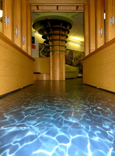
The children also lost no time in claiming their rightful place in the fantastic KidsStop area. To step from ordinary carpet onto a floor of rippling blue water was to be transported by riverboat into a magical realm. In this world, you can read inside an elephant, find jungle animals on the wall, follow a path of pebbles and riverbeds, or curl up in a nook to call up a story on the phone.
The children were having a big time trying out the learning games attached to the sides of the riverboat. One of the coolest activities I saw was an illuminated box with a pen that used light instead of ink. I also liked the cushions and soft furniture that called out “Come read a book on me!”
Next to the lively KidsStop was a long banquette situated in front of a huge window overlooking the program room. People kept running over to the window, catching sight of a major food preparation scene in progress, and exclaiming, “It’s food! Let’s go get in line!”
Watching the unfolding buffet operation became a spontaneous spectator sport. A number of kids took to kneeling on the cushioned bench as they observed librarians peeling back yards of aluminum foil to reveal pans of rice and samosas. By five o’clock, the queue stretched from the locked program room door to the middle of the lobby.
When I returned to the area thirty minutes later, only rice and fruit punch were left, and a jolly group of eaters now occupied the new red stage and the tiers leading up to it. The featured afternoon matinée was Sitting and Standing with Heaped Paper Plate.
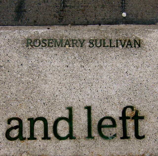
I wasn’t hungry, so I headed upstairs to avoid the chaos of the program room. It was much quieter on the second level, and all the extra space gave me a peaceful feeling. I was also impressed by the range of multilingual materials: Bengali, Hindi, Persian, Gujurati, Chinese, French, Urdu, Tagalog, Tamil, Polish, and Korean. Gazing at these shelves, the poetry selection for the Poetry is Public is Poetry installation on the sidewalk outside seemed especially apt: “A man packed a country in a suitcase with his shoes and left” (“Exile” by Rosemary Sullivan).
Other treasures of the upper floor included a local history room with the proper archival vibe, three study rooms alive to infinite possibility, and a Teen Zone with a long wavy black sofa already inhabited by conversing teenagers. I was also happy to see a gorgeous lounge and an extensive CD collection.
Comparing this successfully-renovated branch to how it looked when I took my 2003-2004 LINC classes to get their library cards, the place was unrecognizable. Inside and out, the new Cedarbrae Library is one of the best-looking buildings in this corner of Scarborough.
2015
It was dark when I finally left the party. I turned around to take a few last pictures and was dazzled by the light pouring from the library. And when I returned five years later to take photos for an exhibit, the light had remained strong. Indeed, Cedarbrae’s open spirit combined with its tinted windows continue to offer rich creative lenses that delight the artist in us all.
Beside the bicycle rack, 20152015201520152015201520152015
A number of years have passed since I last visited Burrows Hall, but Confucius and the Stone Lions have held steady in my absence. Impervious to the seasons, they serve the Chinese Cultural Centre’s courtyard with distinction.
2011
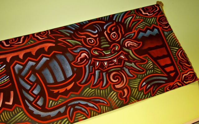
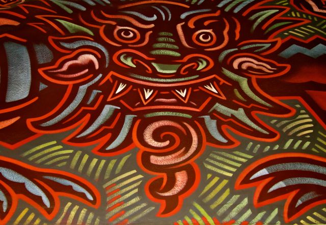
When I walked into the one-room library to west of the courtyard, I was pleased to see the dragon tapestry that I remembered from a previous visit. Presiding over the multilingual collection on the south wall, the sheer size and ferocity of the creature impressed me.
2015
With his bold eyebrows, serpentine goatee, and four fangs, the Burrows Hall dragon commanded respect.
2015
The ceiling in the dragon’s section of the library was much higher than the other half of the room, and I loved how the high north-facing windows revealed a blue Scarborough sky. With architecture that accentuated a view like this, it came as no surprise when I later learned that Burrows Hall had won an Ontario Library Association Building Award in 1999.
2011
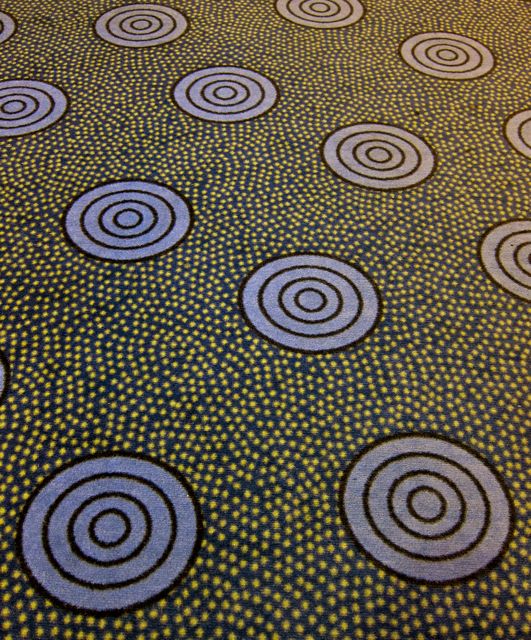
Turning my focus from the ceiling to the floor, I also admired the carpet with its abstract cinnamon rolls in a sea of lentils. (Or could they be bulls-eye targets embedded in lite-brite?)
2015
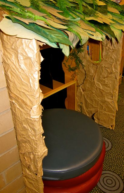
On the other side of the branch, two besotted toy mandrills sat on a shelf in the Children’s Section. With eyes only for each other, they were oblivious to the nearby Reading Hut and the Saturday afternoon crowd.
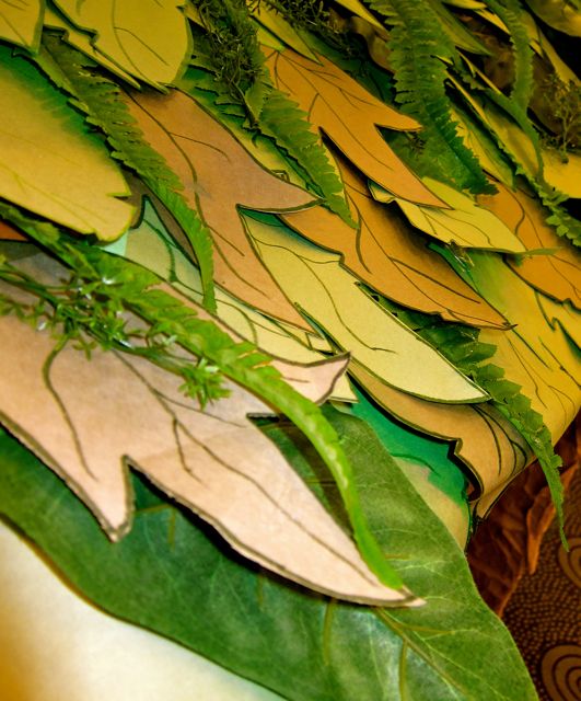
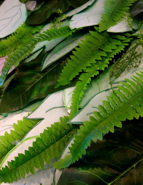
Could “Reading Lean-to” be a more apt description than Reading Hut? Photo taken in 2015.2015Even though the leaves were plastic, I thought it was cool that the Reading Hut had a green roof. Photo taken in 2015.
On the day of my visit, Burrows Hall was so hopping busy that I had to orbit the room a couple of times before I could find space at a table. Then I settled down to take pictures of books from the multilingual collection, which included Chinese, Hindi, French, Tamil, and Urdu.
The temporary challenge of finding a seat did not detract from the pleasure of visiting Burrows Hall. In fact, experiencing such a fully engaged facility made me enjoy it all the more. With Confucius’ statue only a few steps away, it seemed fitting that Burrows Hall had attracted patrons who preferred to spend their Saturday learning at a library instead of reclining on their sofas in front of a TV.
On a research visit to Northern District Library in 2009, I was struck by the serious atmosphere of this branch, how its vast main floor reminded me of a university library. To wander among its extensive shelves took a pleasingly long time, and an hour had passed before I realized I’d better wrap up my notes and fetch some food for dinner.
2015
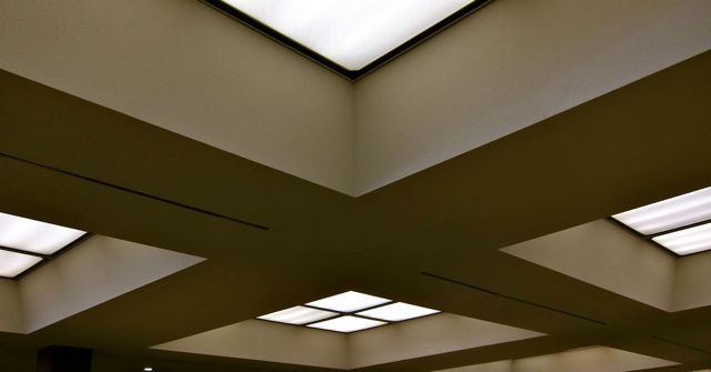
Idly glancing up, I noticed grid patterns on the ceiling that resembled an upside-down waffle. The flat lights were the waffle’s indentations, and the beams which framed the light-grids were the square raised ridges.
As I walked under the pale waffle, I passed leather couches near the entrance and headed over to the large Children’s Area in the southeast corner. Reading benches were placed near the tall windows, creating ready perches for when the call to read struck. An inclusive display of books was propped on top of a non-fiction shelf: Goddesses, Heroes and Shamans, Sikhism, and Many Ways: How Families Practice Their Beliefs and Religions.
A striking feature of the children’s section was a functional art piece entitled Appleapes. Composed of wood, it contained a row of coat pegs integrated into the body of a mama ape who was clutching red apples in the digits of each lower limb. Above the maternal primate were four babies hanging from the red wooden border overhead. They shared their parent’s love of apples, happily clasping the fruit in their hands.
As I meandered through the rest of the library, I marveled at the size of the foreign language collections: French, Serbian, Chinese, and Estonian. ESL and Literacy materials abounded, and a North Toronto Local History Section was available for researchers.
My last stop was the Skylight Gallery. Located upstairs, it consisted of a semi-circular stretch of wall that curved underneath an uplifting window to the sky. After a moment of relishing the quiet space bathed in natural light, I trotted back down the stairs and emerged into the afternoon bustle of Yonge and Eglinton.
In the two and a half years between my first and second blog post about Northern District, a renovation occurred and I added camera skills to my blogging toolkit. (Furthermore, after a recent visit to take pictures for an upcoming photography exhibit, I edited the 2012 photos and added new ones for good measure.)
2012
In 2012, the main differences I noticed were a glass-walled program room (where my friend Ellen and I led a Culture Days program in 2011), luxurious new study booths in the teens section, a snacking zone, and three beautifully contemplative study rooms.
2015
Two other important changes were the shifting of the children’s section into a different corner of the library (minus the Appleapes) and the creation of a spacious reading area in its place.
2012
I liked the way the new reading room seemed to thrust the readers into the heart of Yonge and Eglinton — all the city dynamism without the noise!
201520152012
The final difference between the 2009 and 2012 versions of the library was the presence of a striking art display by Afsaneh Shafai in the upstairs skylight gallery.
2012
Northern District Library, it’s been a pleasure to witness your evolution. Keep bringing the scholarly energy, support for the arts, and willingness to change!
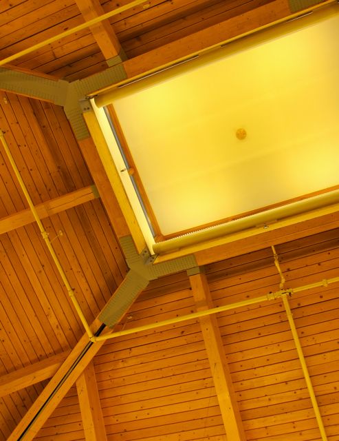
A number of years passed between my first sojourn to Highland Creek and later visits, but I did not forget the distinctive ceiling that resembled an unfolded sauna. Thanks to the the ceiling’s skylight and the generous number of high windows, Highland Creek was as radiant with natural light as ever.
20152015
Not far from the skylight, four lucky readers had settled in the same number of armchairs in front of the hearth. Two coffee tables were piled high with the remains of fireside browsing material: magazines, craft books, and a photo digest of Prince William and Kate Middleton. Later I added to the stack after I photographed two books from Highland Creek’s small multilingual collection.
Closer to the entrance, a glamorous dragon called Desdemona batted her lashes at incoming library patrons. I liked the she-dragon’s sparkly green scarf and the way it complemented her hide-tone. With purple talons matching the shade of her ears, wings and back-plates, Desdemona was the best-accessorized dragon I have ever seen.
20152015
From a high shelf in the Children’s Section, the dragon’s tail received the solar benefit of south-facing windows, something that a reptile in a cold climate must appreciate.
2015
Highland Creek’s multipurpose room contained some interesting wall art that referenced the previous summer’s reading program, Destination Jungle. Thank goodness nobody had torn down the art at summer’s end, for I would have missed the opportunity to see the denim-clad monkey, fluffy cuttlefish, and the melancholy frog.
2011
Highland Creek, thank you for the opportunity to bask in the presence of your skylight, hearth, and bright mural!
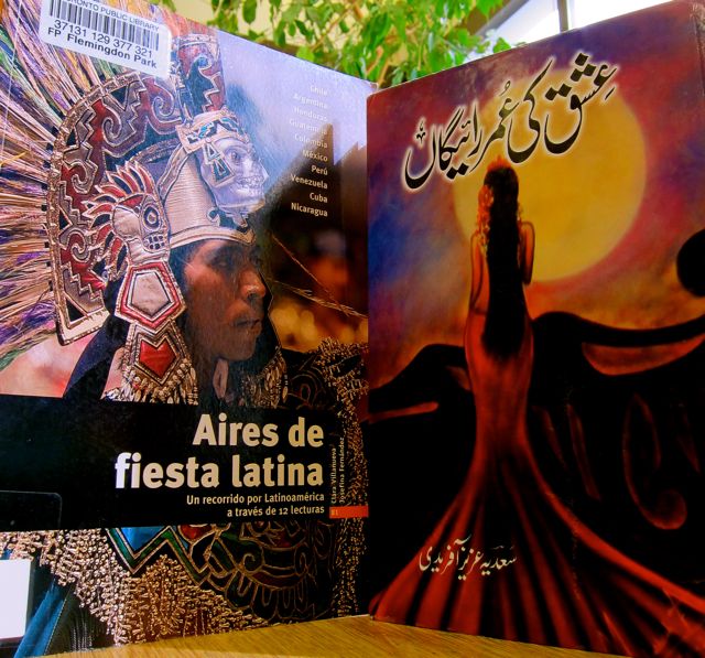
Similar to Dawes Road and Thorncliffe branches, Flemingdon Park Library holds its ground in the shadow of multiple sets of high-rise apartments. Located just south of the Don Mills and Eglinton Avenue intersection, the branch shares its quarters with a pool and community centre.
2015
On arrival at Flemingdon Park, I went to the sunny reading room first. An elderly patron was reading a newspaper in her first language aided by a magnifying glass, and silence reigned among the wooden tables.
2015
After some quality quiet time in the reading room, the skylight near the lobby drew me back into the main section of the library. With my head tilted back towards the light, I noticed the mural that hung beneath a triangle of glass. I liked the central Canadian flag and cheerful panels, each containing an individual picture.
2011
The heart shape composed of nestling face-crescents captured the beauty of Toronto’s multiculturalism, and I liked how the library showed tangible support for diversity with its resources in French, Chinese, Gujarati, Hindi, Persian, Russian, Spanish, Tagalog, Tamil, and Urdu.
2011
In addition to the faces in the heart, a portrait of E. T. also appeared in the mural, causing me to wonder if it might have been painted in 1982, the year the Spielberg movie came out. This would make historical sense, as Flemingdon Park branch opened in 1981.
2011
Even though the library wasn’t as slick and shiny as some of the more recently renovated branches, it displayed a lot of heart. The Children’s section was unadorned but functional, and it was obvious that residents of Flemingdon Park relied on the library for important services that many could not otherwise afford, such as newspaper subscriptions, Internet connection, and MAP passes. (On my most recent visit, more than a dozen patrons had lined up long before the Saturday opening time of nine a.m. in order to secure popular MAP passes. One woman had even brought her camp stool to perch on).
Indeed, though Flemingdon Park’s may lack conventional glamour, it still serves as a place where readers can meet a moon-fish, hipster bears, and Persian heroes under one sunny roof!
Wanting to gain a sense of the exterior of Leaside Library before it opened for the morning, I began to circle the perimeter. However, an ancient boulder soon stopped me in my tracks. According to a nearby sign, this “Precambrian erratic was slowly transported to the Leaside area by a glacier more than 10,000 years ago.” I loved the rock’s dignified presence, which was like a grandfather elephant resting after centuries of geological movement. When I looked more closely at the cracks and patterns on the erratic, I found one that looked like a giraffe.
20102010
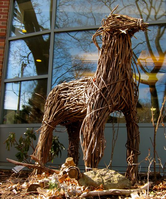
Next, I trotted along a boot-made trail in the snow and took in Leaside Tennis Club and Traces Mane Park before ducking into the warm library. (In addition, on my most recent visit in 2015, I encountered an equine creature made of sticks who stood its ground on the north side of the building).
2015
As I was getting my bearings in the lobby, a group of preschool kids trooped through the door in a jolly burst of noise and colourful hats. Their teachers ushered them into the program room to the right of the entrance, where a sliding door created a separate space for the duration of the program.
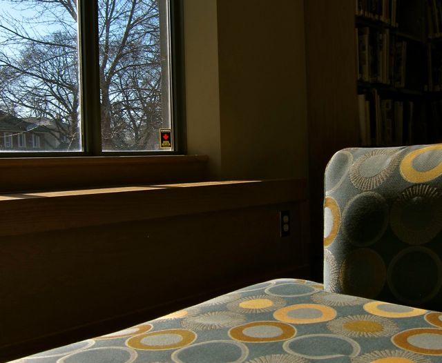
About an hour later, I noted the expansive south window that suffused the place with pure winter light. I also liked the clever storage area for flat cushions in primary colours. (When I was in Brownies in the States, we called them “sit-upons” but I’m not sure if they’re called that in Canada).
20152015
The rest of Leaside’s interior was pleasingly rectangular. I loved the high windows on three sides, especially in the places where dark tree branches held steady behind the panes. Most of the space was open plan, with the Children’s Room demarcated by a portal that contained display cabinets on either side. A bank of computers formed most of the outer barrier of the kids’ zone, with a gap serving as a second entrance.
20152015
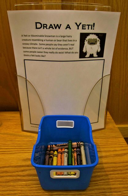
Guarding the cabinet-entrance was a non-threatening Yeti, and on the other side of the barrier was a deer in a long stocking cap. I was very taken by one of the display books, The Cow Who Clucked, for I support a cow’s right to cluck instead of moo if she so chooses.
As I continued my self-guided tour, I found the French collection and some window seats. A patron was contentedly seated on one of them with her laptop. She had set her galoshes carefully to one side and was typing in her stocking feet.
The north window bank also had its fans, as did the local history room near the checkout desk. When I explored the Leaside Room, I discovered a signed copy of Horton Hatches the Egg by Dr. Seuss and a framed example of Mayoral bling with lots of gold maple leaves clasped together.
201520152015
Refreshed by sunlight and shadows, I left Leaside with a spirit of gratitude for its distinctive boulder, contented Yeti, friendly staff, and classy decor.
Located at the northernmost reaches of Woodside Square Mall, Woodside Square Library’s sleekness immediately captured my attention. The exterior wall was covered in silver metal and contained windows looking into this one-room branch.
20152015
With its silver compactness, the library resembled the ultimate hipster submarine. And like a beatnik café, in San Francisco, this educational joint was jumping! The room was packed with parents reading to their children, kids sitting on the floor with their picture books, each computer busy, some elderly men nodding over Chinese newspapers, and teenagers hunkered down over their math textbooks and calculators.
20152015
As I wandered around Woodside Square in a loosely counter-clockwise manner, I admired its groovy flair. Some of the windows on the east side of the north wall contained dark amber panes, creating an artistic effect that was only slightly marred by the mundane view of a Food Basics parking lot.
201520152015
I also liked the wooden wrap-around bench that jutted from the west side of the north wall, providing unstructured seating under another row of windows. And a corner seat tucked between two shelves was another example of clever usage of a limited amount of space.
The children’s area sheltered in the friendly presence of a lozenge-shaped window that overlooked the mall corridor. Seven staggered windows — stacked in bars of yellow and orange — competed with a circular green desk to see who could be the most colourful.
20152012
Although Woodside didn’t have an extensive a collection of multilingual books, it did offer materials in Chinese, Gujurati, Hindi, French, and Tamil. The romance section seemed disproportionately ample for the size of the branch, but why complain when you could enjoy being Seduced for the Inheritance or scandalized by Texas-sized Secrets?
Almost as big as a Texas-sized secret was my surprise at finding a DVD about the history of the Kansas City Chiefs. Growing up in the Kansas City area, most of my acquaintances had an opinion about the Chiefs or the very least a red Chiefs T-shirt. When I was a teenager, I worked in the cafeteria at the college where the team used to train over the summer. (I still remember how much steak the athletes consumed!) Several decades later and one country north of the border, here was a slice of home in a thin plastic box. Amazing!
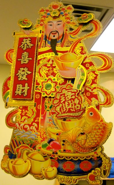
Still marvelling over the unexpected Chiefs DVD, I walked over to the automatic check-out machine. As my selection was processed, I enjoyed looking at the red firecracker decorations that celebrated Chinese New Year for 2009. Welcome, Ox! Lanterns with red tassels dangled from the ceiling, adding a festive vibe to the room.
2012
The last feature of Woodside Square I admired was a sturdy returns slot that was set deep into the wall. I wished I had a thick book to return so I could hear it make a satisfying thunk in its receptacle.
Though I had nothing to return, I left Woodside Square with New Year gifts of colour, memory, and architectural beauty!
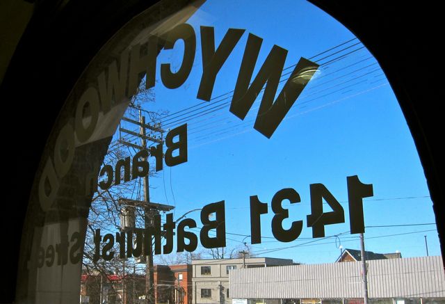
On an afternoon in 2009, I took the number seven bus from Bathurst Station to visit my 63rd Toronto Public Library. As I walked down Bathurst from the Saint Clair West intersection, I caught sight of a sensible castle with timbered window-frames and a lovely fat turret. (This site is also famous for appearing in Scott Pilgrim vs. the World).
20152015
Later, I learned that the official term for Wychwood Library’s architectural style is “Tudor-Collegiate” and that a $50,000 grant from the Carnegie Corporation of New York funded the creation of Wychwood and two other identical branches (High Park and Beaches). Designed by Eden Smith, Wychwood was completed in 1915 and opened to the public on April 15, 1916. (Please see Margaret Penman’s A Century of Service: Toronto Public Library 1883-1983 pages 25-26 for further Wychwood history).
As a twenty-first century visitor, I admired how the attractive wood and stone exterior of Wychwood branch matched the decor of the interior. For example, the glossy checkout desk on the ground floor was made from dark wood, and the east wall in the children’s room contained one of two original stone fireplaces.
2015
In the children’s section, the austerity of the empty hearth was offset by bright red recliners that rested underneath two plush sunflowers hanging from a sign. The orange centres of the flowers had smiley faces stitched on the felt, and multi-coloured petals radiated cheer in red, yellow, and green.
Further animating the space were large papier mâché fish with scales of yellow and blue who were swimming next to a model vessel with russet sails. I also enjoyed local artist John Clapp’s fanciful “Dinosaur Farm” on the south wall, which depicted chickens running around a friendly T-Rex and some porcine Triceratops.
Dinosaur Farm by John ClappDinosaur Farm by John Clapp
Smiling at the idea of dinosaurs as farm guests, I headed back towards the main stairs, briefly popping inside the large round turret, where I found a program room with carpeted steps for seating.
As each narrow step took me closer to the upper level, the extent of overhead immensity gradually became revealed, making me catch my breath in surprise. Who knew a high timbered ceiling could be so exciting?
2015
The wooden ceiling, dark wood, muted lamps, and stone fireplace (identical in structure and position to the one downstairs) reminded me of the Monks’ Dormitory at Durham Cathedral where I used to read poetry and academic texts during my junior year abroad in 1989.
2011Mullioned windows! 20152015
After gawking at Wychwood’s ceiling, I walked through the upper half of the turret (above the program room) which had a curved balcony wrapped round it. Next to some bamboo stalks in a large pot was the French section. The ESL collection was also substantial, as were the fiction and reference offerings.
Only one area remained to be explored: a third-floor perch that had been constructed under the west eave. Taking up roughly a quarter of the space afforded by the hall’s ceiling, it contained one big study table and a few individual carrels.
2011
This cozy platform gave the sense of being in a tree-house, and I felt at peace just resting at the wide table, taking a few notes for this blog post. Thank you, Wychwood Library, for providing so many levels to explore and for your rich connections to history, education, and film!
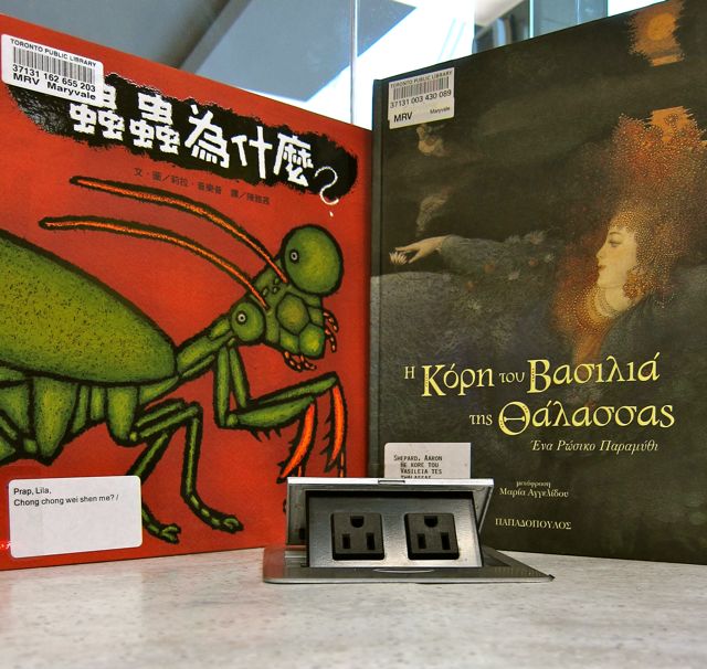
Located next to The Flower Emporium at Parkway Mall, Maryvale Library shares a lot in common with its mall-library cousin, Eglinton Square. Both branches opened in the 80’s (1987 and 1983 respectively), occupy one room, and refuse put on airs. Marvyale even has the same wooden letters spelling “CHILDREN’S” on the wall as Eglinton Square does, although the Cat in the Hat inhabits the letter “C” instead of a monkey.
I like the Maryvale Cat’s jaunty bow-tie and playful expression. (Photo taken in 2015).
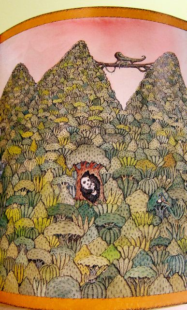
When I visited Maryvale in 2012, I noticed a fold-out series of Peter Sis illustrations of Sleep Safe Little Whale by Miriam Schlein on a high shelf near the irreverent Cat. A wide variety of sleeping animals appeared in the paper panorama, but I found the panda bear mother and her cub in a hollow tree especially endearing.
One of Peter Sis’ illustrations of Sleep Safe Little Whale by Miriam Schlein
Another nearby shelf provided a platform for a white mama rabbit with a baby stitched to her arms. The older rabbit wore a pink ruffled apron trimmed with a floral pattern, and the inside of her ears were lined with same floral cloth. The pair appeared to be party-bound, for they both had festive bows sewn to their upper foreheads.
2012
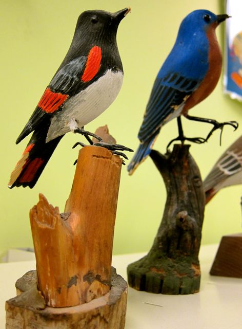
Throughout the library, a certain randomness to the decorations prevailed. Wooden birds faced Lord of the Rings posters on the other side of the room. I saw a Renoir print, some aging travel posters, and an odd paper-craft item (a square within a square with a dangling tail) over the check-out desk. Clutching the registration sign overhead was a superhero toy with a cape.
20122012
Despite my lukewarm response to Maryvale’s 2012 decor, I don’t mean imply that the value of a library lies in its appearance. After all, Maryvale branch is a friendly, well-stocked facility that offers materials in Chinese, Greek, French, Arabic, Tagalog, Tamil, and Hindi. It just seems unfair that some branches have received more investment in their image than others. For example, why does Beaches Library have a a timbered ceiling and a window seat overlooking Kew Gardens while Bridlewood Library* has a rocket made of construction paper?
A simplistic formula such as “wealthy neighbourhood = elegant library” cannot fully explain the imbalance, for some of the most lovely branches — Riverdale, Kennedy/Eglinton, Malvern, Cedarbrae — reside in deprived areas. My wish for less showy libraries like Maryvale is for them to be models of beauty in a wasteland of suburban malls.
20152015Reading Program Display, 2015
*(Note: Bridlewood’s paper rocket is no more! See this post for Bridlewood’s newer look. Moreover, the Mama Rabbit, wooden birds, and the posters are no longer at Maryvale; nor are there any objects dangling from signs above the check-out desk. On my 2015 visit, I was impressed by the new laptop counter that had been installed by the windows).
Inside Eglinton Square Mall is a food court. Inside that food court is a Manchu Wok. And beside Manchu Wok is a library!
A no-frills branch in one square room, Eglinton Square Library is my frequent go-to destination to pick up holds (second only to Kennedy/Eglinton). This library is almost always very crowded, even at six pm on a weeknight. Patrons often need to stake their claims on various study-territories, spreading out their papers widely to ensure sufficient personal space.
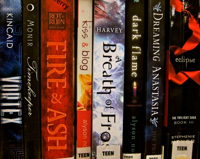
Located a few steamy shelves to the west of the study tables, the Romance collection looms large in this modestly-proportioned branch. Spoiled for choice, readers can consider titles such as Beast of Desire, Perfectly Saucy, and Dirty Harriet Rides Again.
Not far from the south wall, Tagalog, Chinese, Tamil, and French materials constitute the bulk of Eglinton Square’s multilingual section, with a spirited shout out from Hindu videos. (Greek, Gujarati, and Korean used to be available at this branch, but the collections have now moved elsewhere in the TPL system).
On the north side of the room, three sets of low shelves arranged in a boxy “U” shape create an alcove for the Children’s section. The most prominent decoration is a set of chunky wooden letters spelling “Children’s” attached to the wall. A wooden monkey sits in the lower curve of the capital “C”.
2015
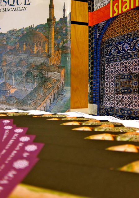
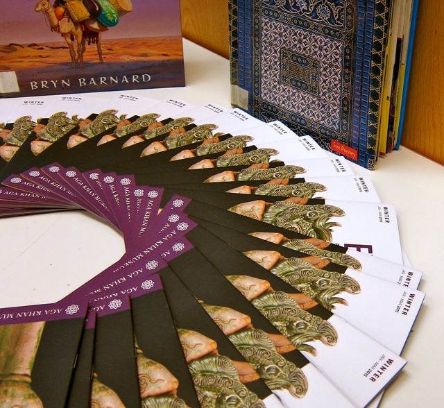
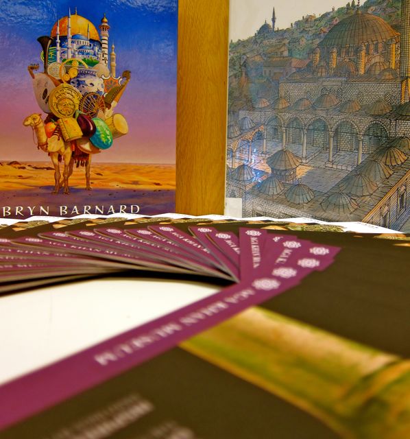
On a recent visit to Eglinton Square, I noticed a striking display on the table near the entrance. It contained books that celebrated Islamic art, culture, and history as well as leaflets showcasing the Aga Khan museum (for which MAP passes can be obtained at the circulation desk). The display exemplified what I like best about Eglinton Square Library: its accessibility, diversity and ability to respond to community needs.
Display of Materials about Islamic Culture, 2015Display of Materials about Islamic Culture, 2015Display of Materials about Islamic Culture, 2015
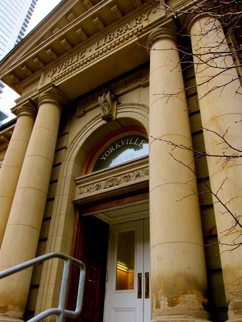
At the turn of the twentieth-century, City Architect Robert McCallum designed Yorkville Library (1907) in a Classical Beaux Arts style. One hundred and nine years later, TPL’s oldest branch still upholds McCallum’s vision of classical symmetry. Dignified stone lions, interior columns, square room-sections, and tasteful lemon walls work in harmony to create a timeless sense of peace and stability.
2014
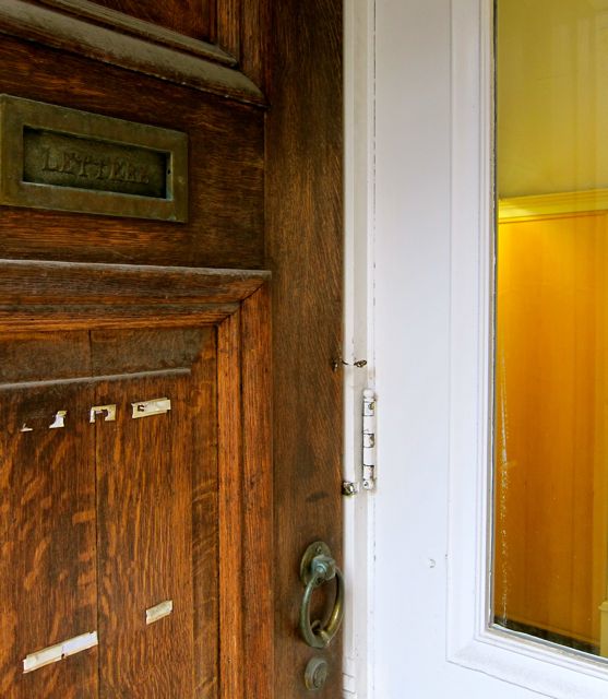
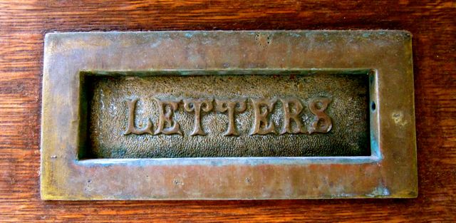
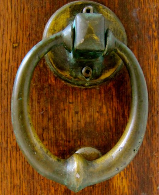
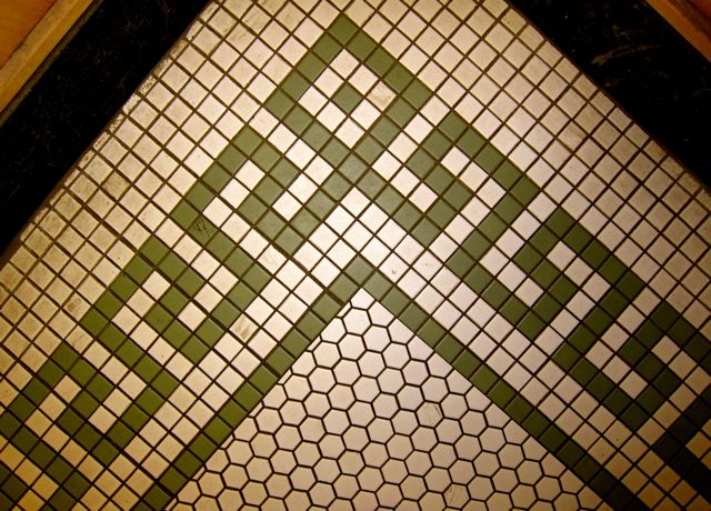
On a visit to Yorkville several years back, I studied a historical display in the vestibule that informed me that the branch was “the first of four libraries built with a $350,000 Carnegie grant.” Learning this fact, I felt grateful that Carnegie’s investment had not only served at least six generations of readers but also funded such artistic details as the exquisitely-lettered letter box, brass knocker, and decorative floor tiles.
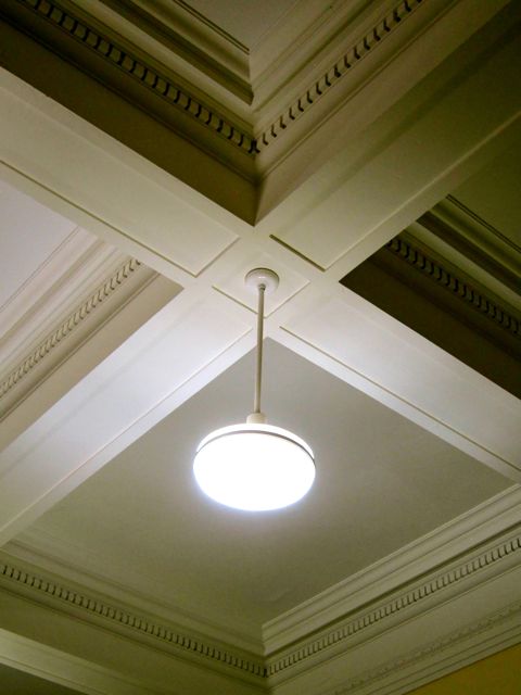
2014201420142014Photo taken in 2014. For a similar ceiling, please see Annette Street Library
Settling myself into a chair at a broad wooden table, I surveyed the facility as a whole. It was comforting to feel connected to more than a century of continuous self-education in such a lovely setting. With the front windows revealing a mass of tree leaves, it was easy to imagine away the twenty-first century commercialism of nearby Yonge and Bloor. According to the lobby’s historical display, when Yorkville branch was constructed, this area was considered the northern part of Toronto. Some trace of that quieter time and place seemed to remain in the library, the legacy of a slower, less harshly-lit era. It was a welcome respite from honking cars, gadget-addled pedestrians, and insistent storefronts.
To get better acquainted with the library’s offerings, I walked over to the checkout area (noting the high lozenge-shaped lamps like the ones at Wychwood) and veered left. Next to the DVD section was a selection from Yorkville’s LGBTQ+ Special Collection, unique to this branch. On the other side of the room was a substantial French-language section, along with adult fiction and books for teenagers.
2014
Crossing the section of the building where a newer addition had been joined to the 1906 structure, I found the children’s section (including lots of French materials), more shelves of fiction, and a special meeting room that boasted many sets of plays. To take advantage of these textual riches, a play-reading group meets there every Tuesday evening, choosing dramatic works by Eugene O’Neill, Norah Harding, Hanif Kureishi, Vaclav Havel, and Neil Simon among others.
2014
As I reversed directions to exit, I paused to admire a cloth ship hanging from the ceiling in the children’s section. Unlike more prosaic vessels, this ship had a rainbow tail like a kite’s. The tail was pinned to the ceiling in two places, creating a shape like a cursive letter “w” that slanted to the right.
Saint James Town has almost the same overhead ship but it lacks a tail. Photo taken in 2014.
As I sailed out the door in a historical reverie, I reflected on what a treat it was to experience a library so venerable and vibrant at the same time.
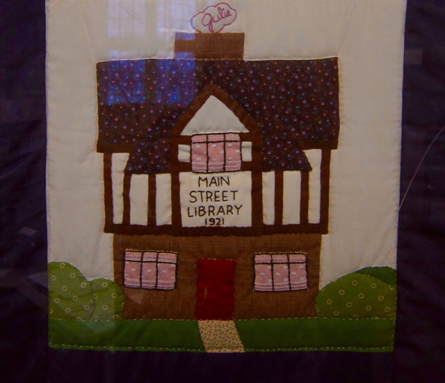
From 1921 to 1977, Main Street Library was known as Eastern Branch. Even though it opened the same year as Dufferin/Saint Clair and three years before Gerrard/Ashdale, Main Street no longer resembles its 1920’s cohorts from the outside.
A well-intentioned renovation in 1977 added a glass and red metal entrance that in my view contradicts the original vision of Chief Librarian George Locke (1870-1937). Locke had aimed for “English domestic architecture” (A Century of Service: Toronto Public Library 1883-1983, p. 26), but post-renovation Main Street misses that target. For example, ivy-covered English cottages do not often utilize Lego-like red triangles for lintels.
Playful angles and arches in the front lobby compensated for what it lacked in historical character. I appreciated the many interesting corners on the first floor, such as the light-filled reading lounge visible through an arch, as well as the 1928 south extension with its powder blue walls.
The main floor also yielded a large central room and a north wing devoted to adult non-fiction (also painted powder blue). With so many windows and open spaces, the inside appeared much bigger than I had expected.
Despite my initial disappointment with the tacked-on modern entrance, the upper level restored my image of Main Street as a heritage branch. The wooden ceiling even smelled pleasantly old!
2015
After spending a few moments gazing at Main Street’s delightful attic, I could sense its historical kinship to Gerrard/Ashdale branch. Two 1920’s attics, beautifully connected!
20162016
The south wing of Main Street’s attic featured exposed brick walls, long wooden tables, and dignified window frames, giving this home for children’s books and the juvenile French collection a scholarly yet comfortable atmosphere.
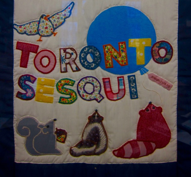
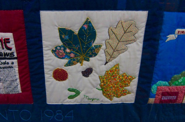
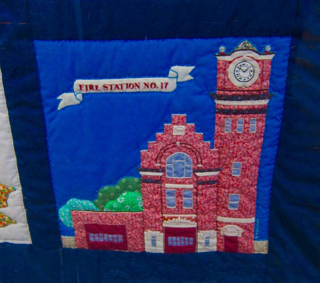
Warming the bricks of the east wall was a quilt stitched in honour of Toronto’s 1984 Sesquicentennial, the same occasion that inspired the quilt at Beaches Library. Without the thematic flow between each section that characterized the Beaches tapestry, the one at Main Street lent itself to individual panel study.I especially liked the quilt blocks that contained a mule pulling a Canada Bread cart, zany leaves, and Fire Station #17.
As I was studying the textile art, one attentive mom was listening to her child read a counting book while another prompted a young reader to respond to an illustration, “Is that a squirrel? Is she painting with her tail?” The latter parent was sitting in the north wing, which had armchairs in front of dormer windows and some steps leading to a reading nook under the west eave.
20162015
It made me happy to see 21st-century families gather around books under the slanted beams of an early 20th-century attic. After all, the learning that happens inside the library is more important than the shape of its front door. I think George Locke would be proud to know that Eastern Branch is still fulfilling its purpose ninety-four years after it opened!
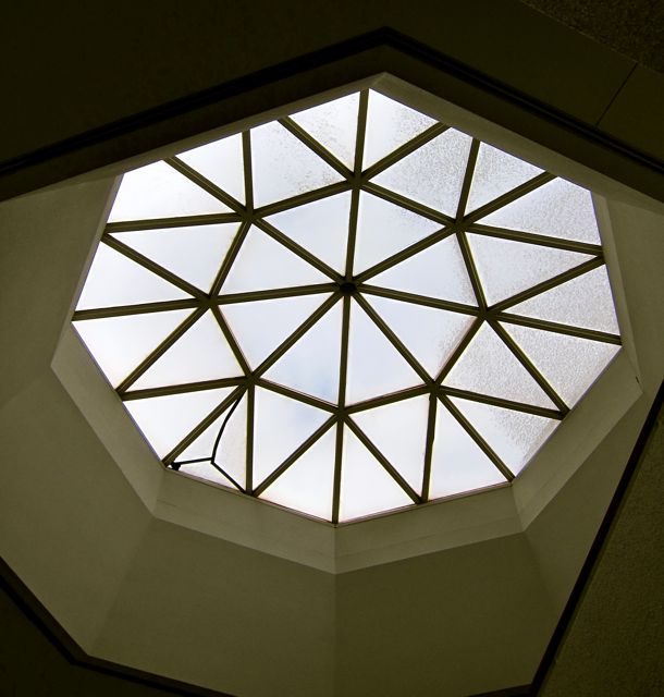
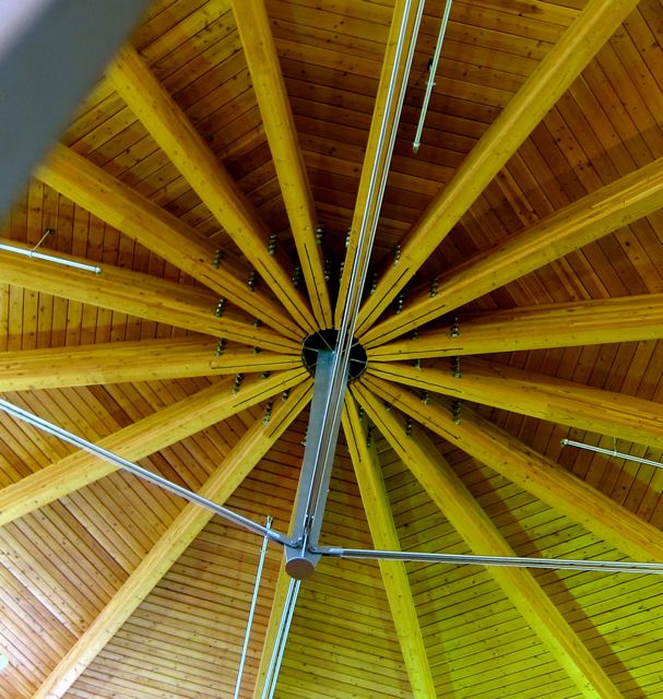
Harmonizing with the friendly round shape of the roof, the interior of S. Walter Stewart branch projects a pleasing openness. Near the checkout desk, circular shelves of videos and DVD’s echo the wheel shape of a skylight above. Wooden beams in a radial pattern support the translucent dome, and a blue band featuring the four compass points in gold encircles the area below the dome. (With such a classic setting, dancers at a Jane Austen costume ball could glide about with ease under the skylight so long as they minded the re-shelving carts).
2015
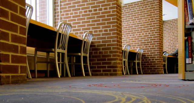
Along the periphery of the main floor are large open study stalls with wide desks between the brick partitions. Readers can gaze through expansive windows to the lawns and bungalows beyond. Fanning out behind the desks, tall and steady shelves of books in Chinese, Greek, Macedonian, and Serbian join rows of fiction, non-fiction, and reference books.
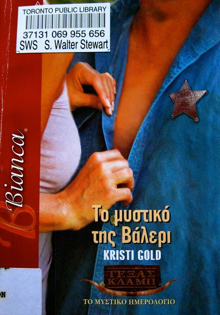
Sexy Sheriff in Danger of Losing His Badge
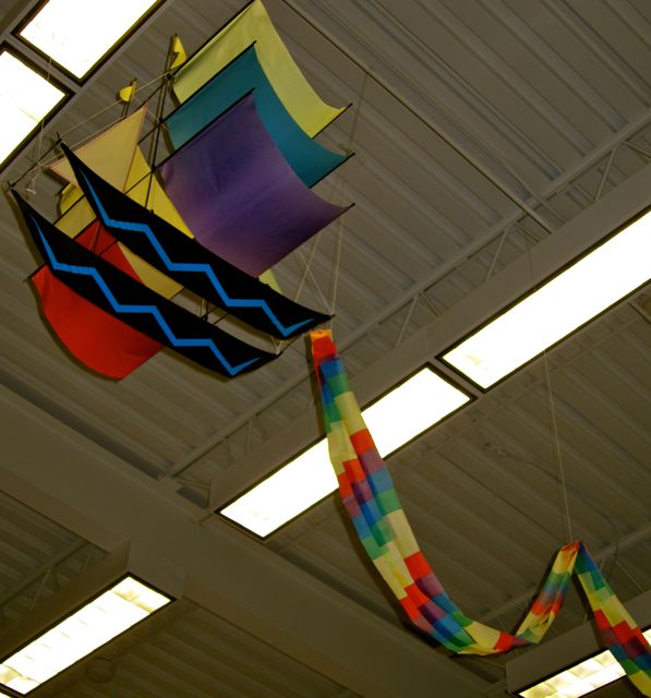
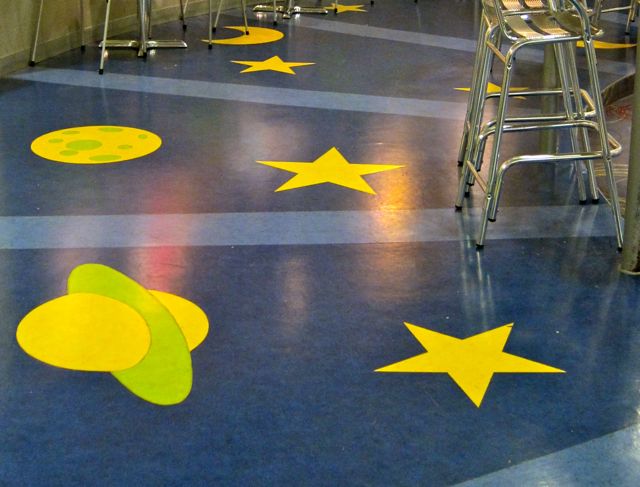
The basement level seems equally engaging. A blue linoleum floor cosmically graced with moons, stars, and planets leads the way to vending machines, a large auditorium, and a lively KidsStop complete with a giant red and silver rocket.
2011Bulletin Board Art Display, 20112011
The KidsStop room also has three original Barbara Reid plasticine illustrations that she made for Read Me a Book (2003). A giant copy of this book is attached to the wall, and as I flipped through it, I recalled the other Reid pieces on display at Parliament Street and Oakwood Village Libraries.
2015
From inside to outside, I love this library’s architectural commitment to circles and arcs. The central atrium, shelving patterns, reading lounge, curved window bench in the Teens’ section, downstairs auditorium, and even the carpet design celebrate the circle and semi-circle. These eternal shapes make visiting S. Walter Stewart an artistic as well as educational experience!
Like the pigeon above, I have always found Riverdale Library’s solid red-brick structure a restful place to perch.
On my first visit, I appreciated the heavy wooden doors that opened to the spaciousness of the lobby, inviting patrons to breathe freely. A soaring white ceiling, skylight, columns, and wide aisles all worked together to create a sense of freedom and possibility.
I felt my spirits revive when I gazed at the skylight of this Georgian Revival edifice, prompting me to send a silent message of thanks skyward to Andrew Carnegie. As recorded in A Century of Service: Toronto Public Library 1883-1983, Carnegie provided the initial funding for this library and three others in 1903 (Penman, p. 16). Ultimately, he would finance ten TPL branches.
20102015
My instinctive window-seat antennae led me to the northeast side of the library, where I found a wide curving bench. This lovely piece of reading furniture was an integral part of the children’s area, which also boasted a double-sided hearth and a Children’s Program Room with a matching window seat on the west wall.
When I went inside the program room, I found a puppet theatre and a leafless tree with a sign that read “Riverdale Tree: Do Not Move.” Five years later, the note had been removed and the tree positioned in a new location. Not only had it travelled, but it was now gussied up with leaves, a salamander, and bedazzled fruit.
201020152015
Back in the main section of the children’s wing, I noticed a pirate ship on top of a central shelf and Paddington Bear high overhead, secured to his chair-swing with massive quantities of packing tape.
The central section of Riverdale contained a corner reserved for teens to flop on some pink and yellow cushions, a computer bay, and magazine racks. Along the curved west wall, rows of tall shelves fanned out in a radial pattern.
Following the curve to the southwest corner, I saw a sign which said “Quiet Community Room.” I opened the door and discovered that it wasn’t quiet at all. About ten women were sitting at various tables with big thermoses and some snacks. When a couple of them gave me half-smiles of “Do we know you? What are you doing here?”, I realized that I was disturbing the morning study break of an ESL class. I apologized and retreated.
To support the class and other learners, a strong ESL collection was only a few strides away from the classroom. There was also a small Vietnamese holding and a much larger one that offered Chinese fiction, non-fiction, DVD’s, and more. On my 2015 visit, I enjoyed the lobby display in honour of Chinese New Year, especially the colourful card, book covers, and flowers.
20152015
From the multilingual bookcases against the south wall, I moved further into the interior and sat down between two high shelves. With my head resting just below a wooden windowsill, I surveyed the materials available in my temporary domain: French dictionaries, self-help books, SAT preparation texts, mathematics books, and fashion guides. I inhabited my bookish retreat for several minutes, leafing through some sale magazines and pausing to admire how vast the overhead space appeared from floor-level.
2015
After getting to my feet, I returned to the window seat to experience it in more depth. I took off my shoes, nestled against the wall where it formed a right angle with the seat, and rested my left arm on the upper ledge. It was the perfect place to write in my journal.I felt very fortunate to inhabit a quiet corner of this beautiful old library, enjoying the trees outside as well as the rumble of passing streetcars on Broadview Avenue. I also felt connected to the lucky Torontonians of the early 20th century who welcomed Riverdale Library into their city and their hearts.


 The creases, tears, and taped-up bits enhanced the artifact’s appeal, for though the map was old, much care had been lavished on its creation.